

DESCHAD: Building a modern brand for a precision manufacturing joint venture
Project Background
DESCHAD is a new joint venture bringing together two family-owned leaders with deep expertise in mechanical drive systems and precision gearing: DESCH, with 120 years of experience in industrial drive solutions, and Ernst Schad, with 75 years of precision gear manufacturing expertise. The new company focuses on regrinding wind turbine gear wheels with unmatched precision, regardless of manufacturer, to restore parts to peak performance.
Mission
Stryve partnered with DESCHAD to create a visual identity and launch an MVP website. The goal was to create a brand that reflects the precision, quality, and engineering expertise of both companies—while establishing a distinct, modern presence to support entry into new markets.
Discovery
The discovery process was a critical first step. We reviewed the history and expertise of both DESCH and Schad, and clarified objectives for the new company. This included research into target audiences, buyer journeys, and the competitive landscape. Team interviews and questionnaires helped us understand the company’s future direction and long-term growth plans.
Through discovery, we identified DESCHAD’s differentiators: precision, expertise, and advanced manufacturing knowledge. We also established the tone and visual direction for the brand, ensuring it would stand out in a traditional and often conservative industrial sector.
Logo Concepts
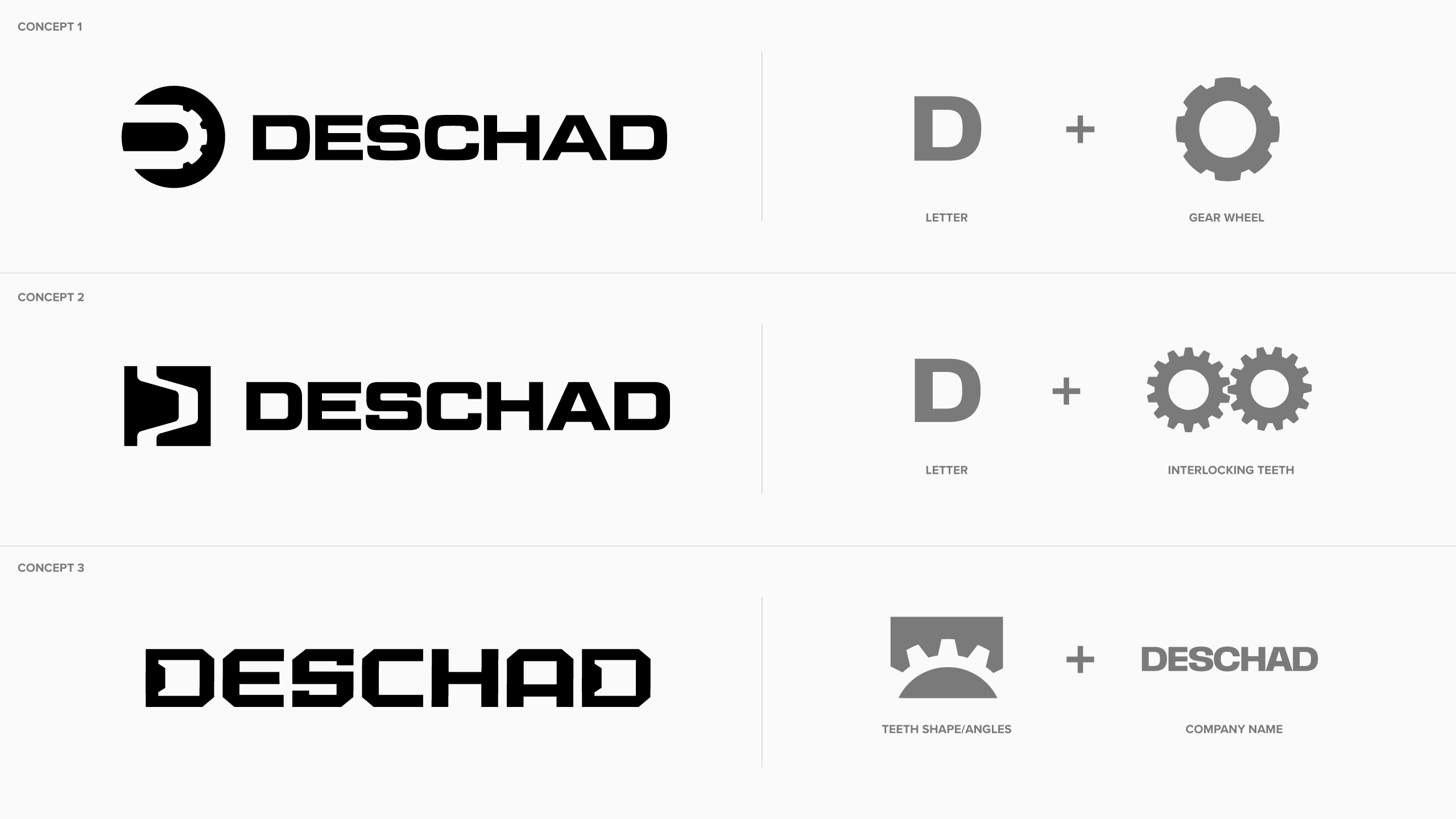
With discovery insights in hand, we developed initial logo concepts to explore how DESCHAD could visually express its identity. Three distinct directions were presented, each designed to capture the company’s technical expertise, durability, and precision-driven approach. Concepts were explored using bold geometric forms and industrial-inspired shapes to reinforce strength, longevity, and reliability.
Concept 1: Focuses on a gear-inspired ‘D’ icon paired with bold uppercase typography. The mark combines the shape of a gear with the letter D to create a strong industrial symbol tied to gear restoration and craftsmanship. The circular form also introduces a sense of movement and efficiency.
Concept 2: Explores interlocking gear teeth within a square, gearbox-inspired icon. The connected shapes represent the collaboration between DESCH and SCHAD, while also reinforcing precision and technical expertise. The bold, compact mark was designed to work effectively across everything from equipment and apparel to digital applications.
Concept 3: Takes a cleaner, more minimal approach by building mechanical-inspired angles and gear-like cuts directly into the wordmark. Instead of relying on a separate icon, the typography itself is the visual expression of the brand, giving the identity a modern, streamlined feel while still reflecting the industry.
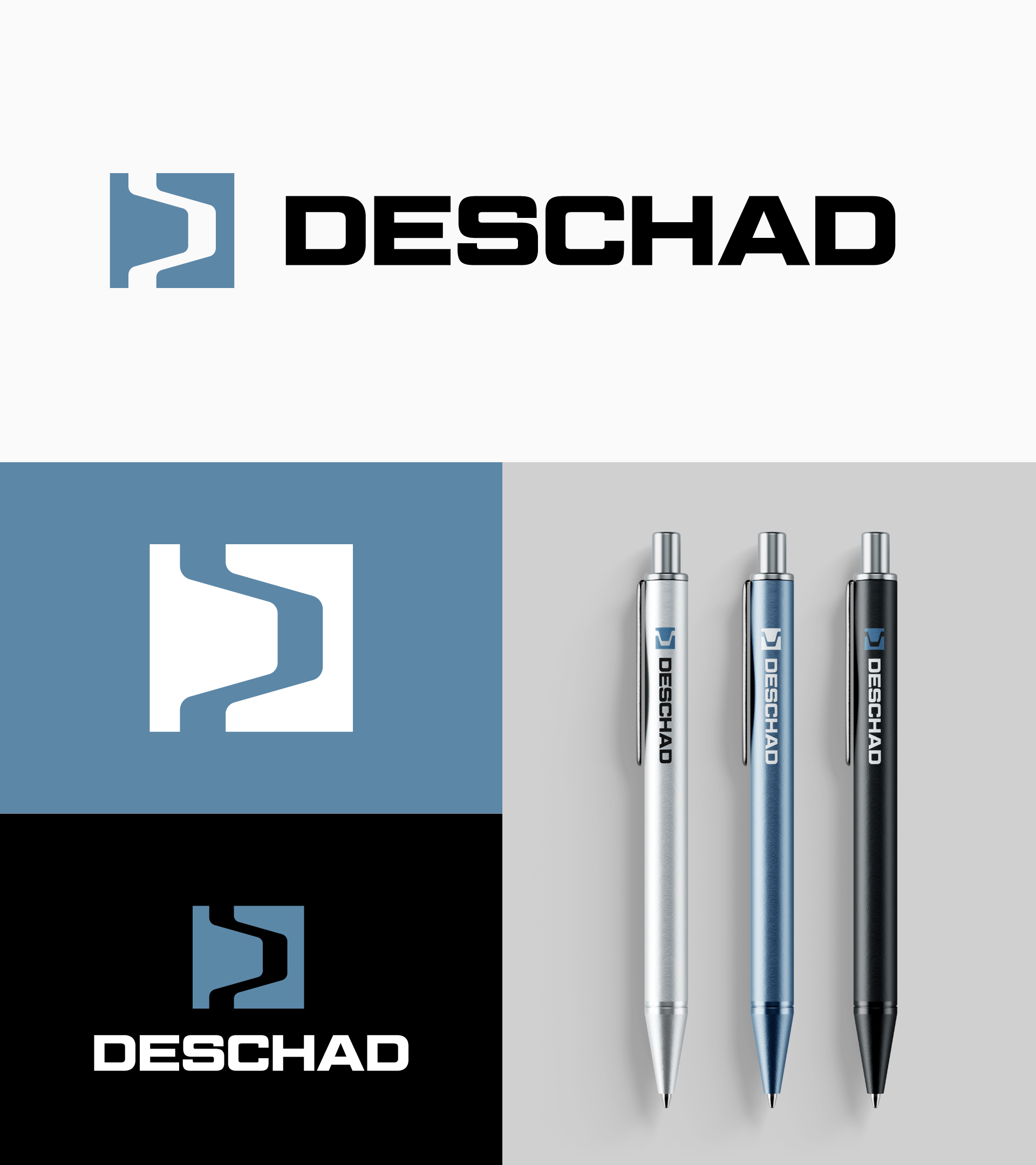
After feedback from the DESCHAD team, Concept 2 was selected for its balance of precision, boldness, and clear representation of both companies coming together. The direction most effectively captures the company’s expertise in gear restoration while creating a distinctive and adaptable identity system that can confidently extend across future brand applications.
Colour Exploration
Once the logo direction was chosen, we explored several colour palettes to find the best expression of DESCHAD’s identity. Options included teal, blue, slate blue-grey, and red. The team ultimately selected a slate blue-grey as the primary brand colour, paired with neutral shades of black, grey, and white.
Brand Guidelines
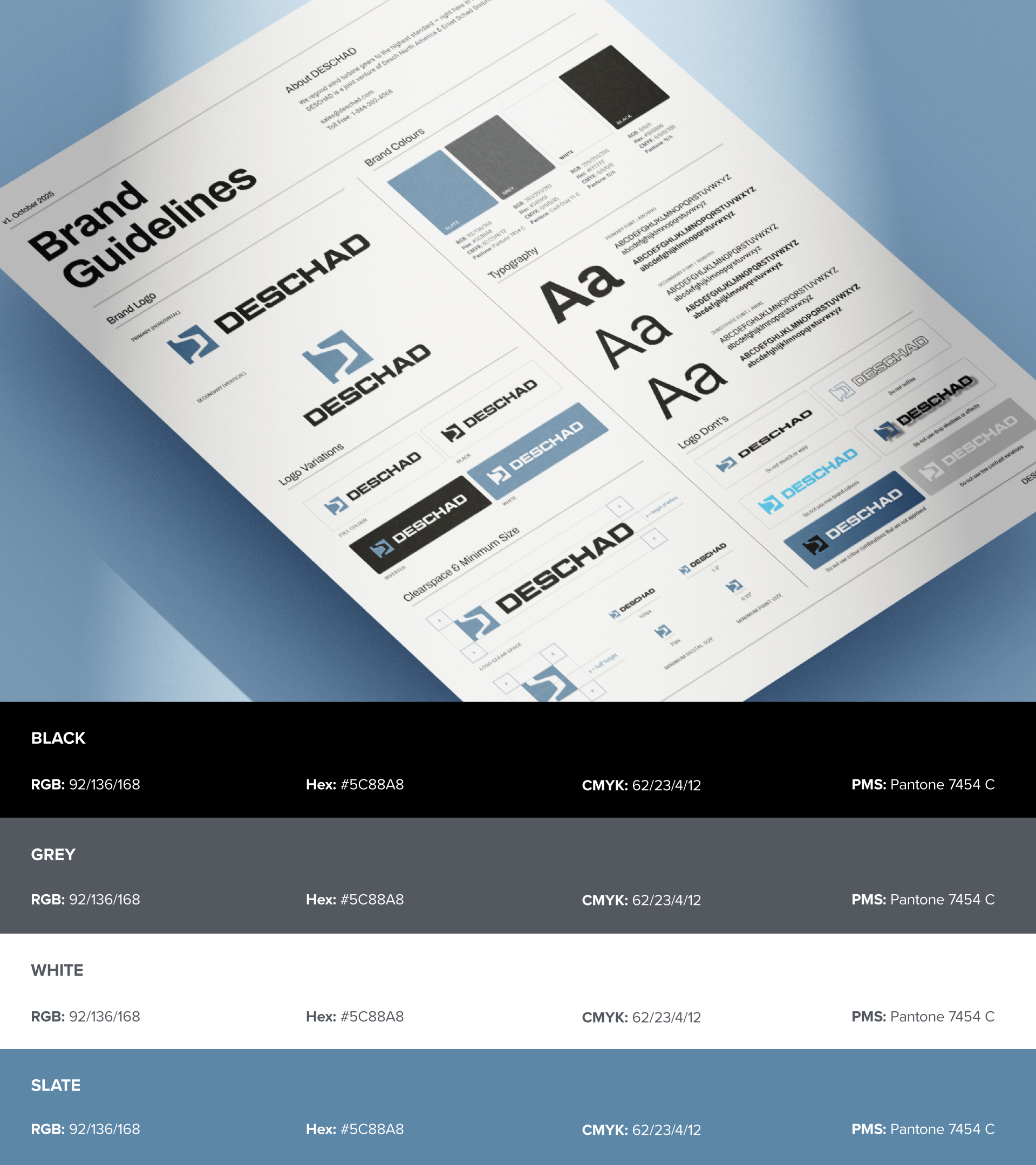
With the logo and colours approved, we developed a concise V1 set of brand guidelines. The guidelines included typography, colour specifications, logo usage, and clear visual direction for future assets. DESCHAD requested a simple, single-sheet reference that could scale over time, providing the essentials needed for consistent brand expression without overwhelming their team.
Brand Assets
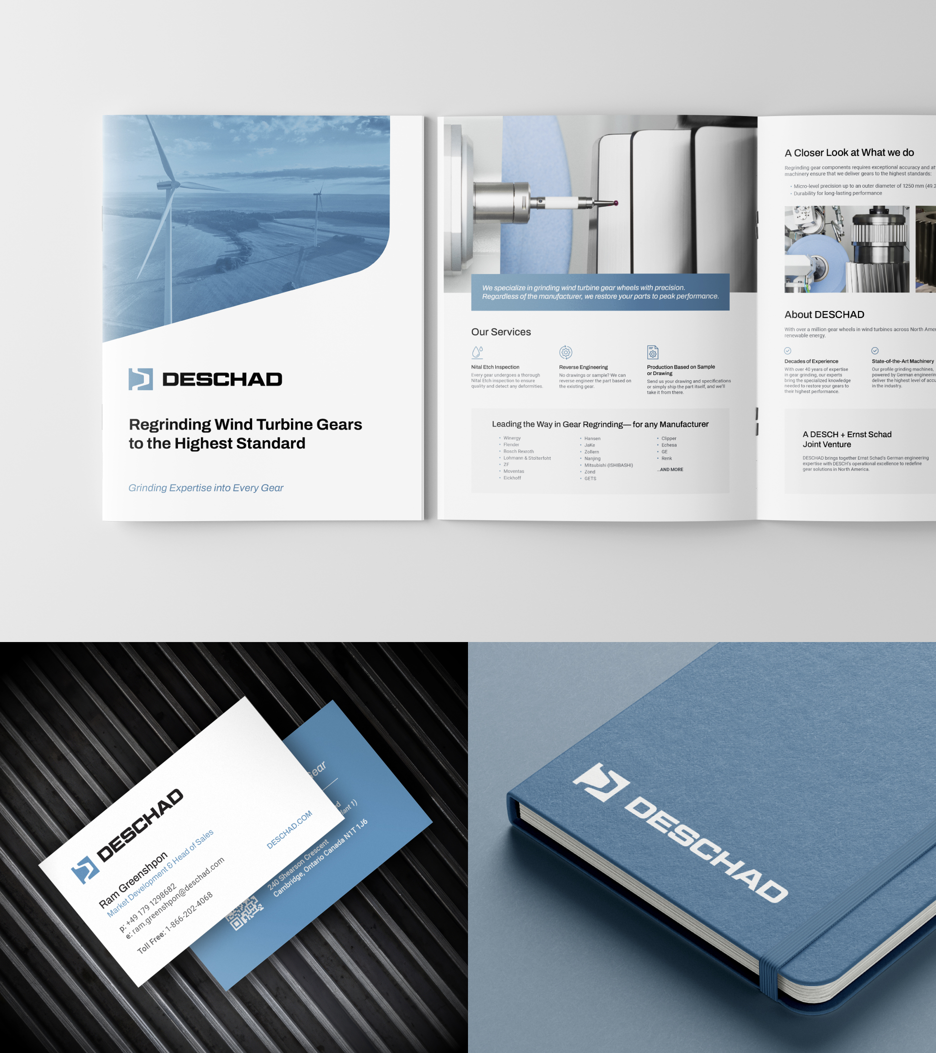
With the brand identity established, we created a suite of essential assets to bring DESCHAD to market. This included brochures, business cards, PowerPoint templates, letterheads, and email signatures. Each asset reinforced the clean, modern, and precise brand identity and provided the team with tools to confidently engage clients, suppliers, and partners.
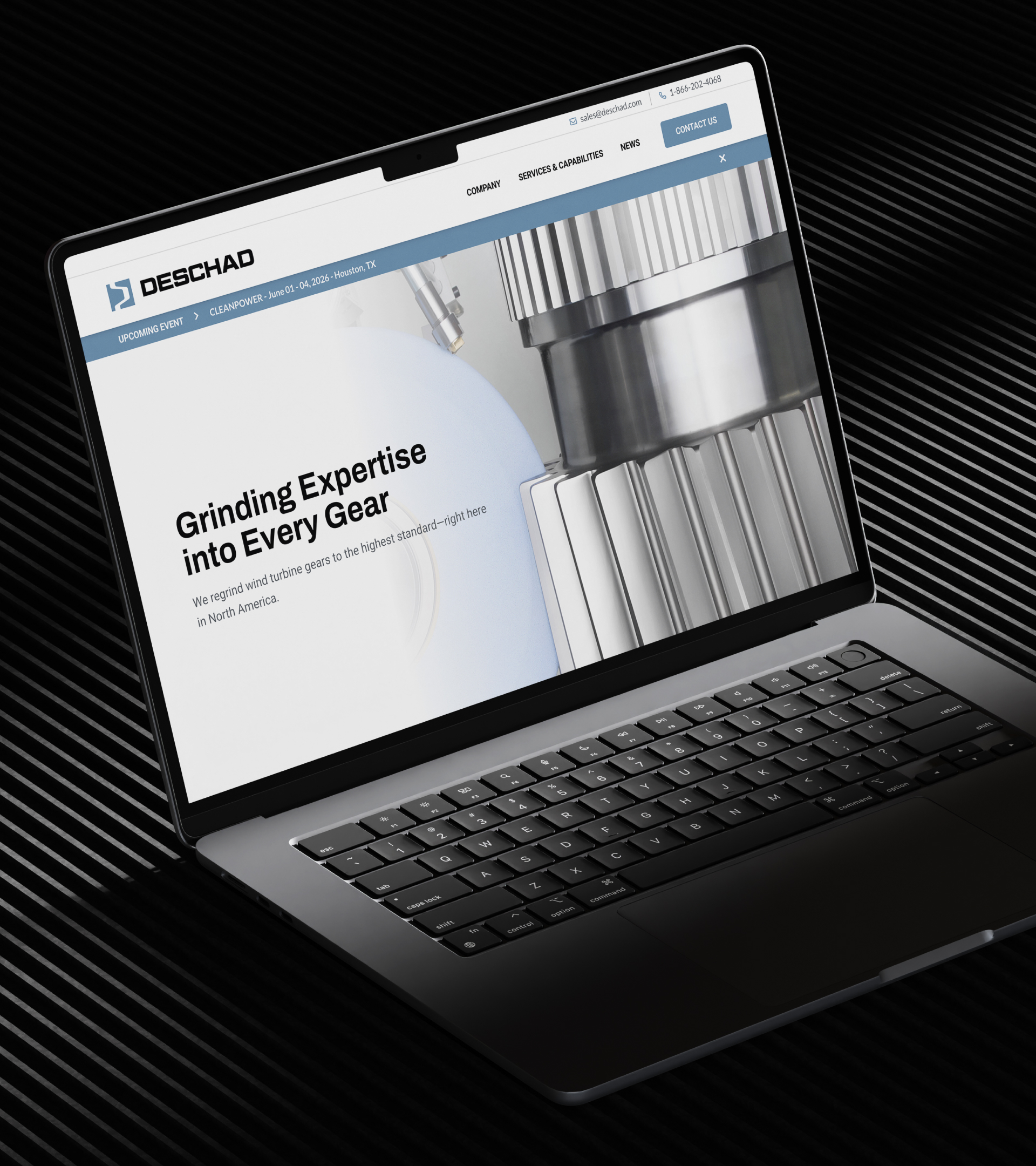
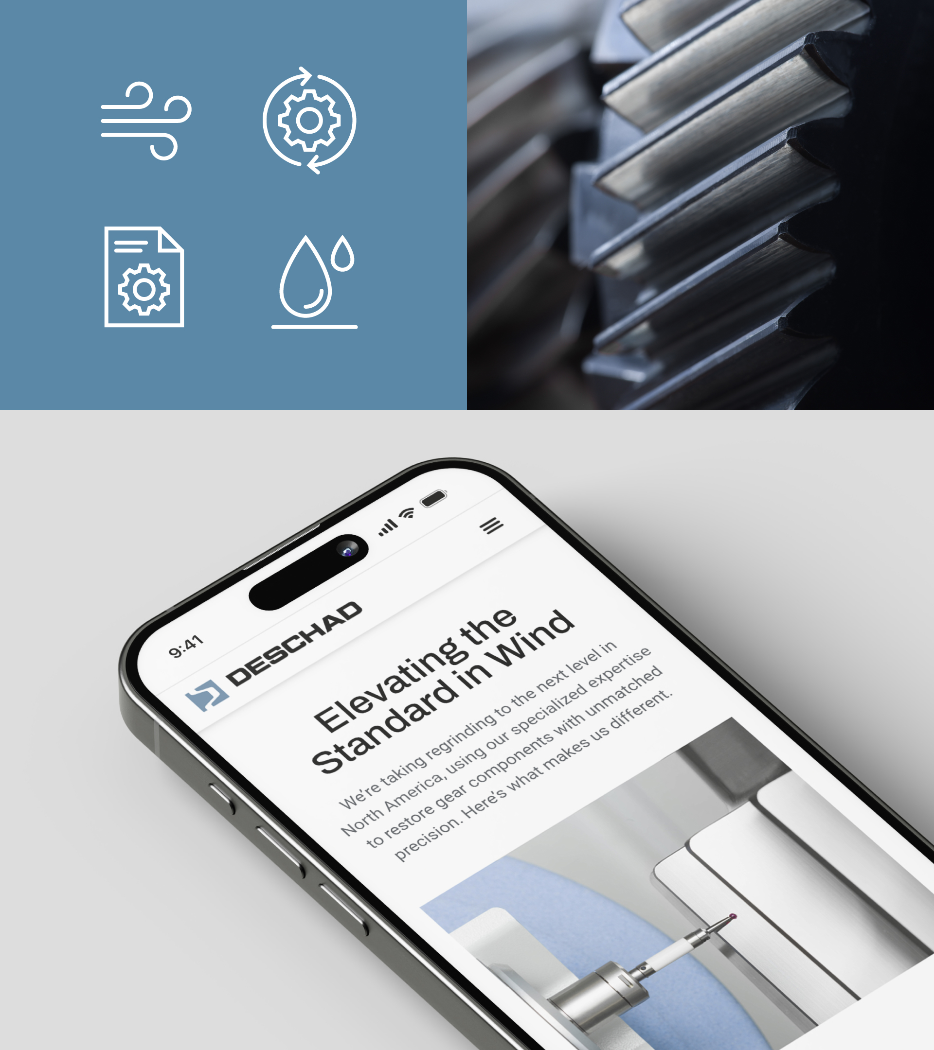
MVP Launch Website
The website served as a starting point for the digital home of the brand. Six pages were wireframed, designed, and built in Elementor on WordPress, with clear messaging and simple navigation. GA4 was set up and configured, and a Looker dashboard was provided to enable the team to track the website’s performance.
The website works seamlessly alongside the brand assets, allowing DESCHAD to communicate capabilities, collect inquiries, and showcase its expertise.
The Impact
Through branding, messaging, and essential assets, DESCHAD was launched as a modern, credible business. The new brand enabled them to launch at trade shows, communicate effectively with clients and partners, and enter new markets with confidence. DESCHAD now has a tangible identity, professional assets, and a digital home that reflects their expertise, precision, and ambition.