

Enabling Axonify to pivot with a new website
Despite fielding a modern website, Axonify—a tech company focused on learning solutions—wasn't content with their level of online engagement. On the surface, everything was fine. The design was clean, the navigation was intuitive, and the content was valuable. But to who?
While the imagery and messaging of Axonify's website appealed to the values of business owners and CEOs, they weren't the audience Axonify needed to win over. Instead, Axonify needed to appeal to HR and L&D professionals and equip them with the information they'd need to pitch the software internally.
That's where we came in. Building on our past relationship, Stryve was tasked to lead and execute Axonify's online pivot to addressing a new audience without undergoing a full redesign.
To do this, we focused on four things:
- Defining the priorities of the new audience and tailoring all visuals and messaging to align with those values.
- Better showcasing Axonify's platform.
- Improving the end-user experience to foster engagement.
- Equipping Axonify with the infrastructure and tools needed to target new audiences in the future.
Aligning visuals and messaging to new values
In pivoting away from business owners, we needed to re-think Axonify’s revenue-based language and corporate aesthetic. While Axonify “powers your bottom-line”—as stated by the old website headline—it’s a result of improved training, faster onboarding, and new levels of employee engagement.
Like HR and L&D professionals, Axonify’s primary focus is employee success across all industries. This would become our North Star and drive our decisions moving forward.
We considered the wide spectrum of industries and users while designing the homepage banner. To avoid a first impression that pigeon-holed Axonify as catering to a specific niche, we moved away from a single-image banner and instead stitched together a series of headshots showing a variety of occupations, ages, and backgrounds. To speak to Axonify’s limitless industry applications, the images cycle through one by one from off the page in a seemingly endless queue.
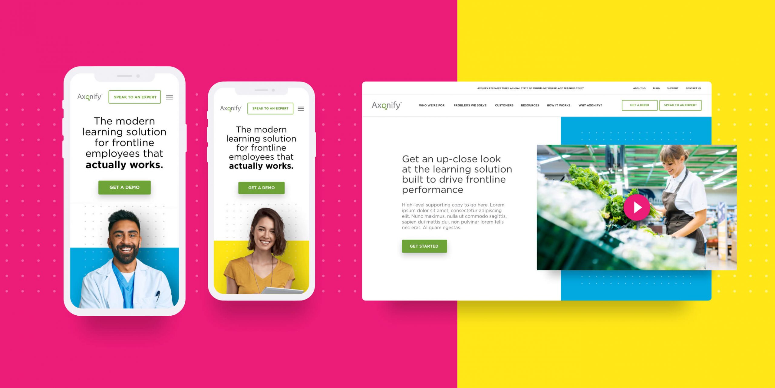
Colour plays a role in this, too. Not only does it represent Axonify’s spectrum of customers, but it helps dial down the corporate tone to differentiate Axonify from its competitors. What makes Axonify unique is its ability to make training fun and engaging. To reflect this concept, we used a primary colour palette to call back to elementary school where learning was often supplemented with games and other activities. Paired with a clean and modern design, we strike a balance between fun, professional, and accessible.
To project these themes and maintain brand cohesion without embarking on a full website redesign, we carried our strategic application of photography and colour through the website’s main internal pages. By doing so, we’ve essentially transitioned from a buttoned-up, bottom-line focused website to one that showcases diversity while putting employee empowerment first — the common goal shared by Axonify and their prospective customers.
Showcasing Axonify's platform
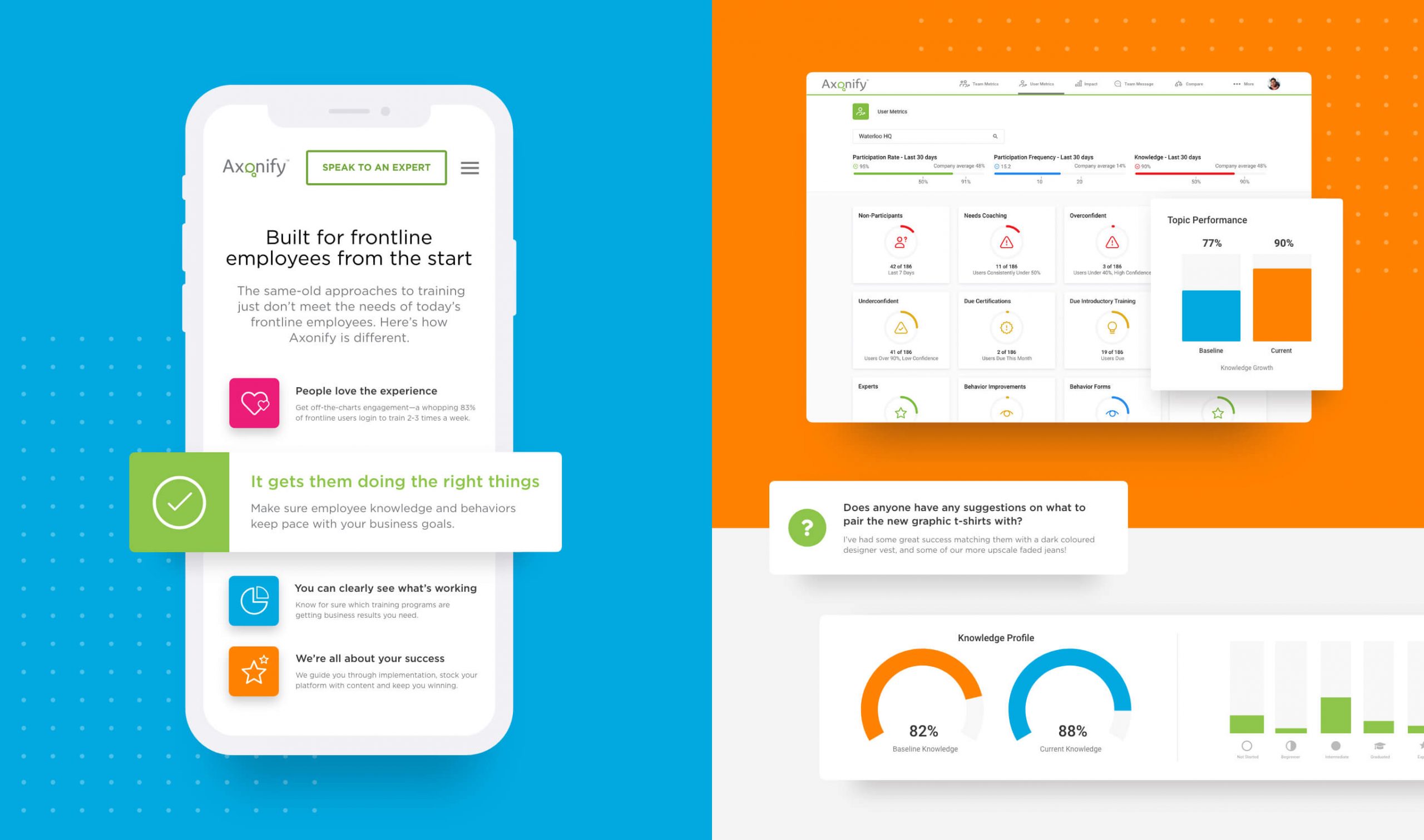
After aligning to the values of Axonify’s targeted audience, we needed to work towards warming incoming leads. Without having a demo immediately available to site users, we used screenshots to show the platform experience, strategically rendering tools and graphs to bring certain key features to the surface. While the site previously relied on corporate-toned stock imagery to appeal to the C-suite, the transition to screenshots is in line with our goal to prioritize the employee. Here, by revealing what they can expect to see as the end-user.
In addition, we’ve incorporated a series of subtle engagement animations and lightboxes to move beyond a static website experience to something more typical of a web app. In combination with screenshots, icon styling, and an overall clean design, we’re able to use the website to project Axonify’s platform experience.
Improve the end-user experience to support engagement
As with most SaaS websites, even the slightest bit of friction or inaccessibility can cast doubt on the software’s usability. As we had previously worked on the site’s main menu—using options like “Who we’re for” and “Problems we solve” for intuitive navigation—we turned our attention to content curation and forms.
Returning to Customer Stories, users who click an article will enter Axonify’s content portal. Integrated with PathFactory, we created content rabbit holes by tying articles together based on industry, use case, and other identifiers. As a result, users consume more content and spend more time on site as they move down the funnel.
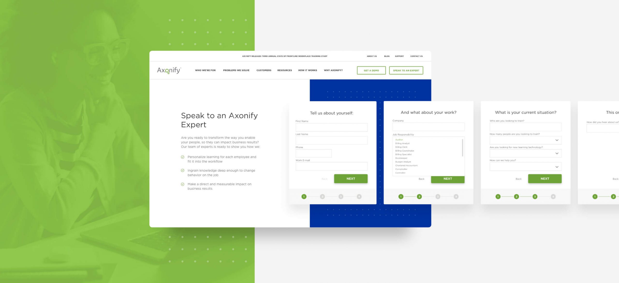
With Axonify applying to a wide range of industries, they rely on extensive forms to get sales up to speed on new leads. To reduce the number of users being scared off by these massive forms, we removed unnecessary fields and broke them down into digestible sections presented one at a time. Additionally, we rephrased queries to be more conversational and less interrogative, framing the engagement as an onboarding experience rather than an administrative task.
As a result of these updates, conversions on Axonify’s “Speak to an Expert” form have doubled. To improve the forms on your site, check out our blog about strategic form design.
Enable future flexibility and independence
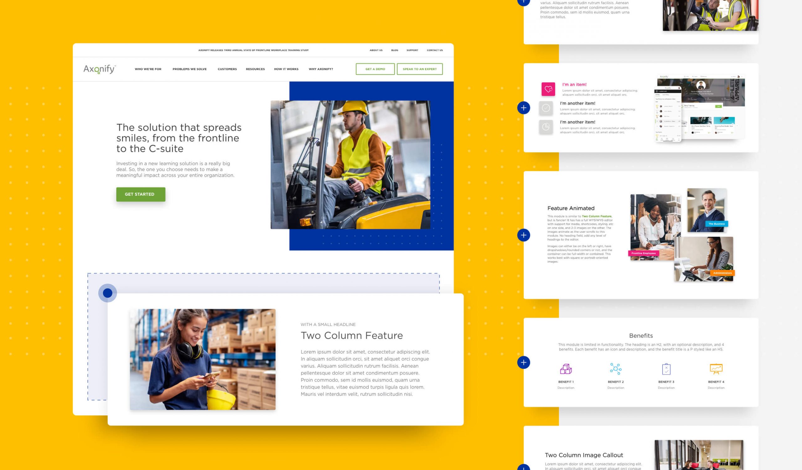
Part of solving a problem is ensuring it doesn’t happen again. In this case, we wanted to equip Axonify with the tools needed to address new audiences and other changes in the future.
To support this flexibility, we built over 50 custom WordPress modules enabling the Axonify team to build new pages on their own—no developer needed. Furthermore, the custom nature of these modules ensures all new pages maintain the aesthetic of the current site and stay within brand guidelines. That means new pages can be integrated seamlessly to contribute to a cohesive user experience.
With this solution, we’ve not only set up Axonify to be self-reliant in the future, but we’ve extended the shelf-life of their site by enabling it to grow alongside their business.
Takeaways
- While it’s Axonify’s logo at the top of the page, this website is about the customer. For B2B brands, we recommend focusing less on who you are and more on your audience. What is important to them? What can you do to help?
- Companies providing easy-to-use products should prioritize accessibility and UX over style points. If your site is hard to navigate, what hope does your customer have in navigating your solution?
- Don’t just talk about your product—show it. Pull back the curtain to make conversions less of a leap of faith.
- Ask yourself, would you take the time to fill out that form? If the answer is no, you have work to do.
- A website is too big of an investment to have a limited shelf life. Organizations should look to collaborate with developers and agencies who can equip them with the tools to independently manage and build off the site post-launch.
- If you’re looking to do award-winning work, you know where to find us!