

Steed and Evans: Recruiting the builders of tomorrow
For over 70 years, Steed and Evans has been one of the largest and most trusted construction companies in Ontario. Despite this reputation, they weren’t immune to the reality many businesses in the industry were facing: an aging workforce. With nearly 1 in 4 of all construction workers over the age of 55 and approaching retirement, the pressure to get younger was mounting.
In a strategic move to position itself as a go-to destination for career growth and development, Steed and Evans partnered with Stryve to create a cutting-edge website, designed to recruit the next generation of skilled workers.
Establishing site architecture and content priorities
As we discussed the previous website, Jared Sommers, Manager, Resources at Steed and Evans suggested that it felt more like a digital bulletin board than a functional website:
“As the business has grown, we’ve been quick to add things—new services, company events, and new photos. The information is important, but the layout of the site doesn’t really support these updates.”
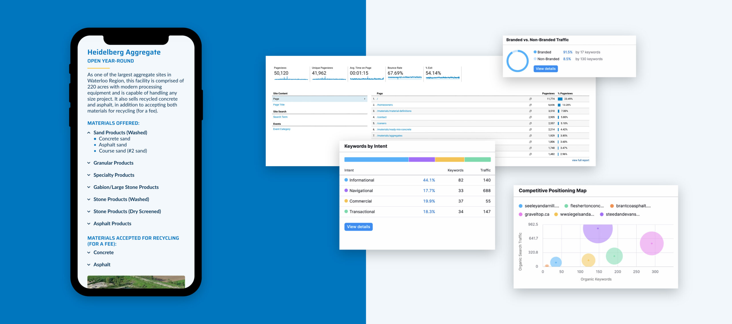
It was clear there was frustration with the website’s lack of organization and flexibility. We needed to establish what content was most important and relevant to the target audience, to streamline and improve the overall user experience. To help answer these questions, we leveraged digital tools like Google Analytics and Semrush, to help identify the most relevant, engaging, and valuable pages on the website.
For example, we found that the ‘Homeowners’ page, dedicated to small services like driveway snow removal, was the second most visited page on the website. These smaller services, however, were being phased out of the business and the people who were visiting this page weren’t the audience they were looking to attract. Key learnings such as this helped shape the new website’s architecture.
Once architecture decisions were made, we turned to Semrush to further research industry terms and the search intent of Steed and Evans’ audience. What kinds of keywords were Steed and Evans ranking for? How did they stack up against their competitors? Were there opportunities to craft new content to help bring in more of the right audience? Armed with this data, information, and target market personas, the Steed and Evans team felt more comfortable making informed decisions about what content to highlight, cut, or re-imagine.
The recruitment journey
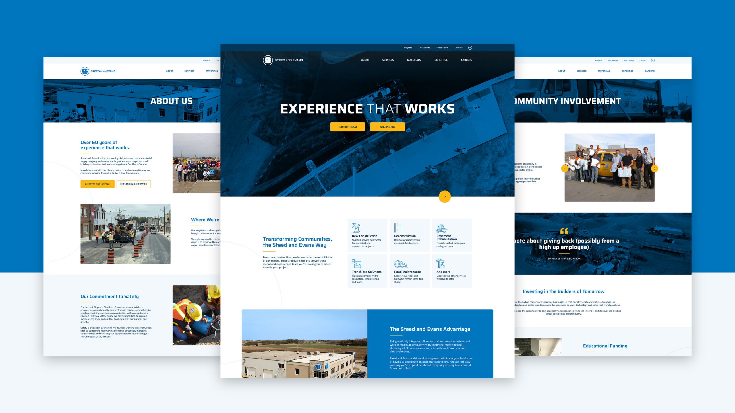
Like any website, the user experience must guide your decision-making. The Steed and Evans team wanted the focus to be on education and ultimately job applications. This is why when you enter the site, you have two immediate calls to action: ‘Join our Team’ and ‘Who We Are’.
For those who are aware of the Steed and Evans brand and are simply looking to apply for a job, they can follow the CTA button in the banner or through the ‘Careers’ heading in the navigation. Selecting ‘Join Our Team’ takes you to the Careers page where the user can explore what types of perks, benefits, and positions are available at the company.
For those potential applicants (or customers) who may not have a deep understanding of the company and are looking to learn more about the company’s history and culture, the ‘Who We Are’ CTA will take the user to the ‘About Us’ page. This allows the user to learn more about the company at a high level and provides opportunities for further exploration. According to Team Stage, the number one factor that sways millennials (this website’s target audience) in a job search is corporate culture with nearly 75% primarily interested in the work environment and professional growth. By linking out to pages such as history, community involvement, and leadership, the prospective employee can get a closer look behind the curtains of what it means to join the Steed and Evans team.
The design approach
Visually, the brand needed to stand out. The goal was sleek and modern without losing the approachable nature of the brand.
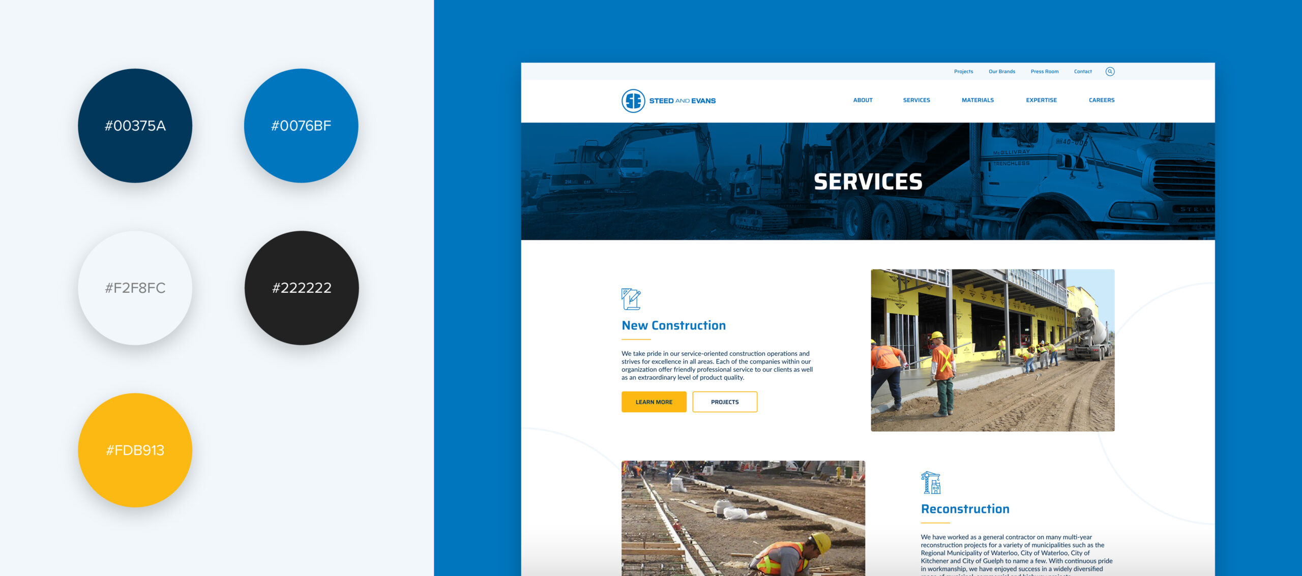
One way this was accomplished was through the use of colours. Staying true to the company’s brand colours, lighter tones of blue and yellow served as the brand colors throughout the site, while a darker navy blue was introduced as a fresh extension. Yellow was strategically used as an eye-catching call-to-action hue, to draw attention to interactive components like buttons and navigational elements.
The two bold and saturated blues create contrast within the color palette, fostering a distinct structure and hierarchy among various sections and modules on the site.
Designing for approachability
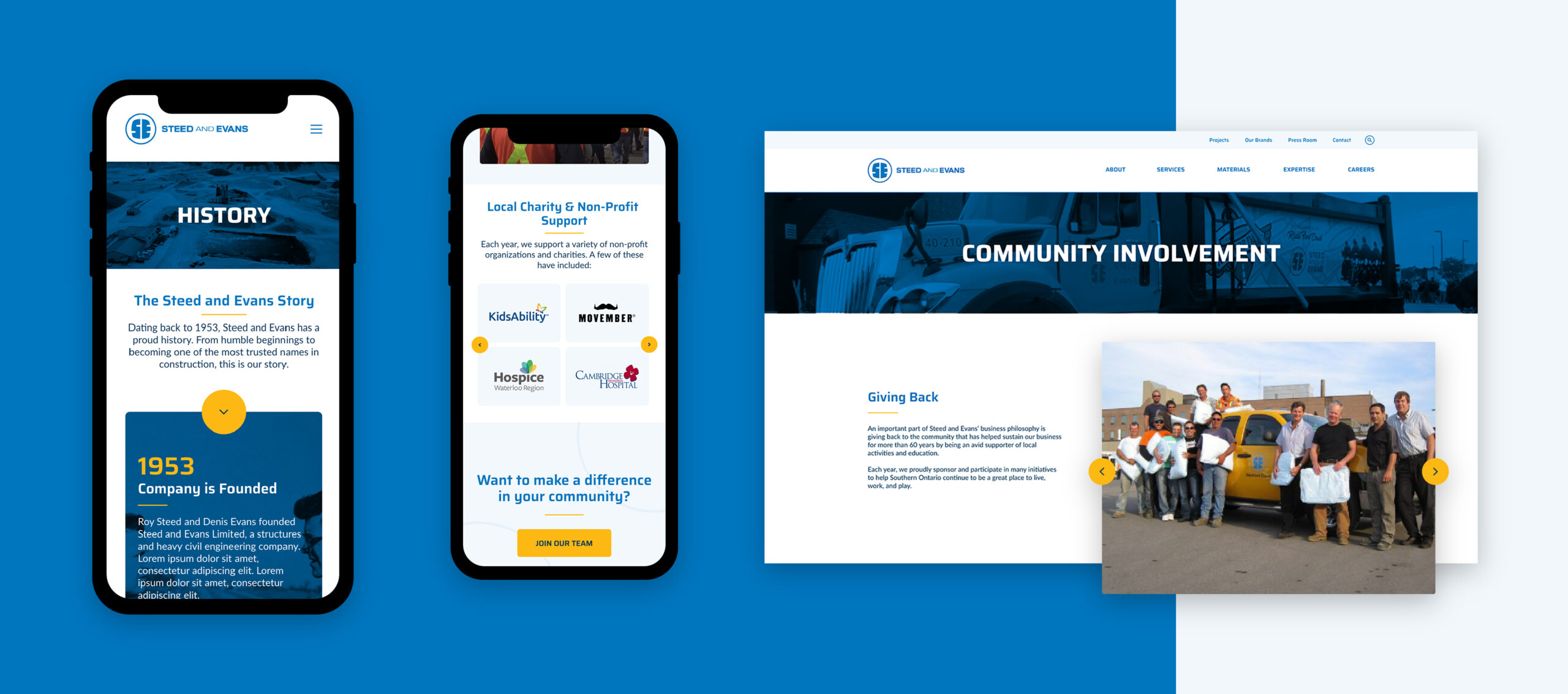
Gleaning further inspiration from the logo, we also leveraged the circle element. Using it for rounded corners on buttons, photos, and throughout the site as a dynamic background. The softness that these elements brought to the design was a great way to contrast the bold font and industrial feeling colour palette while bringing balance to the design overall.
The mobile experience
With this website (and all websites we create), we ensure the user experience is mirrored across all devices. Mobile design is no longer optional or a ‘nice to have’, but a key part of website creation. You may be asking yourself, what’s the big deal? Consider this: nearly 70% of job applications were made from mobile devices last year. Seventy percent! That’s a lot of applications you could be watching fly out the window all because your website wasn’t up to the task.
To ensure Steed and Evans weren’t missing out on any future applications, we designed, tested, and optimized for the mobile experience. This meant ensuring all content was legible, all designs were functional, and
Visual authenticity
Visuals are crucial to any website. For the Steed and Evans team, visuals had to accomplish two main priorities:
- Champion their people
- Show off their scale
When attempting to recruit employees, especially in construction, your portfolio is one of your biggest selling points. So, show it off! Throughout the site, you’ll find action shots, drone footage, and project photography—let the visuals do the talking. Employees need to be excited at the thought of joining your team. What better way to do that than to show off the cool stuff you do? This is why throughout the site, there’s an intention to highlight the size and scope of the work.
As for championing the team, we were very intentional. Every photo you see on the website was captured by or features a Steed and Evans employee. No stock photography, no AI-generated images—just an authentic look at what it means to be a part of the team. When deciding on the homepage banner video, we mocked up three unique options each with different visual elements, orientation, and copy.
Ultimately, option 3 was selected. Why? The people! Their entire brand is built on 70 years of authentically celebrating their employees, so it’s only fitting the first thing you see when you visit the website would be the people who keep Steed and Evans going.
The final product
The Steed and Evans website now has a direction, a flow, and a singular purpose. The new website is cohesive, dynamic, and most importantly, on brand.
On our kickoff call, Jared Sommers (Manager, Resources at Steed and Evans) said:
“The new website should have a refreshed energy that would attract young new talent to the company by reinforcing the values and culture of our business.”
Upon completion and launch of the new website, he said:
“Mission accomplished.”
Head over to the Steed and Evans website to experience the live website.