

Gemini: Branding a new air-charged catheter
Background: Gemini Medical Technologies is a medical technology company that specializes in Urology. Gemini came to Stryve while in the process of creating a suite of Air-Charged Urodynamics Catheters and bringing them to market. The problem? This sub-brand didn’t have a name, logo, or any meaningful branding elements to pull from.
The Mission: Compete with the Urology market leaders by launching a new product line and sub-brand.
The Outcome: A new product name, logo, guide, collateral, and guidelines to explain how to use it all.
The Impact: Atmos catheters now have a clear, recognizable visual identity. These new elements are now being leveraged in multiple touchpoints to assist Gemini's overall marketing and sales strategy.
Brainstorming
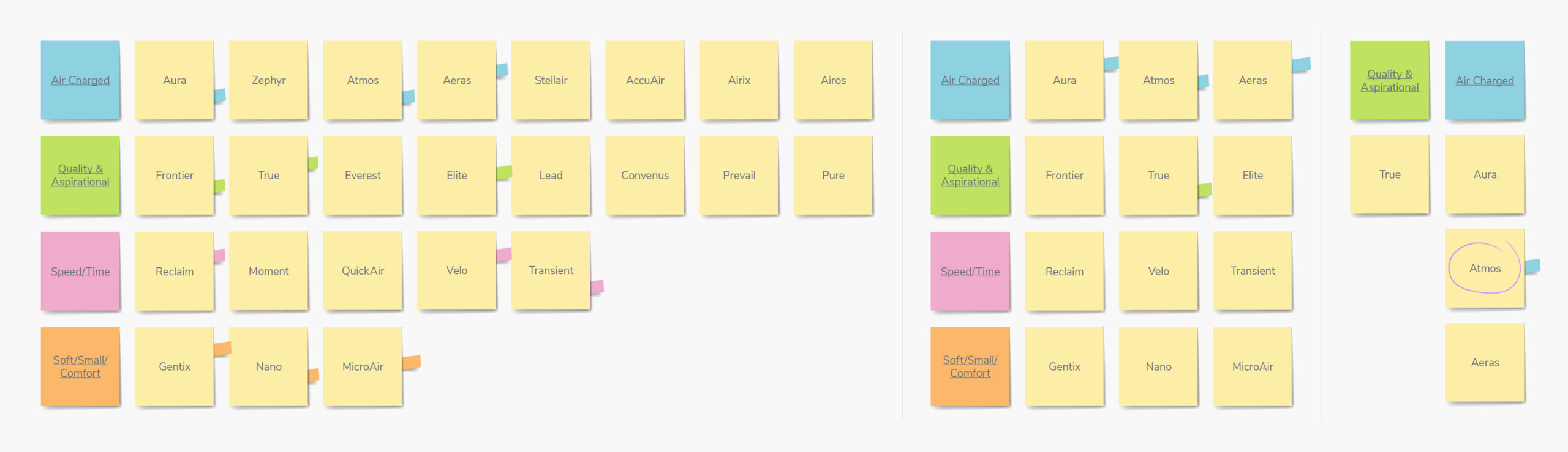
Coming up with product names isn’t always easy. Should the name be tied to its features? The size? The feeling of use? There are a lot of variables at play. For Gemini’s new product—a flexible, soft, and small air-charged urodynamics catheter—it was very much a collaborative approach. Based on initial conversations about the product and what we learned from designing the Gemini logo, we identified four key themes that we would use to guide our thinking: quality & aspirational, air-charged, soft/ small/comfort, and speed/time.
In the beginning, we left no stone unturned. After further research, discussions, and divergent brainstorming, we created an exhaustive list of approximately 50 brand names. This judgment-free exercise aimed to voice all options without holding anything back. What starts as a wild idea can spark a stroke of genius down the road.
From the original 50, we refined the list to 25, then 10. And finally down to 4. At this point, we lacked consensus within the Gemini team with various members of the team unsure of which option to pursue. To help overcome this stalemate, both the Stryve and Gemini teams each created a pros and cons list of each word and ranked them from 1 to 4. What sounded best? What was most aligned with the product? Were there existing products with similar names? This further narrowed the options until a unanimous winner was ultimately crowned: Atmos.
The meaning behind the name
The Atmos name is derived from the word ‘atmosphere’ which speaks to its air-charged technology and sense of softness. Atmos, like its parent company Gemini, has Greek origins with the word ‘Atmo’ literally meaning ‘air.’ The product’s key benefit is that it uses air and not water like other catheters in the industry, so going with a name that highlights the lightweight feeling of using the product was a no-brainer.
Creating an atmospheric Logo
With agreement on the name, we quickly pivoted to logo creation. The Atmos logo needed to communicate a clean, modern, and innovative brand that equally targets men and women urologists. Similar to creating a product name, the Gemini team identified 4 key themes and keywords that should guide the logo designs:
- ATMOSPHERE – air, wind, gradients, light blue
- SOFT/COMFORT– round edges, curves
- CLEAN – simple, modern, thin lines
- CATHETER – flow, soft, air-charged
With clear direction, we presented our first round of logo mockups.
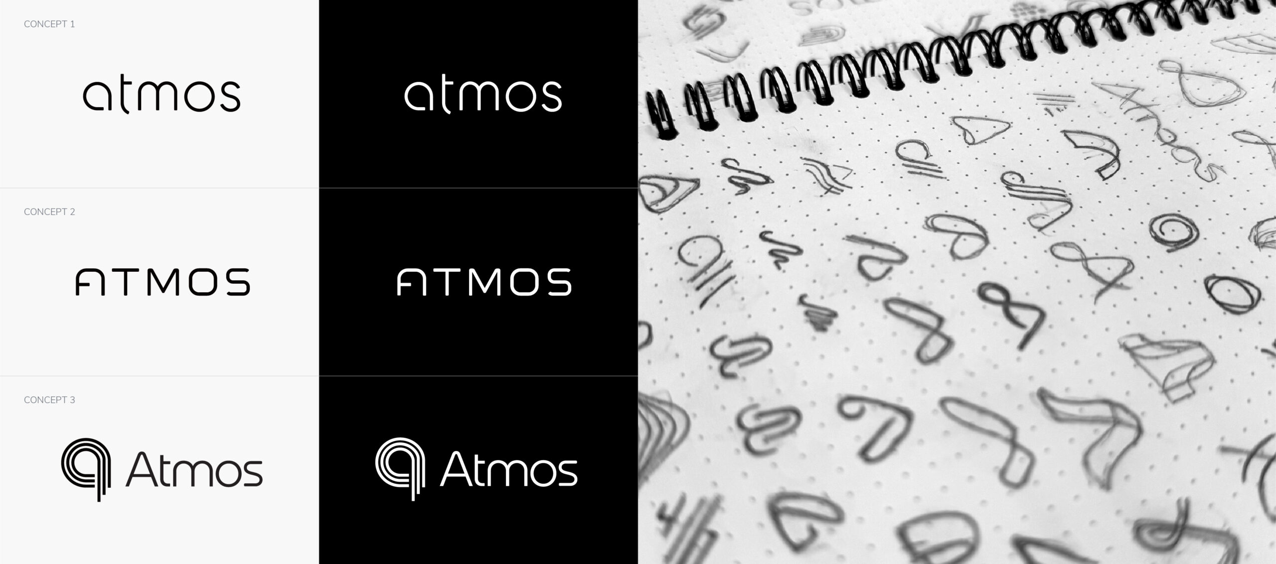
Concept 1: Lowercase “atmos”
Concept 1 had a soft feel with curves, rounded edges, and thin lines. Using all lower cases gives it an approachable and non-invasive feel. The “t” is also a subtle nod to a catheter shape with the two ends and then extending down into a single curve.
Concept 2: Uppercase “Atmos”
Concept 2 leveraged curves and rounded edges. The uppercase lettering can be considered masculine however, the thin lines and rounded edges help balance it and give it a softer feel. The ‘A’ is another nod to the catheter shape like concept 1.
Concept 3: “Atmos” with an Icon/Symbol
Concept 3 is a more unique take on the brand adding a symbol. This version uses a lowercase ‘a’ shape playing on layers of atmosphere or wind with the tapered bottom. It could also resemble how the catheters are looped in photos. This example has multiple tones to convey the airy feeling but also works as a solid colour.
Feedback & colour selection
While Concept 1 received positive reviews, there was universal agreement on Concept 3. Despite the team liking the option, the Gemini team wasn’t sold on the icon with concerns that the logo is “a bit too busy” and “reminds me of the old school Philadelphia Phillies logo being key pieces of feedback. With that, we went back to the drawing board looking to further explore Concept 3 with a different icon and feel.
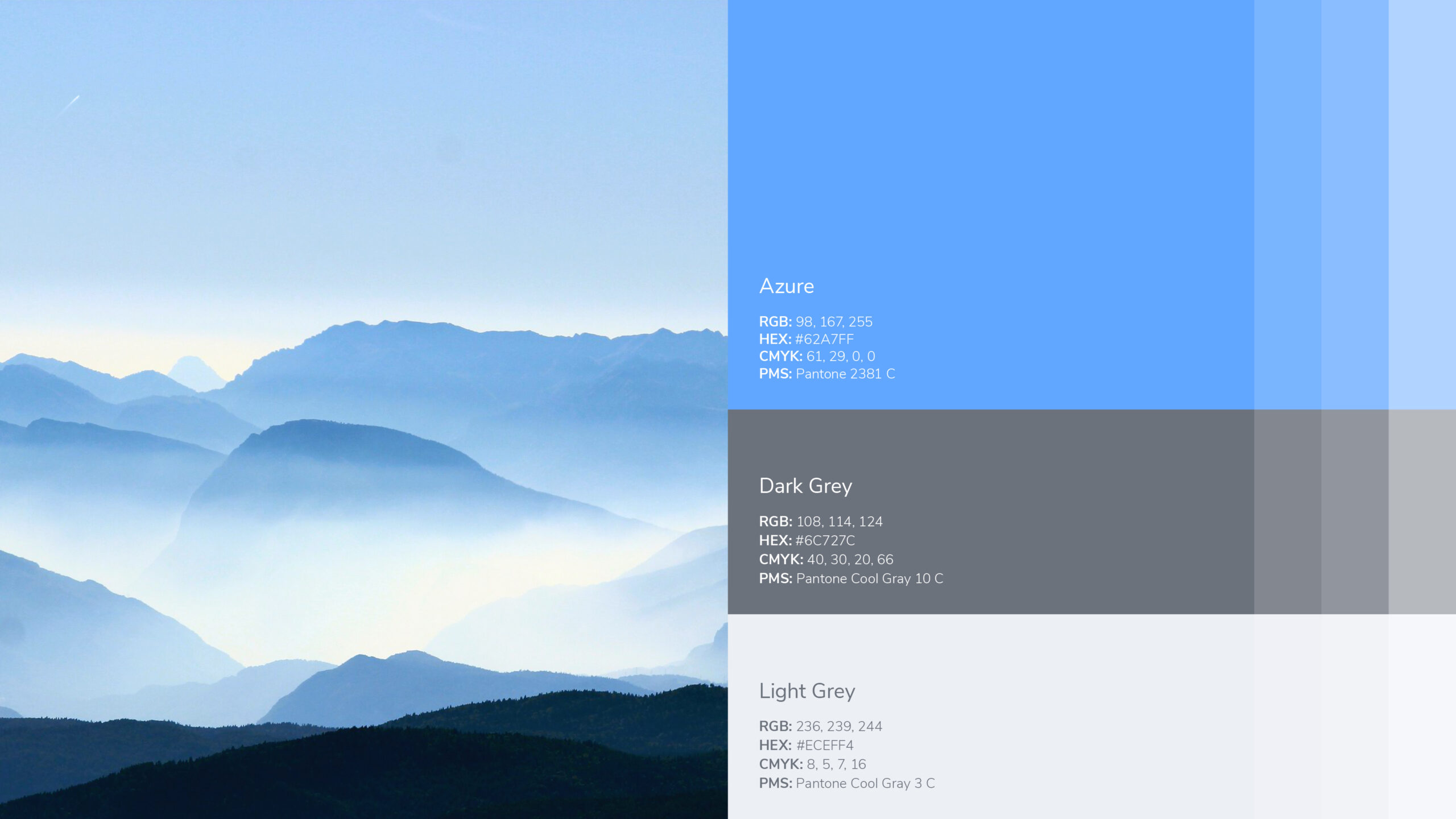
With our designers creating new mockups, we forged ahead with colour selection. The Gemini team wanted to pursue shades of blue because of its ties to the medical community and the feeling of cleanliness. Wanting to stay away from the traditional shades, we created a few colour swatches to help narrow down the specific hue they were looking for.
The Gemini team elected to go with Azure—a bright and vivid shade of blue. Within the Gemini brand, the colour naturally pops and provides a unique look within the medical industry that will stand out.
Round 2
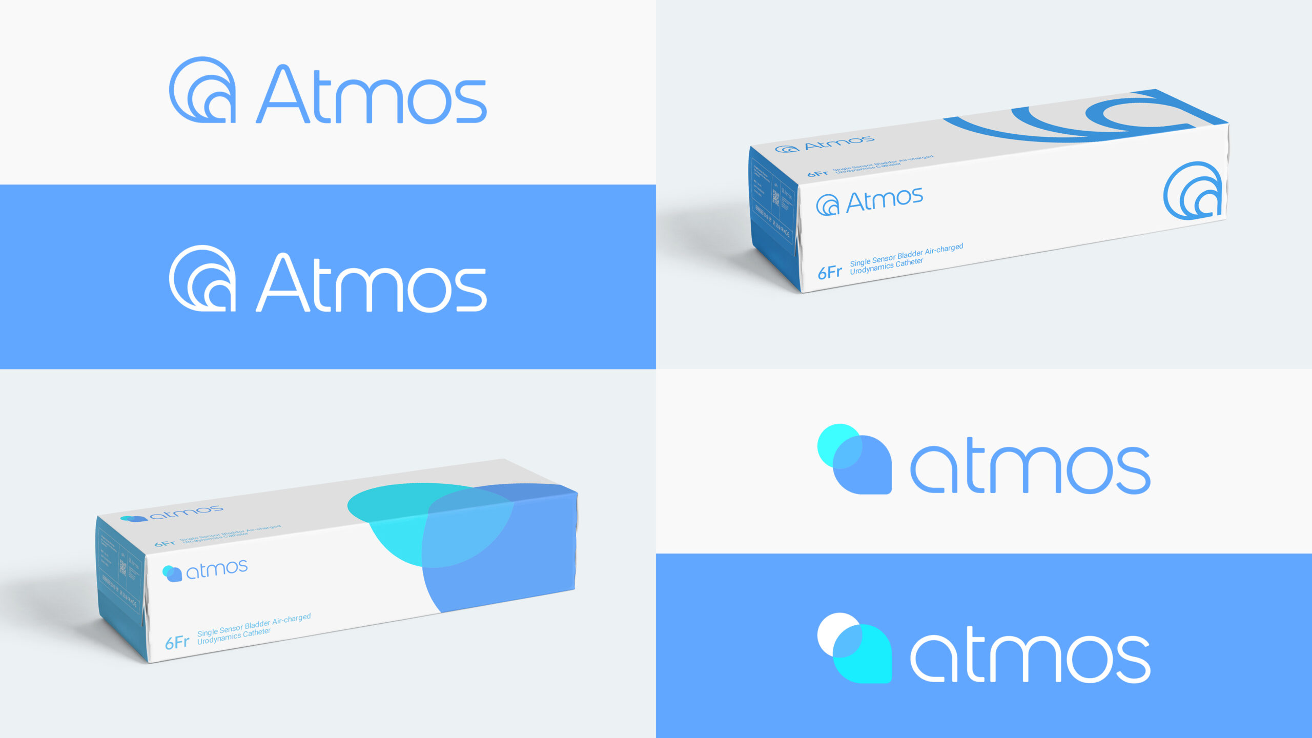
We came back to the Gemini team with two new options. For this round, logos were given colour and applied to collateral items to show how the logo could look in the real world.
Concept 4 kept many of the same elements that the Gemini team enjoyed but opted for a different icon/symbol with it. This symbol dives deeper into the concept of the atmospheric layers of the Earth while preserving the visual representation of catheters.
Concept 5 took a different approach opting to return to the all-lowercase look while incorporating its own unique symbol and two-toned colour scheme.
The final decision
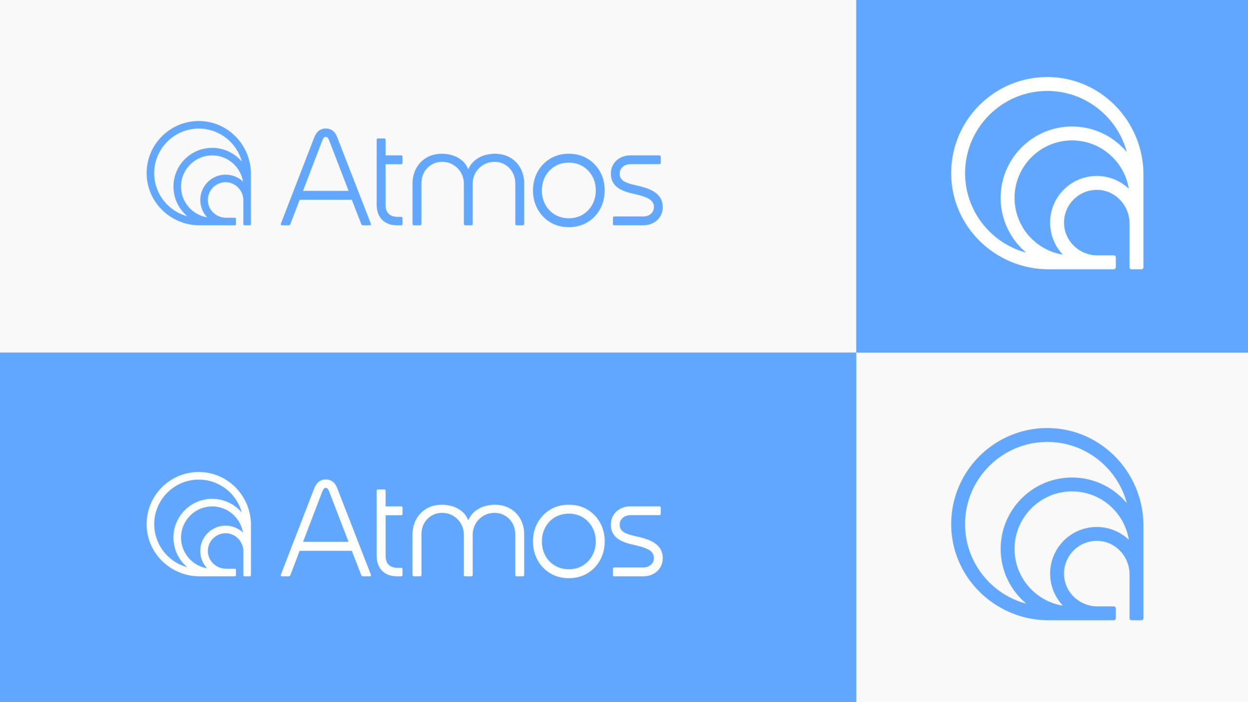
After deliberation, Concept 4 was chosen as the final version of the Atmos logo. The combination of the azure colour, soft and rounded shapes, and the associated atmospheric icon communicates the story of their comfortable air-charged catheters.
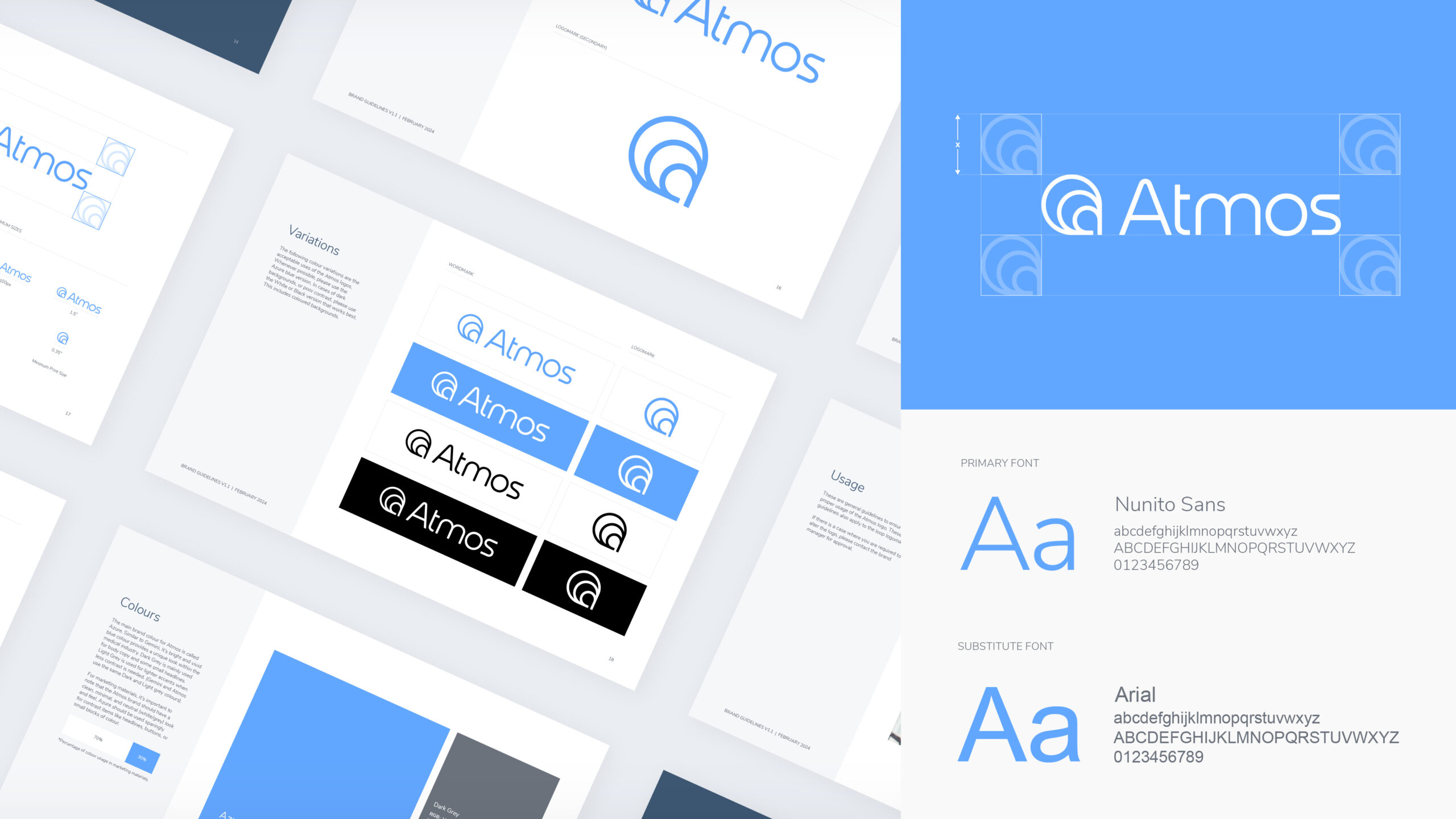
Brand guidelines
So you have a new logo, new colours, new fonts, and you’re not sure how to use everything? No problem. Customary with any Stryve logo design, the Gemini team received a Brand Guidelines deck with instructions and tips on how to (and how to not) use these new brand elements. Ranging from logo positioning to typography, everything you need to know is spelled out.
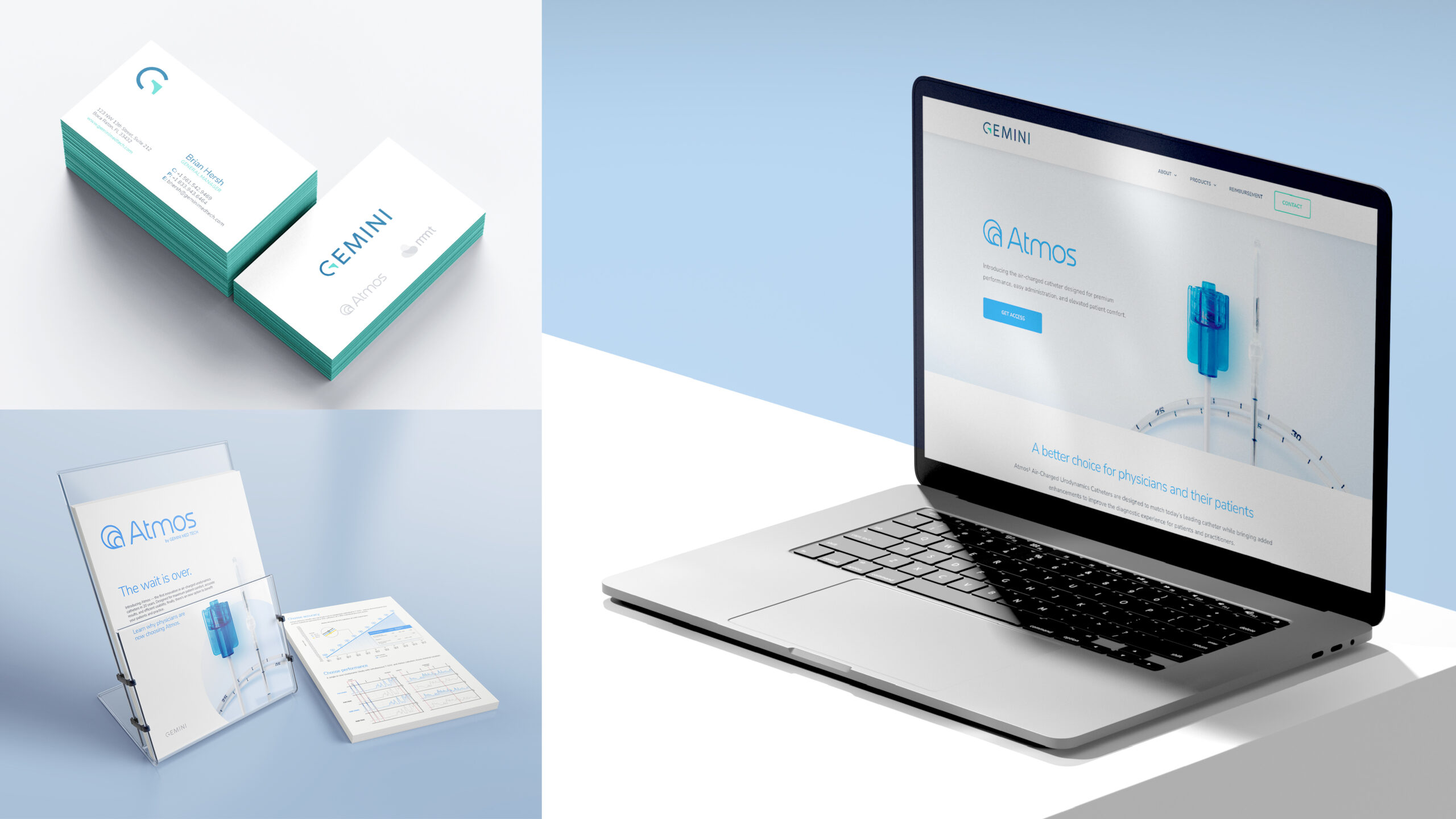
Collateral
With the above guidelines in place, Gemini was eager to bring this new brand to life with some collateral items. These items included two-sided sales sheets (available in print or digital), new and improved business cards, and cutting-edge visuals on the recently launched Gemini website.
Testimonial
From Katie Gallagher, Director of Marketing at Gemini:
“The final branding they delivered was nothing short of outstanding. They created a cohesive visual identity that seamlessly translates across multiple touchpoints, from our website and marketing materials to our social media presence. The new branding feels fresh, modern, and perfectly aligned with who we are as a company.
I highly recommend Stryve Digital Marketing to businesses seeking a strategic and creative branding partner. Their expertise and guidance have been invaluable in elevating our brand and boosting our market presence.”