

DigitalEd: Redesigning a leading STEM education platform’s website
Project Background : The COVID pandemic forced companies all over the globe to shift their businesses to adapt to a remote-first model. For educational institutions, this meant rapidly pivoting to online learning. For companies like DigitalEd, a provider of online educational solutions and digital content, this represented massive opportunity, but with it, new competition. Looking to separate themselves from the increasingly crowded digital learning landscape, DigitalEd partnered with Stryve to design a new modern website.
The Mission: DigitalEd wanted to be viewed as a leading voice in the digital education space. This meant elevating the brand in the minds of existing and prospective customers, partners, and employees.
The Outcome : A clean and modern WordPress-based website that promotes DigitalEd's content, services, and expertise.
The Impact:
- An easy-to-use and maintain WordPress website that drastically reduces the time needed for website updates.
- A more engaging and intuitive discovery process ideal for prospective customers, partners, and employees.
- An increase in time-on-page, demo signups, and overall site engagement.
- Elevated visual brand elements that can be leveraged in sales and marketing collateral.
The starting point
DigitalEd’s website was originally built on a headless CMS that was hard to use and lacked the widespread support and plugin library of popular CMSs like WordPress. Additionally, it had been designed by a team of product engineers whose goals for messaging and functionality were not aligned with marketing’s. As the website evolved, complex code and conflicting management led to broken links and outdated content. To position themselves as an industry leader, they needed a new website that looked good, functioned well, and was easy for their marketing team to update as their business evolved.
Structure and navigation
Starting with the website’s navigation, simplicity was the name of the game. The DigitalEd team wanted a straightforward menu that provided the user with the most sought-after information and allowed for curiosity and exploration.
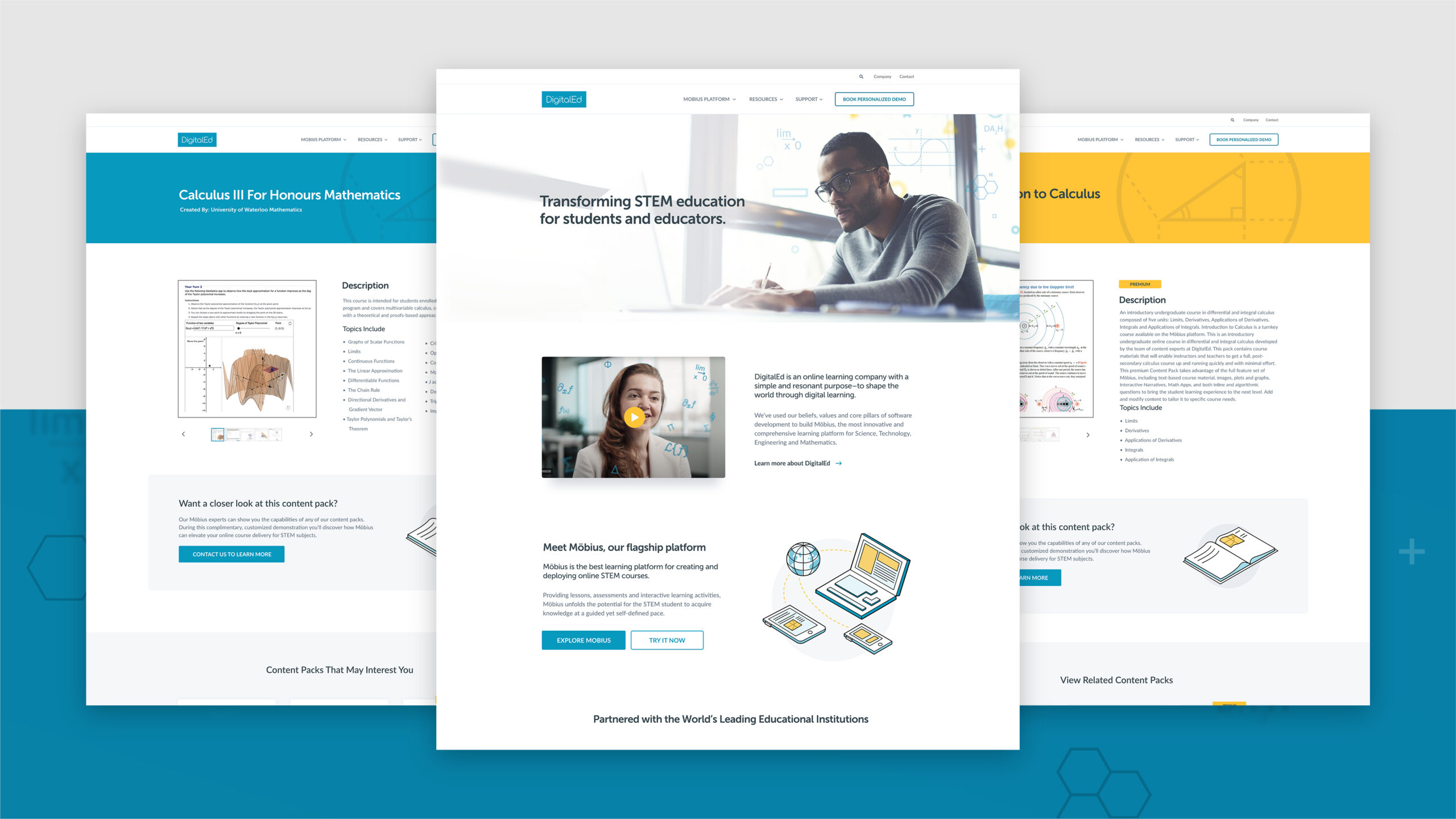
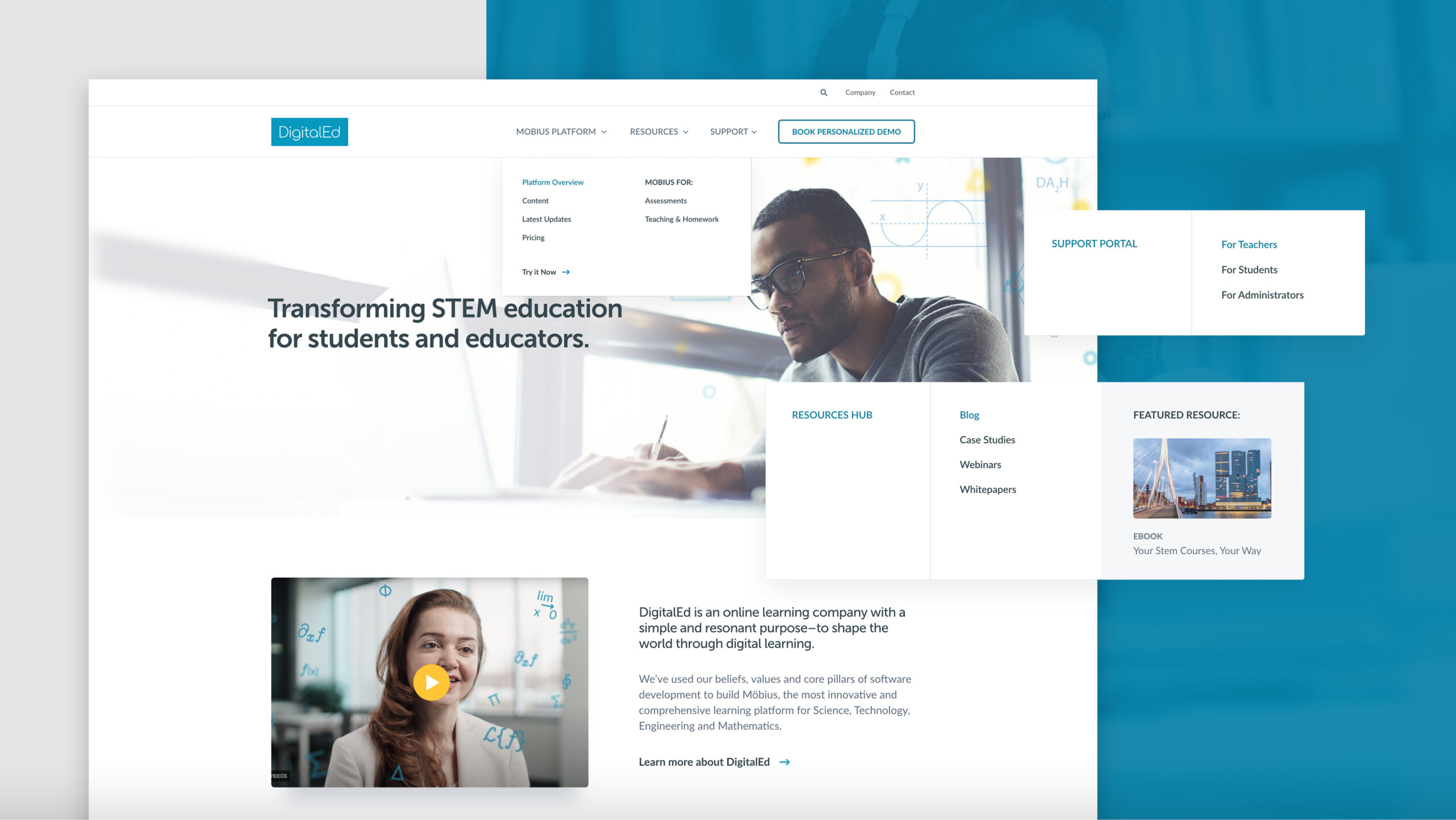
We worked collaboratively with the DigitalEd team to better understand the buyer’s journey. Ultimately, we arrived at the menu below. With more of an emphasis on their resources, products, and content catalogue, we prioritized these items, while standard pages like Company and Careers remained in the eyebrow nav and footer.
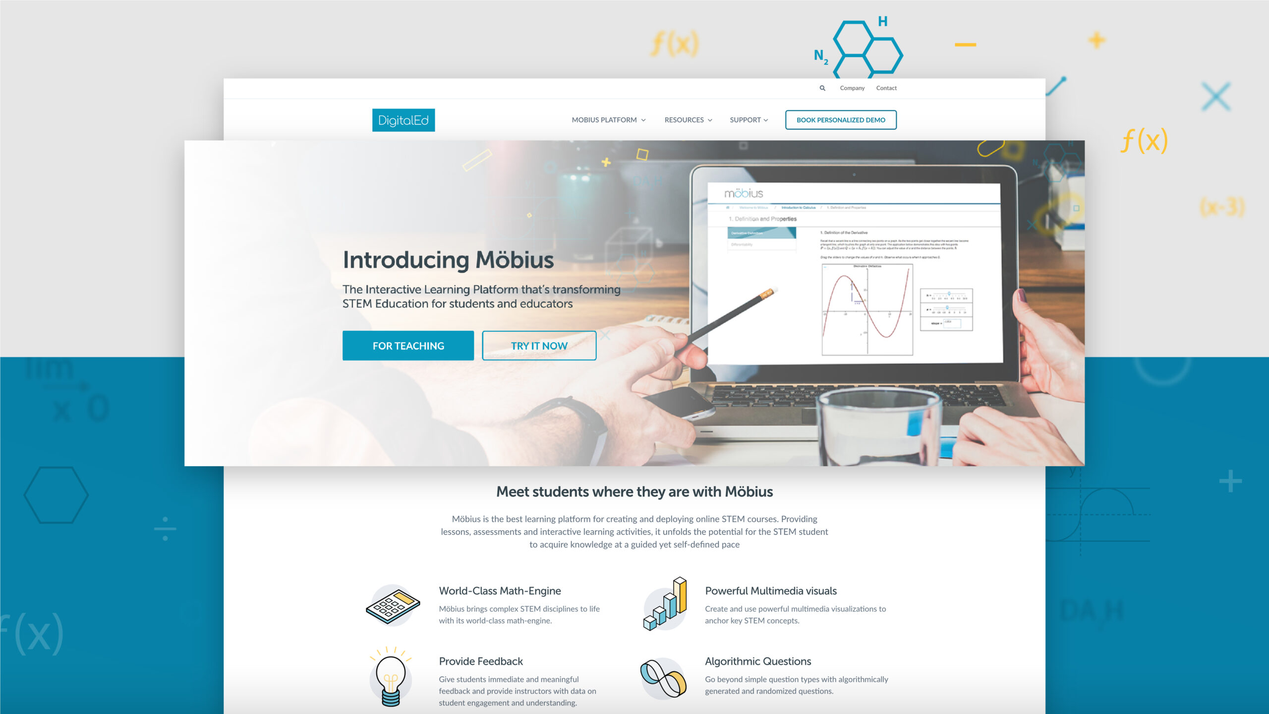
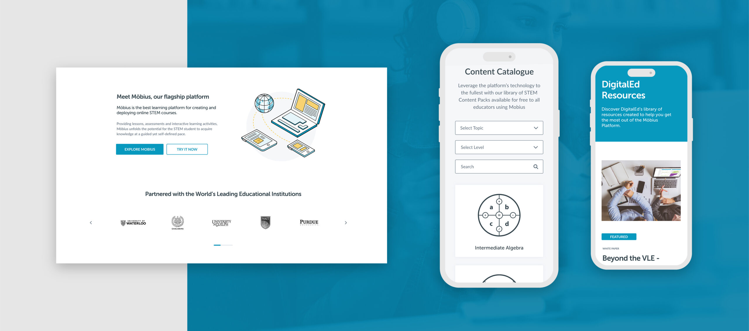
One of the most significant changes made to the navigation was changing the call-to-action from ‘Try it Now’ to ‘Book a Personalized Demo’. Before, the ‘Try it Now’ page hosted an embedded web version of their product, Möbius, without context or further steps in the user journey. It was a dead end. After, this page became the CTA on Möbius product pages, which then led to the ‘Book a Demo’ page, providing a much better flow to the user journey.
The characteristics of modern design
When it came to discussions around the existing website design, members of the DigitalEd team weren’t shy about discussing its shortcomings.
“It’s static. It lacks emotion. There’s no cohesion.”
It was clear the existing website’s design and functionality were holding the team back. The frustration felt towards their existing website, however, quickly turned to optimism when talking about what this future version of this site could be. In those discussions, four words continuously came up and quickly became the guiding light for this website and online experience as a whole: clean, simple, interactive, and human.
Keeping it clean and simple
The site needed brightening up. By working with brighter colours and simpler layouts the site instantly became more approachable, professional, and competent. Brightness, paired with a modern and sleek design helped reduce the feeling of congestion which is important in website flow. By featuring plenty of white space, easy-to-read fonts, and breathing room between sections, the user is encouraged to explore and navigate how they want to. The new website features a minimalist colour scheme which also played a role in brightening up the site adding small pops of colour to complement the DigitalEd brand blue.
An example of this is the use of ‘math confetti’ used throughout the site (pictured below). The use of STEM symbols and iconography was an easy way to brighten up previously dark and heavy photos/ banners, inject some new brand colours, and add a layer of visual interest.
Building interactivity
DigitalEd’s existing website was seen as shallow and static by their team. Engaging the audience and enhancing the user experience was important for coming off as more legitimate and gaining new demo sign-ups. To do this, engaging content that was previously buried, was brought to the forefront and featured in some of the most visited places on the website. Hover effects, animation, and video were all used throughout the site to make it feel more alive and more engaging. Subtle movements, colour changes, and interactive content all help keep the user’s attention and encourage further exploration.
One key area we focused on engagement was the content section. We wanted the user’s first experience with Möbius, DigitalEd’s learning platform, to be compelling. Crisp visuals, visually interesting carousels, and dynamic content help give the user an idea of what the experience would be like for themselves or their students. Interactivity drives interest. Interest drives demos. Demos drive conversions.
Humanizing the experience
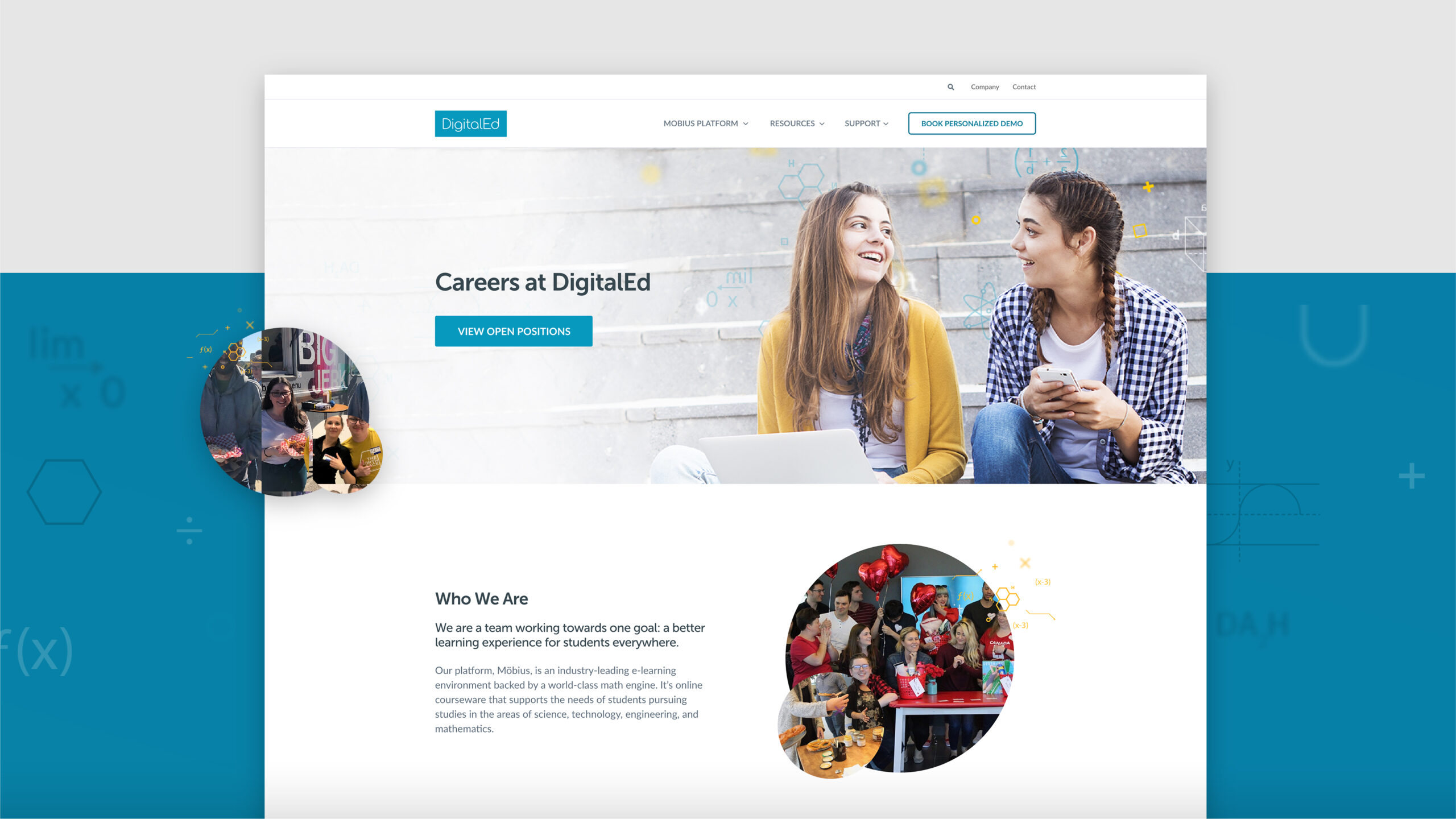
To inject emotion into the site, the focus was placed on photography and company culture. The existing site was extremely tech-heavy with static animations and photos of the product, rather than capturing what’s at the core of the business—the people. This is why you’ll find candid photography throughout the site, which not only humanizes the brand but makes it feel more approachable and authentic. Company pages such as ‘Careers’ and ‘About Us’ were enriched and expanded to give people a behind-the-curtain look at what it’s like to work for and with DigitalEd. By highlighting their people, their story, and the company values, it’s easy to understand who they are, what they stand for, and what it would be like to be in business with them.
Reasons to believe
DigitalEd wanted to be seen as a leading voice in the digital education industry and while a modern-looking website can help with that, prospective customers, partners, and employees need reasons to believe that claim. With countless companies entering the space, the website needed to show why DigitalEd was the clear choice. This was accomplished in three key ways:
- Highlighting global partnerships and testimonials – this type of social proof can go a long way in establishing trust with your audience. Highlighting key educational institutions and their experience with the product adds a heightened level of legitimacy to the company. If you’re partners with some of the most prestigious Universities in the world, why not show that off?
- Calling out leadership experience and thought leadership – unlike the dime-a-dozen online learning brands, the DigitalEd leadership team has decades of experience in the field. The About Us page features key members of the organization with a direct link to their LinkedIn profiles for those looking to ‘check the resumé”. You know exactly who’s in charge and their vast experience. You can also head over to the new-look Resource Hub to browse case studies, ebooks, blogs, and webinars to stay up to date on the latest innovations in online learning. These resources not only add significant value to anyone in the online learning community, but they also highlight expertise and thought leadership in the space. This goes a long way to prove they don’t just talk the talk, they truly walk the walk.
- Showing off a refreshed content catalogue – at the end of the day, DigitalEd wants its audience to try its product. That’s why re-imagining the content catalog experience was so important. Users can now experience what it would be like to use the online platform, without the commitment of purchase. With the ability to explore over 100 topics/courses, answer sample questions, engage with sample activities, and learn about course breakdowns, the user can explore at their own pace.
The impact
At the outset of this project, we wanted to make life easier for DigitalEd and its users. This meant making the website:
- Easy to use: from navigation to design, the user experience now has a natural and exploratory flow. Whether it’s your first time on the site or your 100th, it’s easy to find the information you’re looking for. This is not a tangle of content that the user has to unravel, the website gives the user what they want, when they want it, and how they want it.
- Easy to understand: the content, the storytelling, and the buyer journey are now clear. This website has many different audiences with different agendas. It was important to speak to all audiences in simple and clear language that anyone could understand and see value in.
- Easy to maintain: a massive pain point for the DigitalEd team was their inability to easily update and make changes on the fly. The new site offers built-in flexibility with a custom and easy-to-use WordPress back end. With custom and re-usable modules, creating pages, updating copy, and swapping out photos is a breeze. Don’t believe us, here’s what Siobhan Paul, Director of Global Marketing at DigitalEd had to say about the process:
Thank you all for the work you did on our site! It looks fantastic, flows well, and is much easier to work with than our old system. We’ve been able to produce and update pages quickly and easily now that we don’t have to code everything. WordPress is a hit; we even have volunteers to create new content and pages—a huge win. We appreciated that you kept us on track, were patient, and we learned much as a team.
Since its launch, the new website has helped elevate DigitalEd’s online presence. Overall, it has led to increased site engagement, and demo signups, and has become a critical marketing tool for the business.