

Rebranding Emtek as a modern industry leader
The manufacturing industry is vital to Canada’s prosperity. Accounting for over 10% of the country’s total GDP, Canada needs innovative companies to keep pace with global standards and drive the industry forward.
Recognizing this need for innovation in the component manufacturing space, Emtek Processed Alloys called on Stryve to revamp their brand identity and position them at the forefront of modernization. Having opened a new state-of-the-art headquarters in 2019, Stryve was tasked with redesigning the brand and website to reflect this milestone and frame Emtek as a progressive forward-thinking leader in a tired industry.
Through this case study, you’ll learn:
- How we communicated modern and progressive themes through the design of Emtek’s new logo and branding.
- How we rebuilt the website's layout, navigation, and content flow to improve the user experience and brand image.
- What we implemented to set Emtek up for future success post-launch.
- How we’ve continued to support Emtek with content, campaigns, and other tactics.
Designing a modern logo to separate Emtek from its competitors
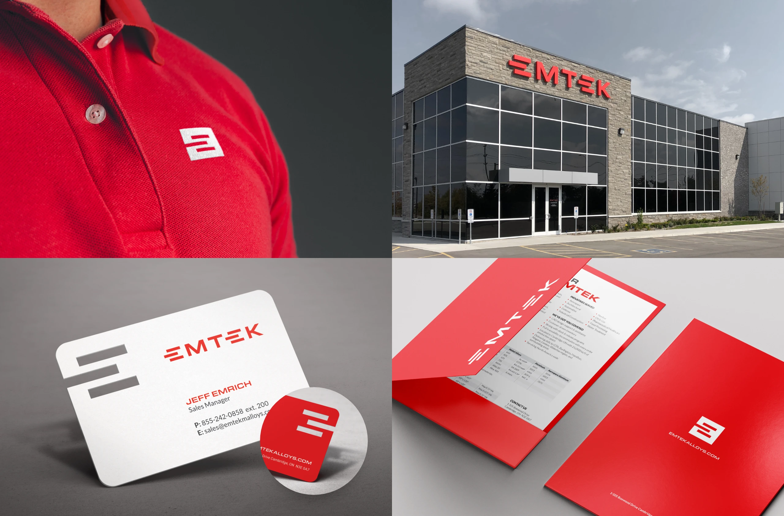
With their original logo calling out just two key services, Emtek needed a new logo to represent their expanding capabilities. With ongoing investments in new technology, they needed a flexible design to represent what they do today and what they’ll do years from now. Furthermore, with a drive to plant their flag on the leading edge of their industry, Emtek required a modern design to stand out amongst others in manufacturing.
First, Stryve introduced a new colour palette. Using red—an attention-grabbing, lightweight, high-energy colour—we moved away from the heavy blues and greys typically associated with metalwork. In pairing red with dark grey and white, Emtek looks almost like a tech company–fast and sleek compared to the slow and bulky brands of their competitors.
While the colour is a departure from what one may associate with manufacturing, the bold box-based text pushes a sense of stability and strength. To address what Emtek does at a high level—cutting and processing for manufacturing—we cut three rectangular segments from a red square and used those segments to build the letter E in the wordmark.
This concept was then applied to the business card, in which the letter E is actually cut from the card. With Emtek sales representatives engaging potential customers at trade shows, this smart and stylized card, along with redesigned collateral, makes for a strong and memorable touchpoint that further separates Emtek from the pack.
It’s easier with Emtek
“It’s easier with Emtek” isn’t just the headline we penned for the homepage. It also served as our mantra for design, content, and the overall user experience as we built the new website.
As with the logo, we moved away from blue and orange and applied our new colour palette. Using red to draw attention to interactive components, we used dark grey text on white backgrounds to offer clear readability. While the previous site used bulky shapes, complex scrolling, and metal textures to communicate Emtek’s capabilities, the new site takes a more minimal approach, with a sleek design that puts text and imagery in position to tell the story without distraction. With subtle nods to AutoCad flowing from branded collateral through to the website’s CTA banners, the clean aesthetic lends itself to the modern idea of manufacturing, where refined, state-of-the-art technology has replaced loud grinding cogs and manual practices.
A key element to telling the Emtek story is the homepage banner video. Opening with an exterior shot of Emtek’s new facility, the footage takes the user through the front doors to show their advanced technology in action.
User Experience & Content
From a technical perspective, the previous website was in need of restructuring. Not only did it lack an intuitive layout, but it also lacked the responsive cross-device usability expected of modern websites. By establishing a more refined design, we were better positioned to make the site responsive, reorganizing components for a quality experience for mobile, tablet, and desktop users.
Establishing a more intuitive navigation and content structure was critical to the cross-device experience as well. Entering the site, users are now drawn to two options: start your project and learn more. While the former leads to a conversion form, the latter brings users to a brief description of Emtek and a high-level view of specialty services. Toggling through the icon menu, users can quickly learn more about their service of choice by scanning the benefits, features, and technology associated with each. As users reach the bottom of the service funnel, they’re again presented with an opportunity to start a project. This time, a project tied to their indicated service of interest.
While the new site appears to have less text than the previous one, it actually has more. Because of how the pages are structured and tied together, we were able to include more information on services, technology, and other key items, without the same text-heavy aesthetic as the previous site. While this contributes to a boost in SEO, it also results in a more accessible and engaging content experience—one where users can quickly find what they’re looking for and leave with a better understanding of it.
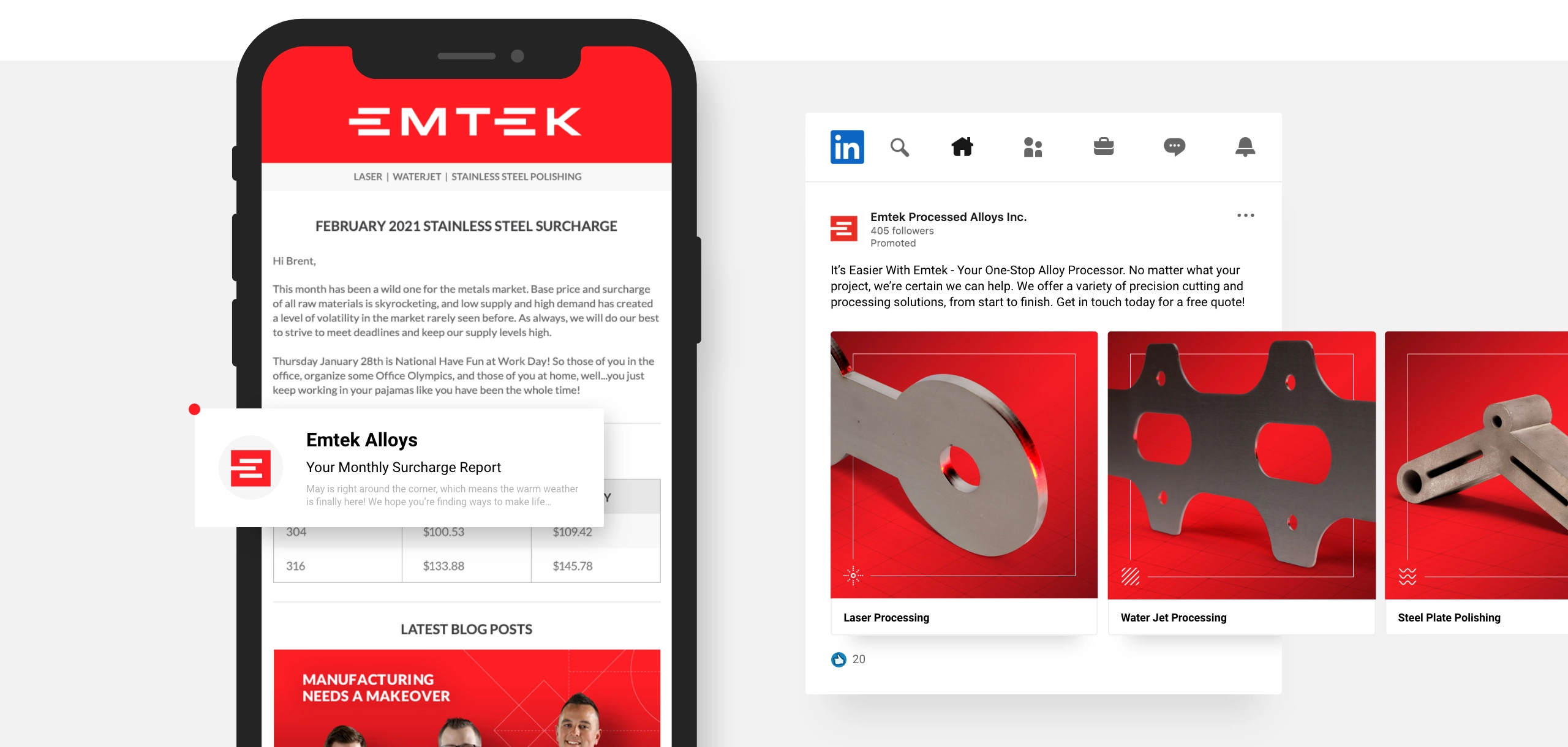
Ongoing work with Emtek
After launching the website, we extended the redesign to additional digital touchpoints including email templates and social profiles. We drew attention to these touchpoints with lead generation campaigns set up with imagery, custom-targeted audiences, and strategic keywords that Emtek can recycle for future campaigns.
To help Emtek get started, Stryve conducted content interviews to facilitate the writing and publishing of three articles. Each of which circles back to reinforce Emtek’s position as a progressive forward-thinking leader in a tired industry.