Creating modern, digital-friendly branding for Zehr
Zehr is a prominent real-estate developer and construction company based in Kitchener-Waterloo. Their strong focus on partnerships throughout the process results in beautiful and functional new buildings and restorations.
The Challenge
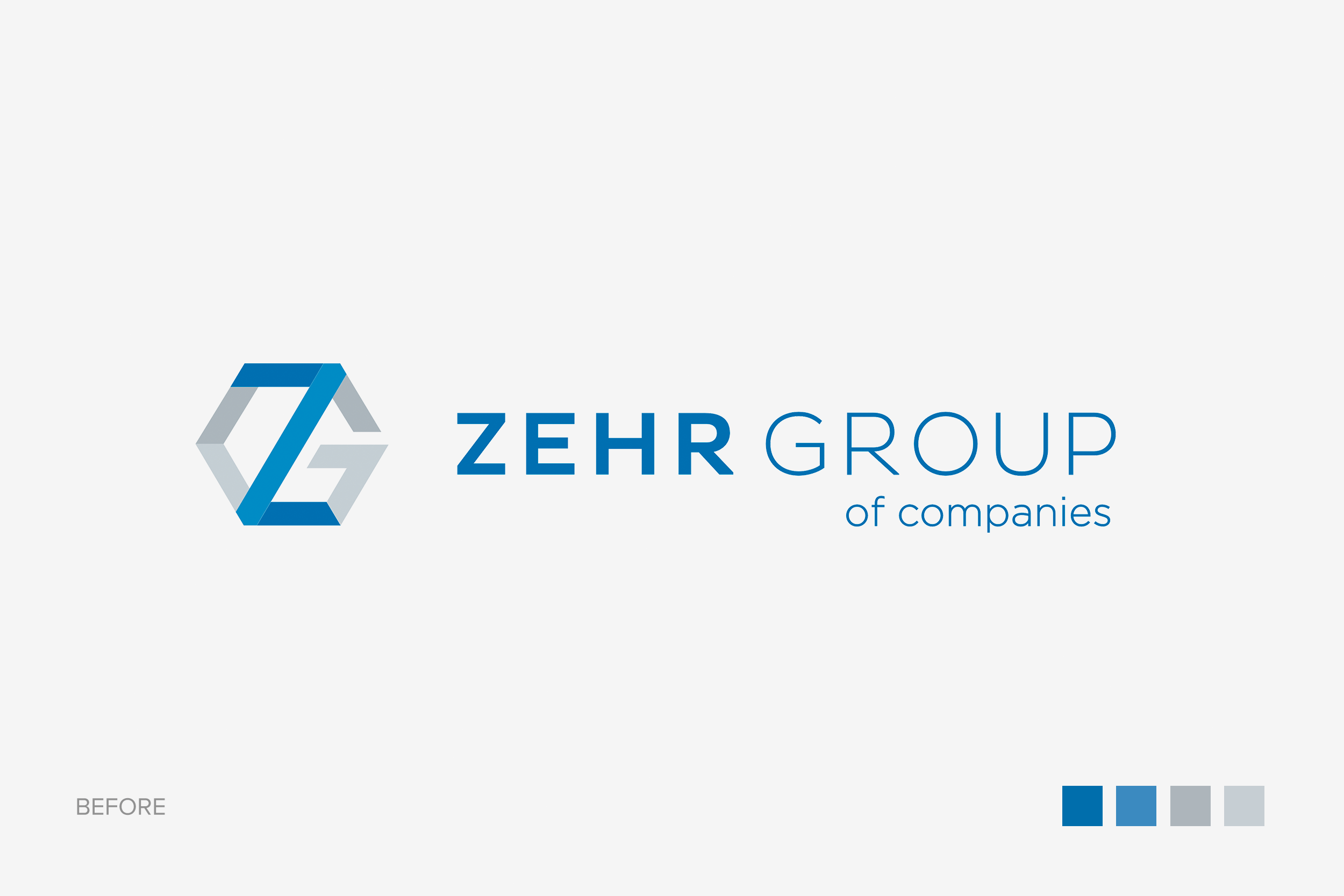
Zehr’s previous logo had many colours in it. They found it difficult to translate the design to non-digital touchpoints. For example, embroidery on clothing was particularly expensive. Zehr was looking to simplify their visual identity and represent their brand with something bold.
At the same time, Zehr was working with a consultant to solidify the company’s mission and vision. The new brand identity needed to reinforce this work.
The Work
Stryve started by surveying members of the Zehr team to further understand what their brand represents and what differentiates them from the competition. We learned that they wanted a brand that was strong, vibrant, and represented their roots in the Kitchener-Waterloo tech community. We gathered information from their mission and vision work.
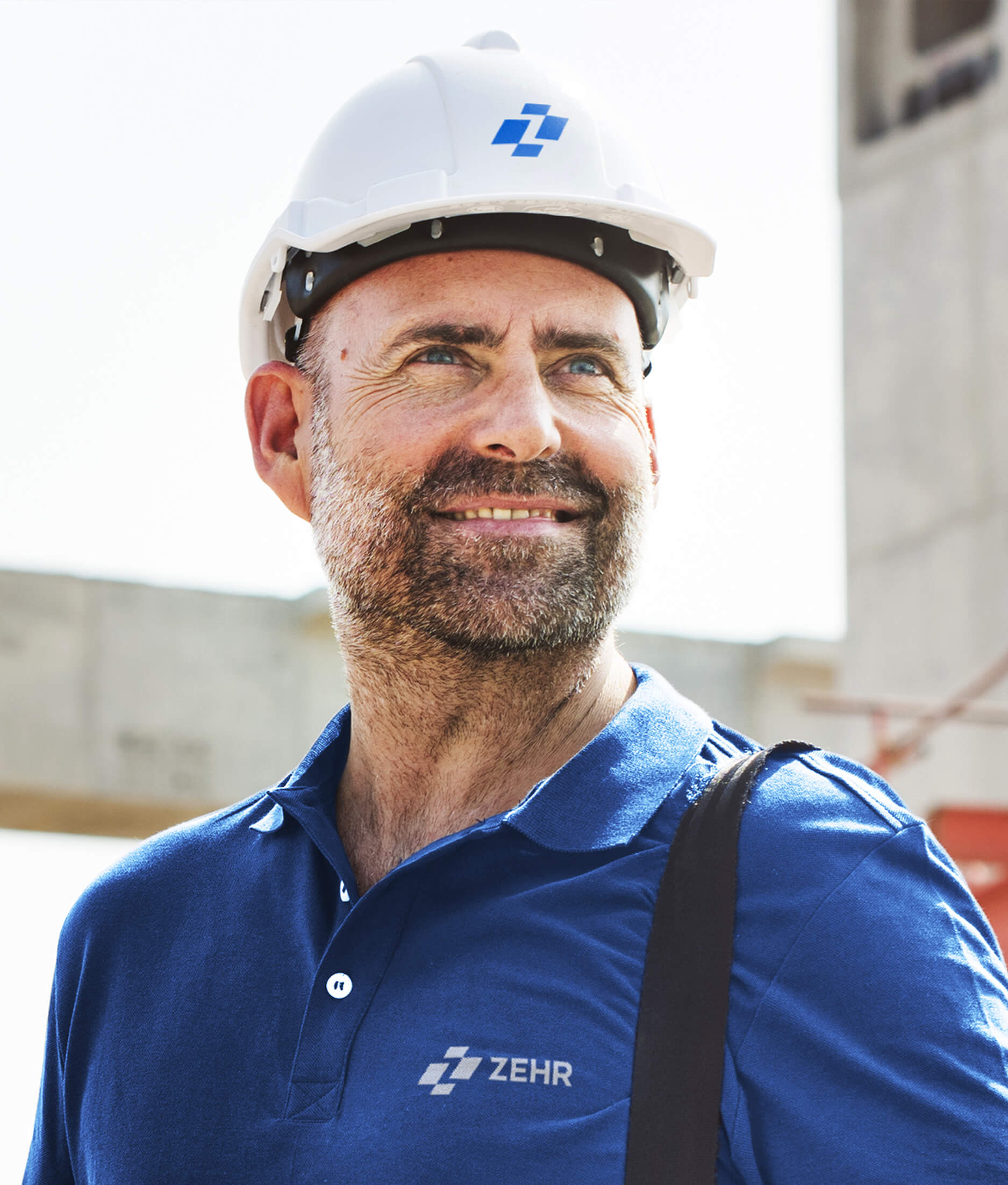
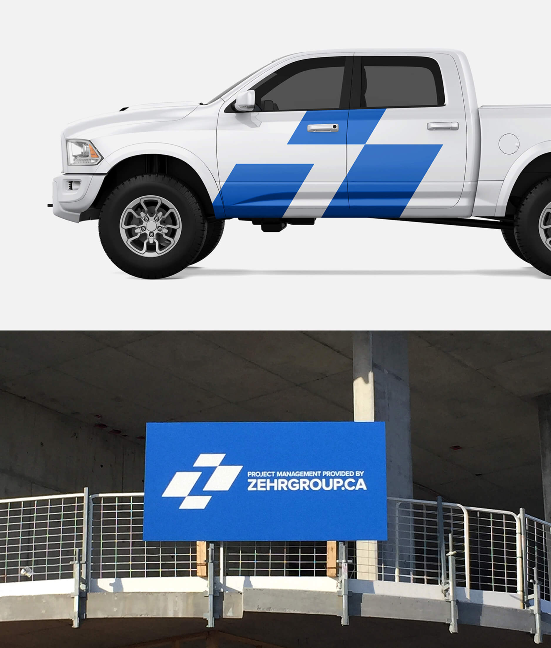
A few concepts were presented to bring out the letter Z and a feeling of blueprints or a city. Each concept was shown mocked up on various non-digital touchpoints so that Zehr could see how it works on trucks, clothing, documents, and signage.
The Results
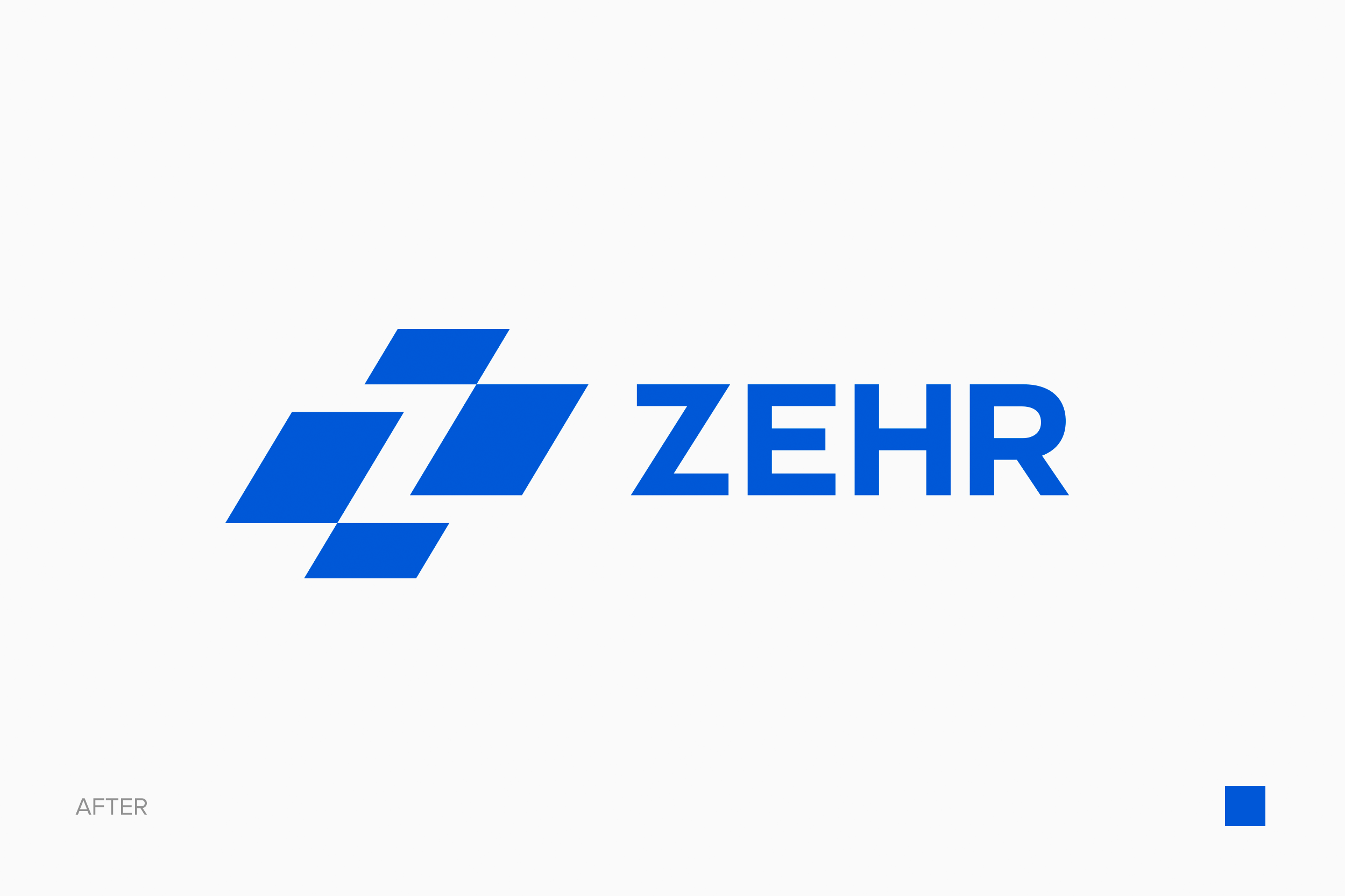
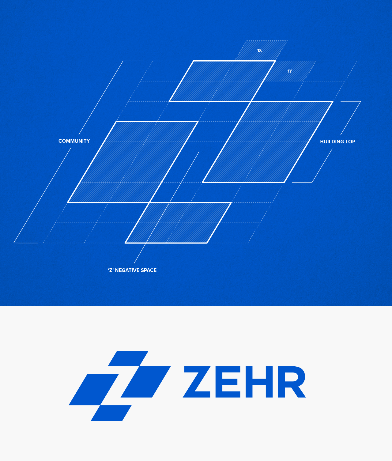
Zehr’s new logo is significantly more vibrant and modern. The negative space creates a Z, while the blocks are of an aerial view of a city block. The large, angled shapes give the logo a feeling of momentum and strength, which are both true of the company. The shapes and angles of the logo have been carried out through many of Zehr’s marketing touchpoints to create a strong visual identity.
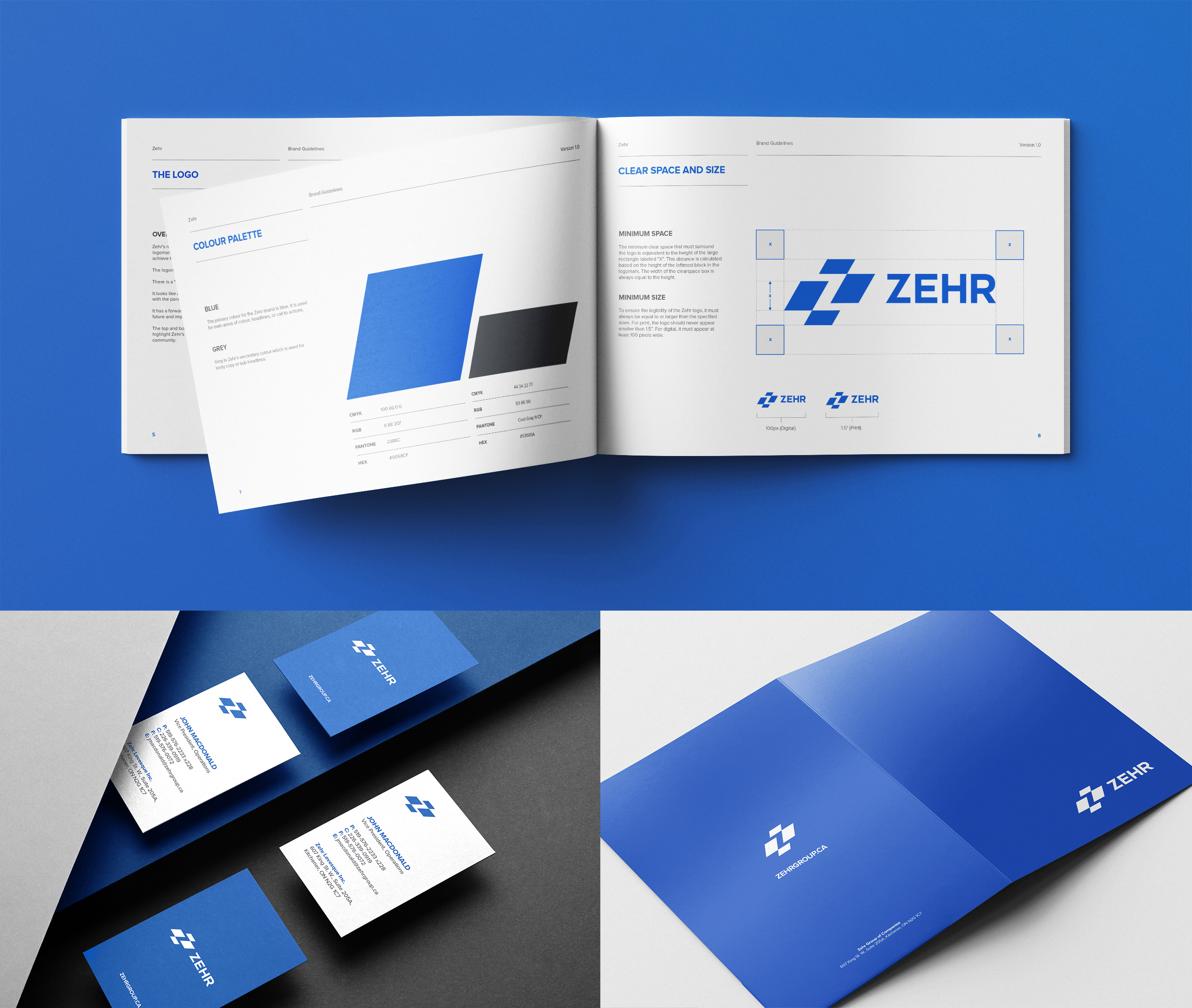
When it came to creating marketing materials for Zehr’s new brand, utilizing their new bold blue was important for brand recognition for each of their touch points. Additionally, a brand guidelines document was created to maintain the integrity of the Zehr brand both internally and externally facing.
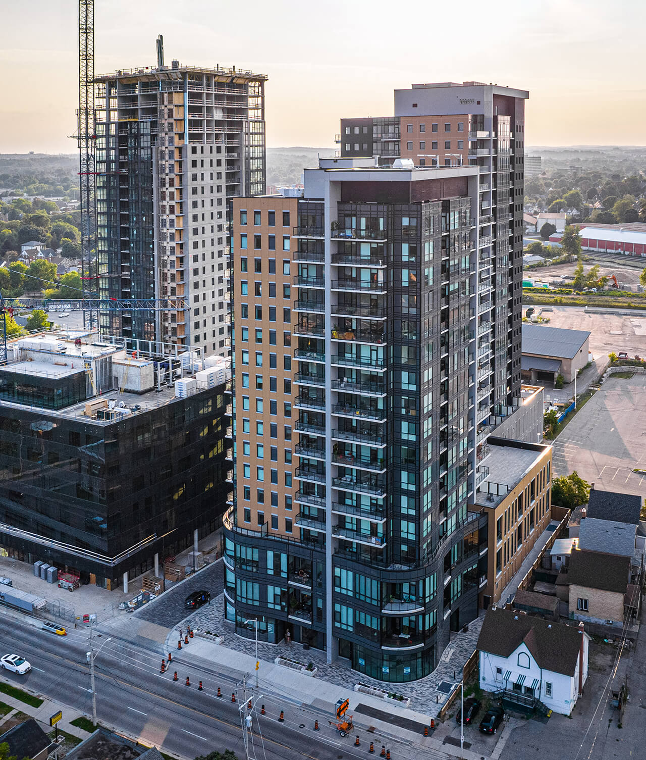
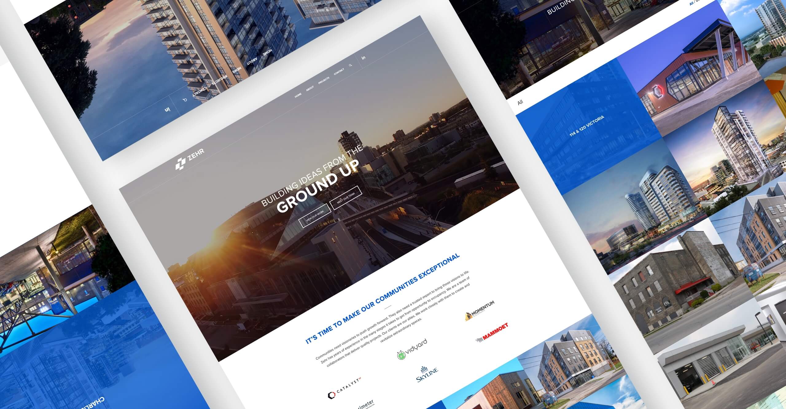
Zehr’s attention to detail is visually apparent in their projects, both concept and finished. Utilizing their photography as the main hero, their new site captures the quality and diverse number of projects Zehr has been a part of.
