

Building a better content experience
Content plays an important role in lead generation. It contributes to SEO, it gives you ammunition for social media, and it proves your level of knowledge and capability.
That's why we've always invested in content production. At Stryve, everybody writes. We publish great content every week and it generates the lion's share of our online traffic. The problem? We were so focused on the contents of our blog that we lost sight of our blog itself. Over time the design and layout became generic and outdated. The chronological feed and shallow structure led to important content getting buried and lost. As a result, our blog failed to reflect the standard and creativity of not only our content but our agency as a whole.
We could do so much better. So, we transformed our blog into a content hub.
Through this case study, you’ll learn:
- How the new layout has extended the shelf life of our content and increased page views by 172%.
- How we raised the time on site by 377% through designing for engagement.
- How we've used our content hub to both showcase the abilities of our design team and separate Stryve from competitors.
- How a content hub impacts both SEO and lead generation.
Extending the shelf life of our content
Looking at our old blog, you would never guess just how much content we’ve produced. Having published a blog each week for almost a decade, the structure of our blog–the standard chronological grid used by most companies–was working against us.
Like Google Search results, the chronological grid does nothing to entice the user to scroll. Instead, users click through the first few rows and everything else gets buried. While marketing moves quickly, guides to better copywriting, campaigning, and strategy are timeless and show a level of expertise that’s essential to not only our audience but our own business development.
We needed a new design to expand the spotlight on more than just a few recent posts.
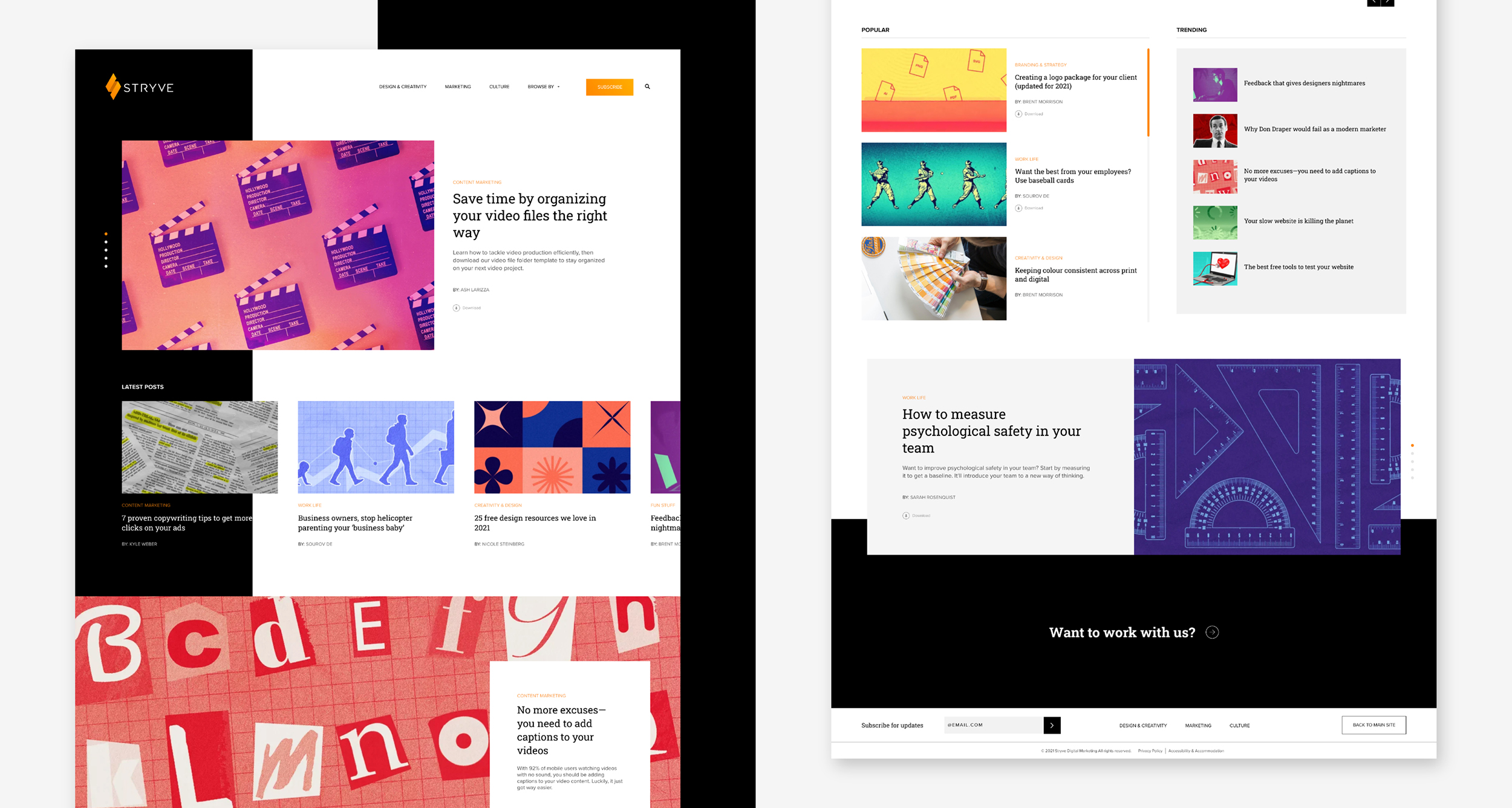
To do this, we broke the front page of our content hub into different sections defined by what’s recent, what’s the most popular, and what’s trending–the latter allowing us to curate articles based on what’s going on in our industry, in pop culture, or in world news. With each section having its own unique design, our new layout entices the user to scroll by implying novelty below the fold. Beyond that, each of these sections are scrollable, allowing us to present even more content on the front page. All these elements come together to ensure our homepage curation is different from day to day, giving users more incentive to visit again.
As our content library grew over the years, so did our list of categories and tags. Having more options is great for a lot of things, but user experience isn’t one of them. You want to dictate as much of the user’s path as possible to limit any decision paralysis and keep them from getting lost. With so many categories, articles became harder to find.
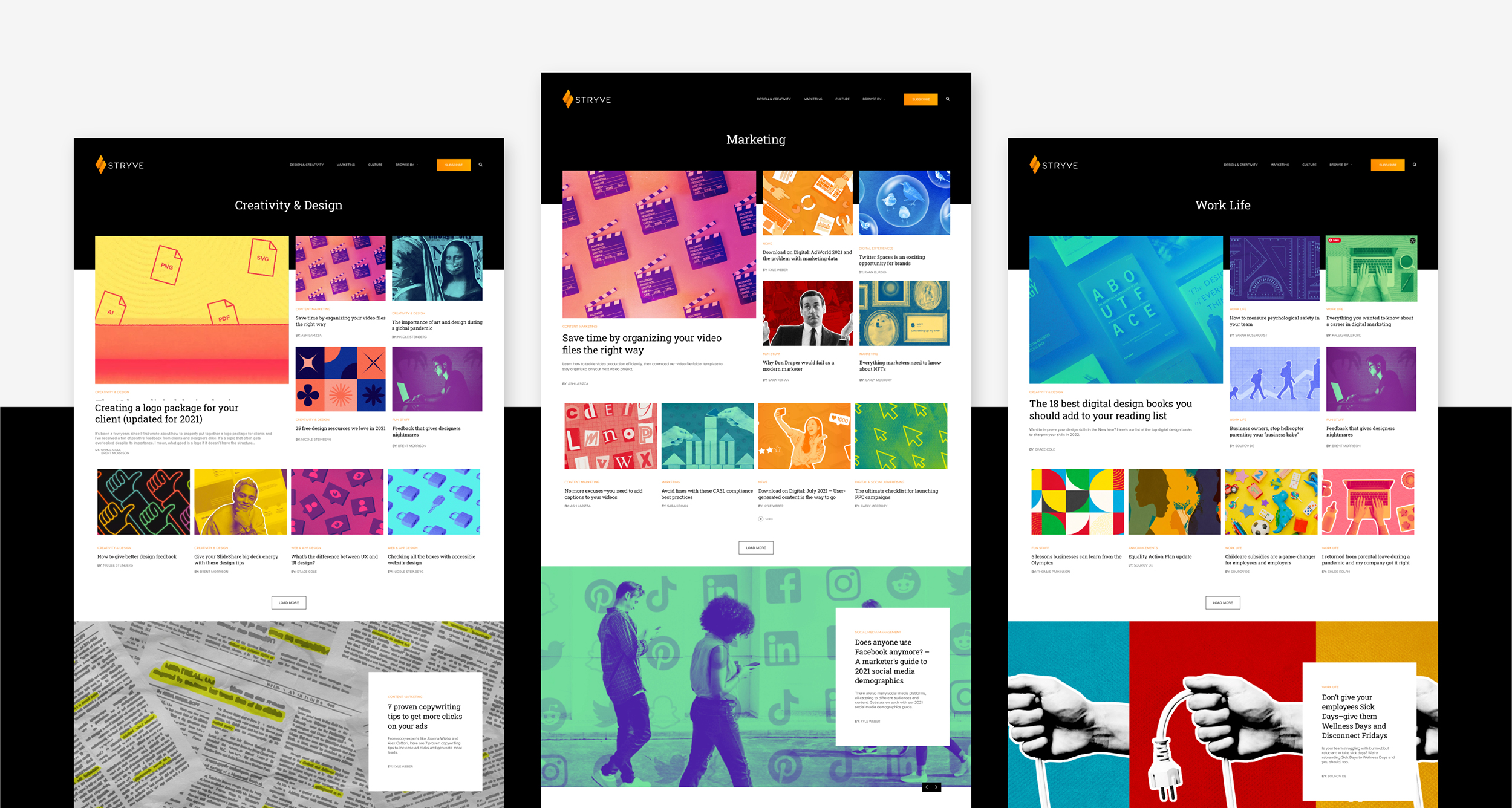
To fix this, we highlighted three categories in our navigation that not only covered the bulk of our content but reflected the main focuses of Stryve as an organization–design & creativity, marketing, and culture. These categories also reflected the main segments of our audience. With designers less interested in our marketing content and vice versa, we framed each category page as a homepage in itself, applying the same structure and design as the homepage.
By making these changes, we’ve increased the traffic to our category pages by 743% while our article views have increased by 172%.
Designing for engagement
Let’s be honest, most marketing content is dry. It’s overly technical, it’s too buttoned-up, and it’s something you read out of necessity. We wanted to change that by letting the personalities of our authors rise to the surface. We inject humour, pop culture, and other elements into our writing to engage the reader.
But this is only a half measure. We needed the design of our content hub to follow suit.
To make for a more dynamic experience we opted for a design that looks and behaves more like an app than a blog. With some sections navigable with horizontal swipes, images extending off-screen, and micro-animations on hovers and clicks, we’ve broken our blog out of its previously rigid frame by adding a creative flair to typically unremarkable elements and interactions. Here, we wanted to show that creative design can be subtle. It should elevate the content, not distract from it.
As marketers, we know users are short on time and attention. To account for this, we built out modules for downloadable content, slideshows, and other features to not only draw attention to key points, but to break apart long runs of text for a more inviting read.
Lastly, we’ve added related posts that automatically populate based on tags matching across our archive. This not only surfaces old posts, but it invites users to continue down their chosen thread.
Altogether, these efforts have helped raise the total time spent on our blog by 377% while lowering the bounce rate by 25%.
Showcasing our design as a differentiator
Perhaps the most noticeable departure from a traditional marketing blog is the imagery. With each blog image custom-made by our design team, the fun and colourful aesthetic allows our content to stand out amongst the stock images that dominate the social feeds of our audience. Furthermore, these eye-catching images entice users to click on social platforms or Google Discover–which calls for creators to use their own original imagery.
The designers at Stryve use the blog images to push the creative boundaries past that of a typical B2B client. We have the mantra, “No more boring B2B marketing,” but it’s our responsibility to show clients what that can look like by practicing what we preach. In fact, many of the creative interactions and animations used on our content hub are ideas we’d never had the chance to try. Some ideas we mocked up weren’t even possible. This demonstrates how we’re using the content hub as a lab where we can freely experiment with new ideas before pitching them to our clients.
How content plays a role in lead generation
With our content archive being the largest contributor to SEO while also generating the majority of our website traffic, the content hub plays a critical role in lead generation. As we’ve done with our updated content hub, brands should organize their content into categories reflective of their services then drive users to those service pages through content channels. To do this, each of our blogs concludes with a custom-tailored CTA that drives traffic to an applicable service page or contact form. As a result, each article is a pitch–we prove our understanding and demonstrate our value before prompting the reader to consider how that value could elevate their business.
With this in mind, we’ve stepped up the tracking on our content hub to get a better understanding of the topics users are most interested in. We track video views, button clicks, downloads, and more. This not only tells us what users are interested in but helps to identify gaps in our archive.
While many organizations fail to see the value in content production, we’ve gone the other way. It’s not a “nice to have”, it’s a difference-maker. So we’ve treated it like one. We’ve approached and presented our content hub as a second website and for most of our traffic, it’s their first impression of Stryve.
With the positive results we’ve seen over the last year, it’s been well worth the investment.