

Tri-Mach: Modernizing a manufacturing giant’s website
Your website is often your first opportunity to show who you are and what you're capable of. If your company is modern, innovative, and cutting-edge, your website should reflect that. And that's precisely why Tri-Mach Group contacted us to redesign their website.
For over 35 years, Tri-Mach has been an industry leader in providing sanitary stainless steel solutions to the food, beverage, and pharmaceutical manufacturing industries. Tri-Mach prides itself on delivering best-in-class fabrication and custom installation services. They've earned a reputation for top-quality workmanship, a commitment to food safety, and technical expertise. Recognizing their website was not representative of this, they gave us a call.
The Challenge
After our initial call with the Tri-Mach team, it was clear that a new website was long overdue. Their business was rapidly growing and evolving and their website couldn’t keep up.
“We need a clean and condensed site. It’s easy to get lost in our current website, we need to be able to quickly convey what we do and highlight the people that make it happen.”
– Krystal Darling, CEO, Tri-Mach Group
Through our discovery sessions, we determined that a successful website for the Tri-Mach team would seek to accomplish seven key things:
- Restructure their site architecture to account for new services, products, and brands
- Visually refresh their website with a clean, modern design, and intuitive navigation
- Create a streamlined inbound process for their sales and marketing teams
- Highlight their expertise and the full scope of their capabilities
- Create a better user experience for their content
- Attract top industry talent
- Create an easy-to-update website backend
Here’s how we accomplished just that.
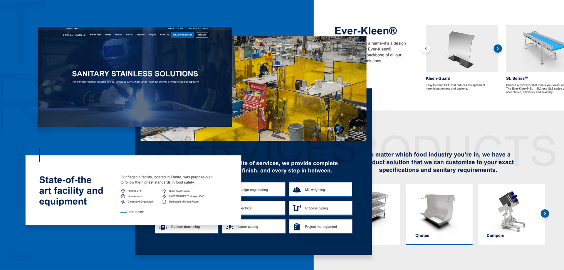
A Visual Refresh
The direction we took for the redesign was “show, don’t tell”. We approached it with large, impactful imagery, typography, and overlapping shapes and sections. We kept copy short and impactful. We didn’t over-explain anything. Tri-Mach’s previous website felt like reading an encyclopedia of information. We wanted to remove the walls of text and keep the visitor engaged. This strategy makes it more inviting and easier to skim and understand what Tri-Mach offers. The overlapping shapes, sections, and typography also add a unique dimension to each page. The shapes and layout are a subtle nod to the “building blocks” Tri-Mach uses in their manufacturing, while the line details echo that of their logo and speak to their precision.
The colour palette used on the site is an evolution of Tri-Mach’s existing website and logo colours. The original colour palette lacked contrast between dark navy and black which caused the design to fall flat and caused challenges with creating CTAs, hierarchy, and interest. So, we lightened the navy blue slightly and added a brighter blue for CTAs and accents. We reserved the black for the body copy. Since black and navy can be heavy colours, white backgrounds keep it bright and airy. Allowing elements on the side to breathe with lots of padding, margins, and white space keeps the design as clean as their manufacturing facility.
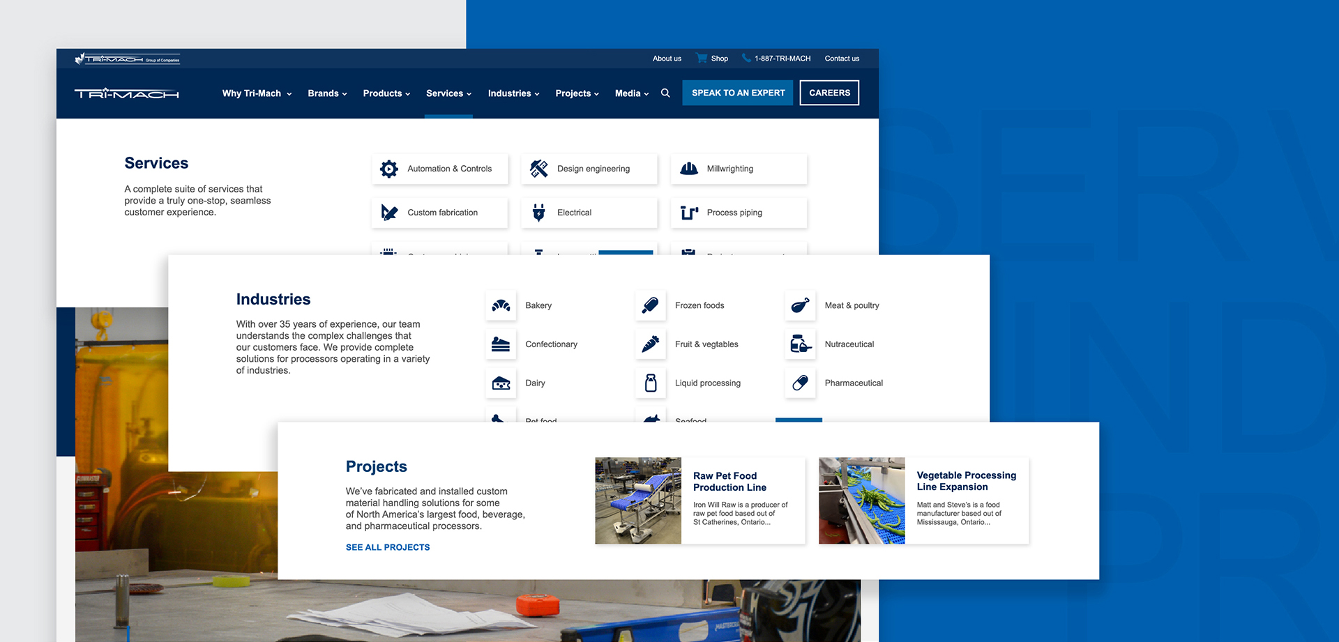
With a complex offering of standardized products, customized large-scale solutions, services, and brands tailored to specific industries, the navigation was a critical part of the redesign. Following that same guiding principle of ‘show, don’t tell’, we opted for a mega menu, which is visually impactful and highly informational, presenting the site map in a clear hierarchy. The navigation now highlights all the necessary information at a glance in a visual, easy-to-access drop-down menu.
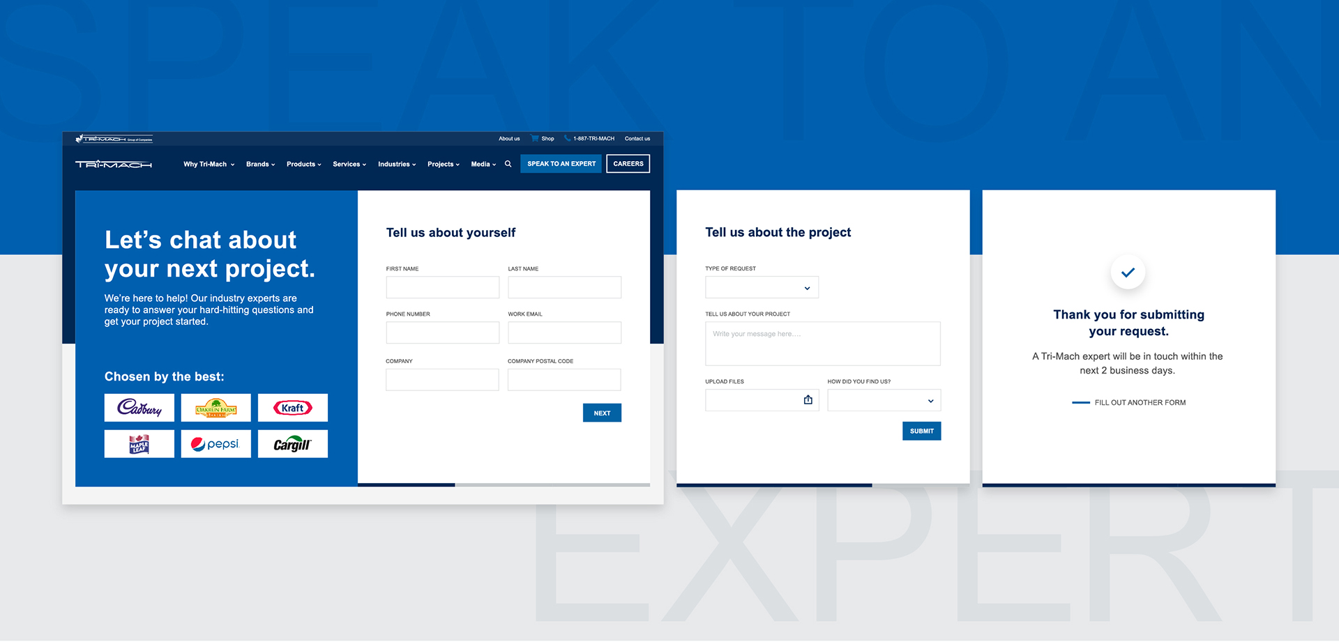
Streamlining inbound sales
For Tri-Mach, custom solutions are their bread and butter. This means that no matter how much information is on the website, a customer will need to speak with them about their specific needs eventually. With this in mind, we wanted to make the customer-business transaction as easy and frictionless as possible. When you first land on the site, ‘speak to an expert’ appears as a large button in the navigation. This was intentional. When someone comes to the website with any kind of question, they know immediately where to go.
Once on the ‘speak to an expert’ page, we created an intuitive form for the customer to fill out with all the key information the sales/marketing team would need to reach out and assist with the inquiry. This form asks specific questions and allows the person to upload media, making it easy for a sales rep to get a head start on understanding the customer’s problem, saving valuable time for everyone.
Demonstrating their expertise
With the redesign, we aimed to better highlight Tri-Mach’s expertise. And not just technical knowledge, but their talented team, their work, their qualifications, and their scale. With that goal in mind,
- We featured their flagship facility front and centre on their homepage with big photos and facts important to their potential customers. We included a CTA to a page where you can watch a video to see inside their facility.
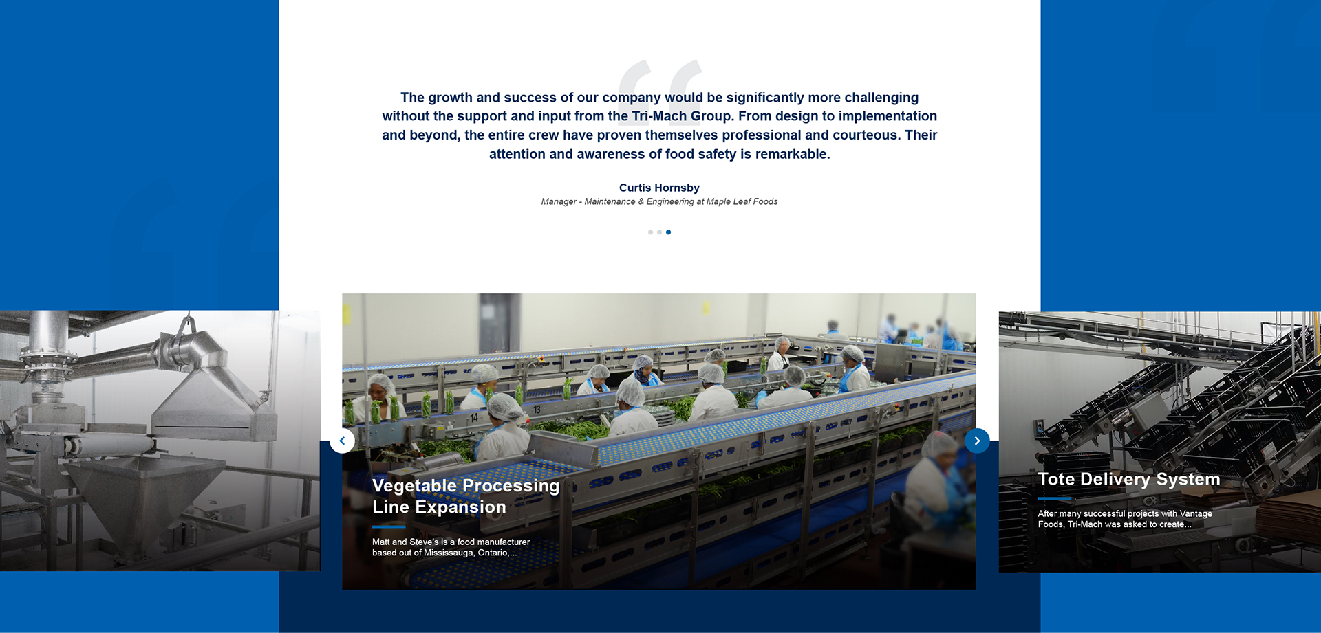
- We created a filterable and searchable project page, with filters for services and industries to help prospects explore relevant work. The filters also allowed us to dynamically add the latest projects to applicable services pages.
- We created a ‘Why Tri-Mach’ page that highlights their team’s numerous certifications and associations
To further reinforce their expertise, we included strategically placed social proof throughout the site including client testimonials, awards, and recognitions, as well as the logos of the industry-leading brands they work with.
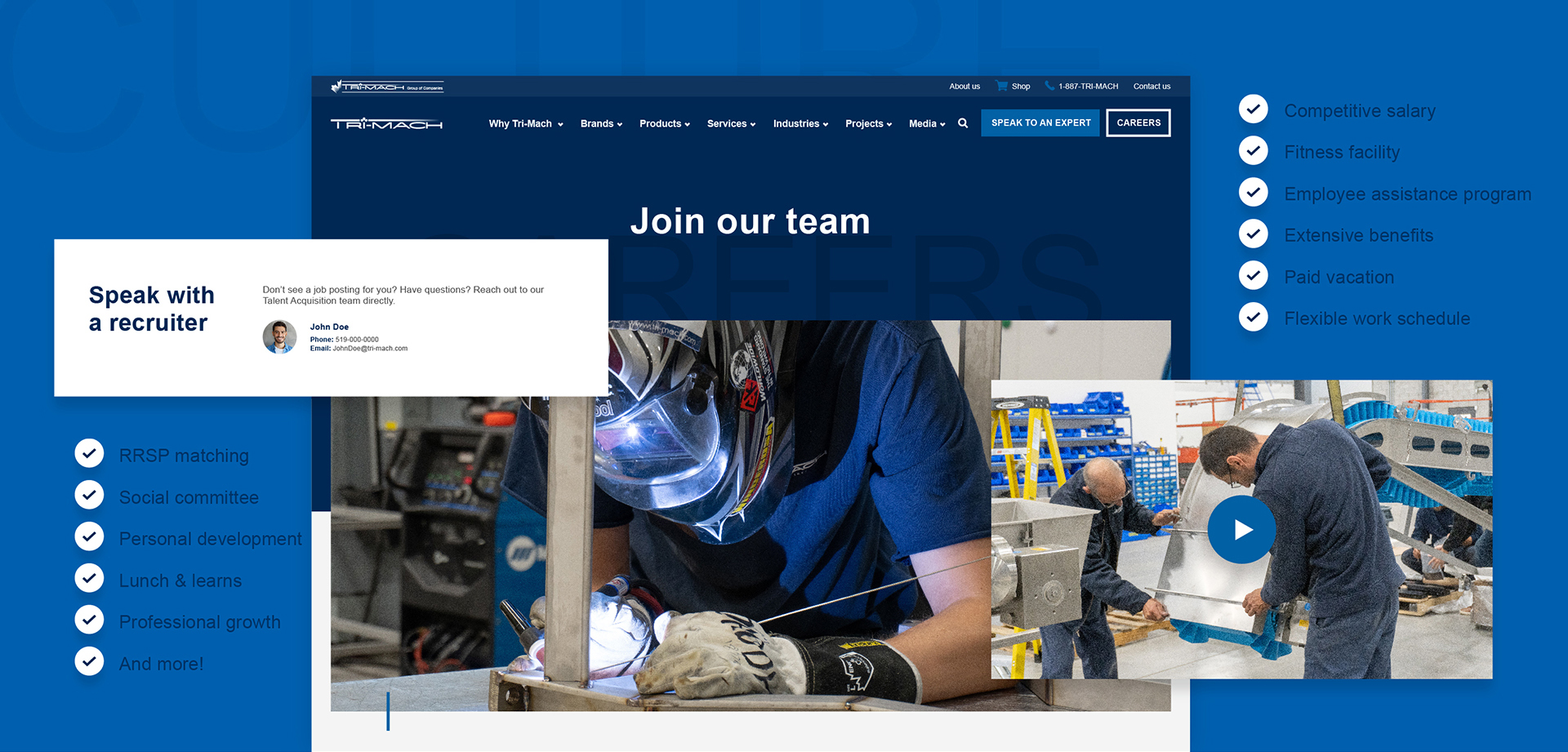
Attracting top industry talent
Think of your website as an ‘always-on’ recruitment tool. A place to show off who you are, what you do, and what you stand for. When thinking about applying for a job, the first place people go is the company website. They want to see the type of company they’re applying to. Company culture, employee benefits, reputation—it matters. So why wouldn’t you put it front and center for all to see?
With this in mind, Tri-Mach wanted the site to be people-focused and authentic to who they are as a brand. To do so, we included employee testimonials, sections on corporate social responsibility, history, benefits, and training opportunities—all things you’d want to know as a prospective employee.
With an in-depth careers page and strategically placed CTAs driving to it, we’ve made it simple for applicants to learn about the company and easy to apply.
An easy to maintain, secure site
Websites need to change, evolve, and grow with the business which is why we ensure our clients can easily make updates when those changes inevitably arise. There are always new pages to add, new projects to show, and company news to share. For this reason, we always build sites with back-end usability and customization in mind. We create custom page builders with click-and-drag modules (each with its own set of built-in tooltips and guides), meaning Tri-Mach can update its site without a developer or any knowledge of code for years to come.
To further preserve the integrity of the site, we hosted through Pantheon, which utilizes Developer, Test, and Live environments with automatic backups. This means Tri-Mach has three opportunities to test changes before going live. If something manages to get by each of the three fail-safes, they can always revert to a site backup from the day before. Websites are a large investment, so we make sure they’re built to last.
The Final Product
At Stryve, we believe, cookie-cutter templates are reserved for… well, cookie-cutting. The websites we build are completely customized to each client’s unique needs. You want something that stands out from the competition, so why settle for anything less?
Tri-Mach’s new website is clean, modern, organized, and has a unique look and feel. It’s easier to digest and navigate with a clear hierarchy, more visuals, and less copy. Whether you’re browsing the products catalogue, looking to get in touch with the sales team, or applying for a job, the Tri-Mach brand shines through. Tri-Mach was so pleased with their new website that they applied the same theme to their sister company, Advanced Millwrights.
But don’t take our word for it, here’s what Grant Luszcezk, Marketing Manager for Tri-Mach had to say:
“I wanted to thank you for all your help and patience throughout this site build. Everyone here is thrilled with the final product. I also was able to learn a lot from the process flow and approach your team utilized. Thank you to the Stryve team for their help and expertise.”
You can check out Tri-Mach’s new modern site here. And if you’re looking to refresh your website, give us a shout.