

InFlight Integration Website
InFlight is an amazing tech company that enables teams to re-imagine the user experience of their enterprise applications without undermining the underlying systems or security. That means InFlight can take that old software you should have ditched years ago, redesign it, and redeploy it to be more efficient, more user-friendly, and more on brand. The same goes for those cumbersome workflows and digital processes you fight through five days a week. The result is increased productivity, employee retention, and employee engagement for InFlight customers. InFlight says there’s no reason why your HRIS, ATS, or other web-based tools can’t be as intuitive as the apps on your smartphone. That's a bold statement and it would be Stryve's job to communicate it with a new site.
The Challenge
As is the challenge with any new or unique technology, it can be difficult to communicate a previously foreign concept. How do you convince audiences their impossible problem actually has a solution that isn’t too good to be true?
To effectively deliver InFlight’s value proposition, we would need to better understand the needs of their target market and align our messaging with those needs. From there, we would need to structure the site to nurture leads and push users to convert on InFlight’s demo and pricing requests.
Driven by Analytics
We took to GA to assess where users were falling off. Bounce rates were high and the main behaviour flow consisted of a back and forth between the Home page and About page. Clearly, users were missing something.
The majority of traffic landing on the Demo page consisted of new users coming directly from organic search results. With the Demo page offering no more than a form, these ice-cold leads were starting at the bottom of the funnel with no prior exposure to InFlight’s content. This is the opposite of lead nurture, so we took this information along with InFlight’s desired conversions and planned a new website structure to influence user flows.
InFlight challenged Stryve to create a new website that connected with our target customers to build empathy and credibility. Stryve applied our own product design and user experience principles into the site, created intuitive navigation systems based on customer personas, and designed a front-end that amplifies key information and content. The result is a customer-focused site that clearly communicates our value proposition in the most efficient way possible. We’re already seeing a lift in key metrics and site conversions. In addition to the end results, the process of working with Stryve was great. They field a scrappy team of SMEs that drove the project to completion.
Karl Wierzbicki
Director of Marketing, InFlight
Design
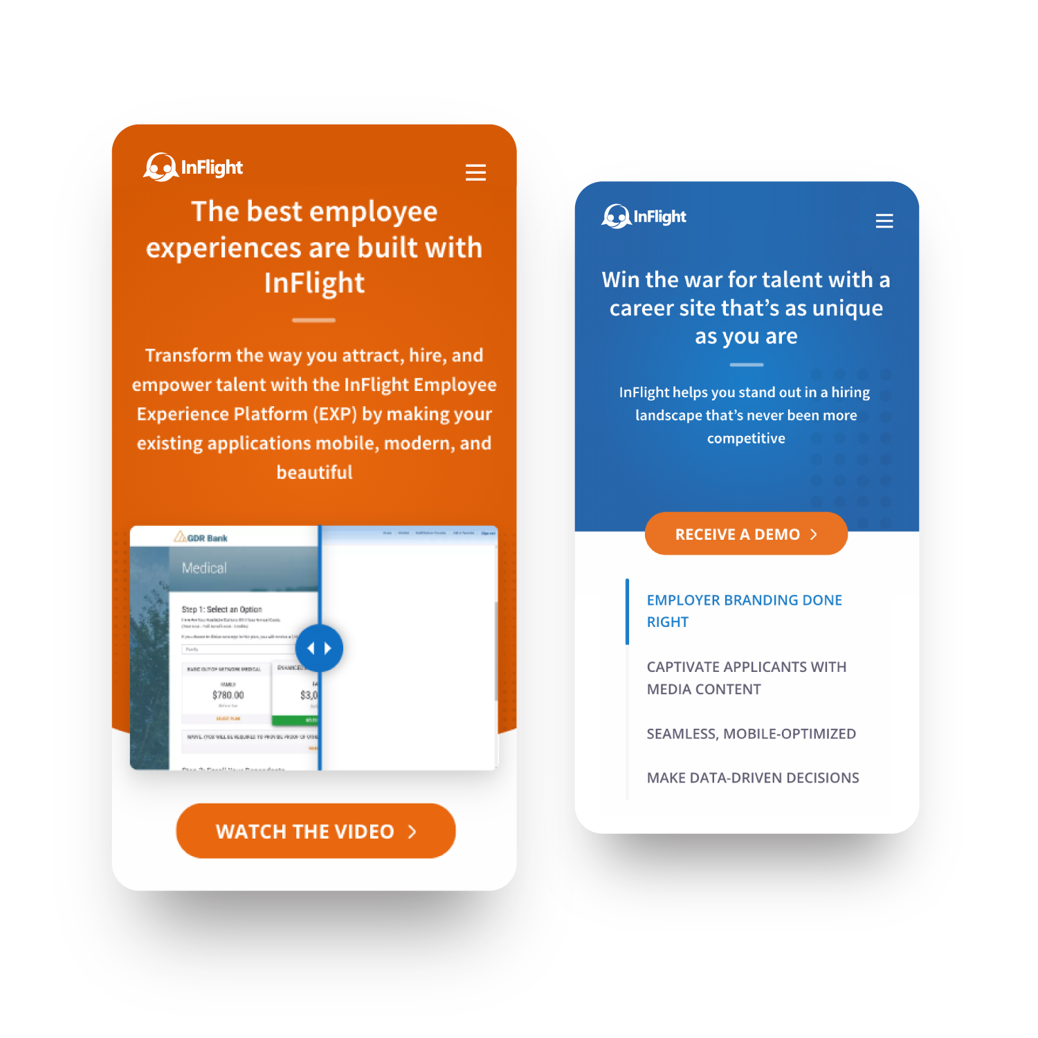
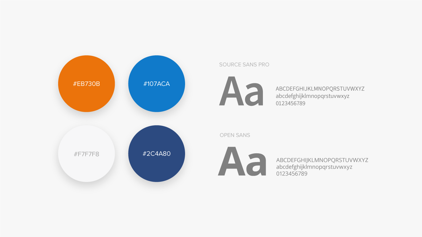
We wanted to make InFlight appear more modern and approachable while still keeping their established branding intact. Our first move was to adjust the colour palette, making their orange and blue more vibrant while demoting their navy down to an accent colour. The goal was to come off as less corporate and more friendly while providing a new feeling of energy.
The biggest design challenge was keeping things in line with WCAG 2.0 accessibility guidelines while fulfilling our brand objectives. Brighter colours are eye-catching, but they can provide issues with contrast—especially with white text. This meant adjusting colours and font sizes to pass AA standards while still maintaining a clean and professional design. Since InFlight ensures their products are AA accessible, we needed to make sure they ate their own cooking and met the same standard themselves.
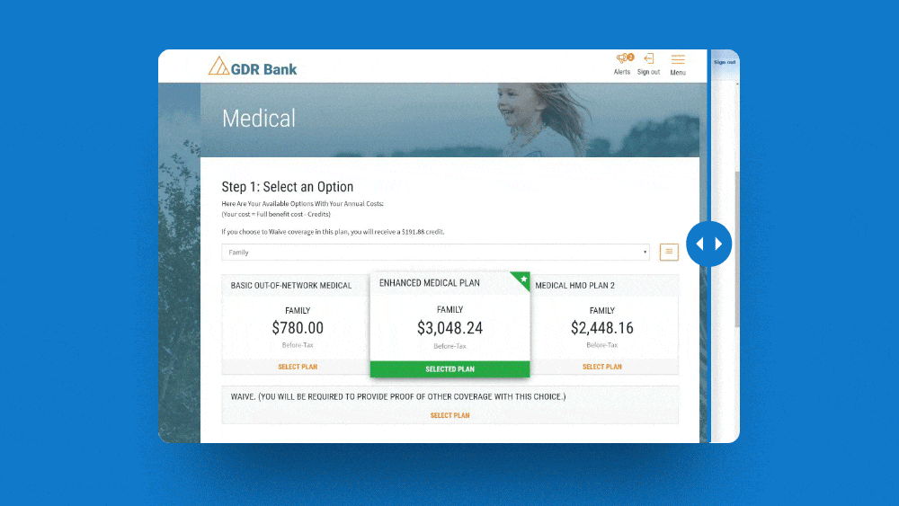
To give a fresh look to the site and brand, we moved away from generic stock photography and instead presented InFlight’s work as the hero. We created interactive before and after modules to show the InFlight difference and prove their service offering isn’t too good to be true. It was also a decision in line with our goal of keeping the site customer-focused, choosing to show what customers will receive rather than stock models who represent them.
Content and Imagery
After analyzing competitor sites and buyer personas, we came up with three main use cases and framed them with goal-oriented content. From there, we used industry statistics and statements to empathize and address market pain points before presenting InFlight as the solution.
Now, it isn’t enough to just say InFlight is the answer — we needed to show it, too. We used a combination of before and after screenshots and interactive hot-spot images to show InFlight in action. Then, we support our claim with a testimonial or case study before closing the page with a free demo sign-up.
User Experience
The old InFlight website failed to dictate any sort of navigation path, leading to randomized behaviour flows and a poor return on conversions. While we would rely on content to educate users, it would need to be presented in the right sequence to effectively nurture leads.
Apart from having clear buttons and a clean layout, the new site is structured so users will typically get the same story whether they click links throughout the page or work their way across the navigation menu. We’ve done this by breaking the site into sections with inline buttons only linking to proceeding stages in the funnel. This means whether users click the menu or scroll through content, they’ll always be lead down the funnel.
Back-End Usability
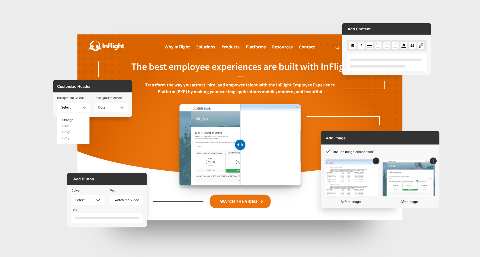
A website is never truly finished. As time passes, there’s always new pages to add, new images to show, and new campaigns to support. For this reason, back-end usability is key to the long-term success of a website.
Apart from providing a detailed maintenance document with instructions on creating and editing components, the backend was customized with usability in mind. With each page broken into click-and-drag modules (each with their own set of built-in tips and guides), InFlight can update the site without a developer or any knowledge of code.
To further preserve the integrity of the site, we hosted through Pantheon, which utilizes Developer, Test, and Live environments with automatic backups. This means InFlight has three opportunities to preview and confirm changes before going live. If something manages to get by each of the three fail-safes, InFlight can always revert to a site backup from the day before.
A website is a major investment, yet the typical company website lasts just 3-4 years. Luckily for InFlight, their new site is equipped with a custom backend and advanced hosting to ensure it outlasts the standard site.
On the previous website, maintenance, updates, and building new pages were cumbersome and frustrating tasks that forced me to rely on hacked-together solutions. Now, with the Stryve developed and implemented back-end, the site is significantly more user-friendly and enjoyable to use. I’m able to build new pages faster while maintaining a cohesive and beautiful front-end.
Kirstie
Marketing Communications Specialist, InFlight