

Equitable: Revitalizing a 100-year old business with a rebrand for the digital world
The Mission
Upon their 100-year anniversary, the Equitable team felt their brand was outdated and no longer an accurate portrayal of their company identity and reason for being. They needed a refreshed brand identity system designed to clearly articulate what they’re about to their audience of clients, advisors, and partners. Our mission was to revitalize their brand and distinguish them as a digital-first company.
The Outcome
Equitable was able to determine a renewed brand purpose, positioning, and values. After rigorous ideation, design, and refinement, Equitable achieved a successful rebrand highlighted by a new logo, supporting brand elements, intentional color palettes, accessible and character driven typography, photographic direction and tone of voice reflecting their desired brand personality.
The Impact
- Equitable is positioned for continued relevance and growth in the digital age.
- Transcending mere visual transformation by profoundly aligning the company's identity with its core values and future aspirations.
- Cohesive brand guidelines now offer a unified framework for consistent brand representation.
- Equitable distinguishes itself as a beacon of client-centricity with distinctive visual elements.
The Project
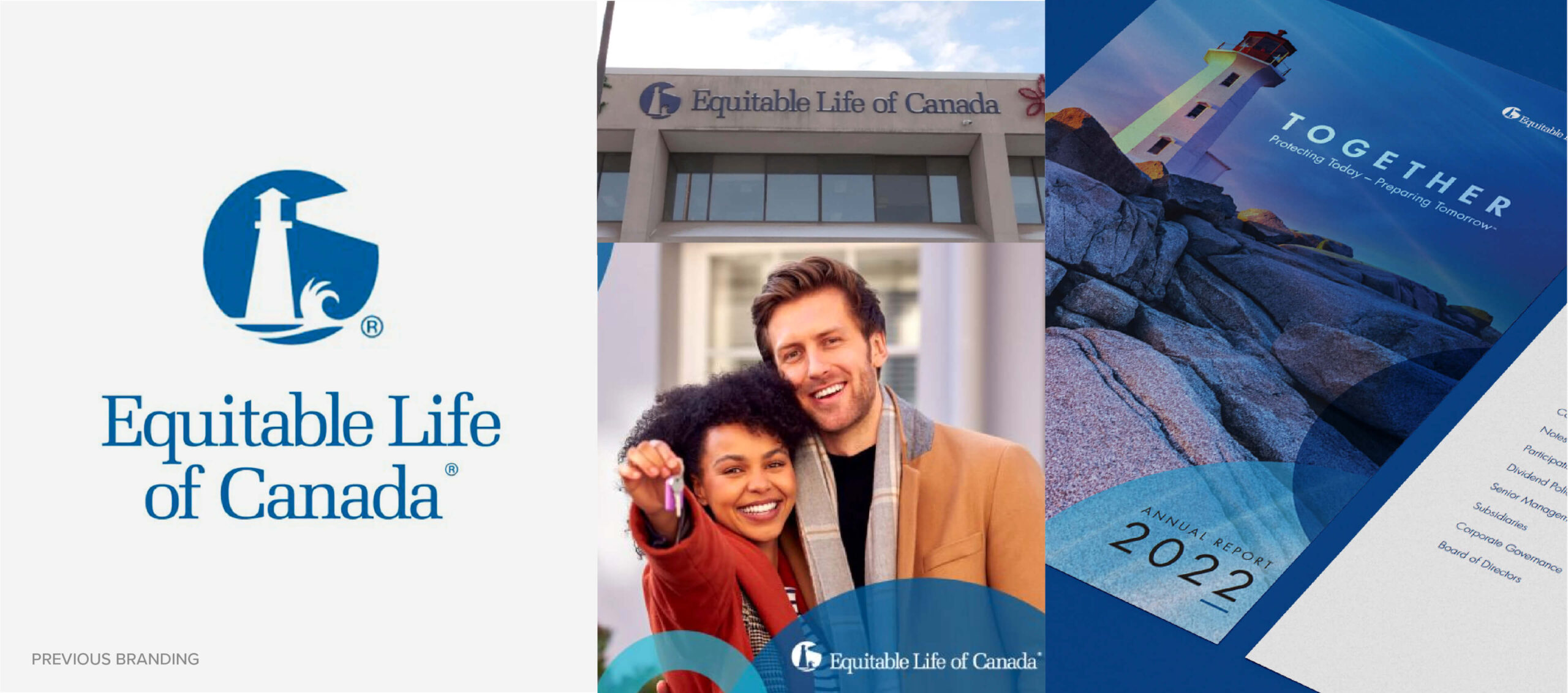
While some businesses are digital natives that only existed during the internet age, there exists a slew of legacy brands with decades of achievements against the changing backdrop of our world. Equitable Life of Canada, now known as Equitable is one of those great legacy brands.
Built on a century of trust and distinction as one of Canada’s largest federally regulated mutuals, Equitable came to us with visual equity and a strong reputation amongst its core clients. Since 1920, Equitable has committed to protecting Canadians with life insurance solutions that suit their needs. As an established brand, they wanted to pay homage to their legacy in a contemporary manner while creating a refreshed brand identity system that allowed them to continue meeting Canadians where they’re at—online.
Equitable wanted to transform into a digital-first company. They felt disconnected from their brand. It was not representative of who they were as people, their company values, and their vision for the future. It was time for a transformation that could reaffirm their deep roots while propelling them towards a new century of servicing Canadians in the digital world.
As Fabien Jeudy, the CEO of Equitable put it: “We’ve been around for a hundred years and want to make sure we’re around for the next hundred. We understand that expectations have changed and want to position ourselves to meet these expectations.”
Brand purpose, positioning and values
For a successful rebrand, we needed to understand who Equitable was, what they stood for, and how they fit into this world. Together, we walked through a series of exercises mapping out the history of their brand, who they are now and who they want to be as they entered a new century.
Through collaborative workshops, we further distilled the key objectives of the rebrand and identified the brand purpose, positioning and values we wanted to explore.
- Brand purpose: Together. Protecting today. Preparing tomorrow.
- Brand positioning: Focused on you.
- Brand values: Simplicity. Equity. Guidance.
We applied critical thinking and strategy at every step. In the words of Donna Carbell, the EVP of the Individual Insurance Division and Brand Impact at Equitable: “We’re not just flipping over to a different logo and we’re not just swapping out this colour for that colour. It’s really intentional.”
Through that process, we learned that it was important for Equitable to:
- Stand out in the sea of sameness.
- Communicate values of simplicity, equity and guidance consistently.
- Highlight their differentiator as a mutual focused on clients.
Grounding brand exploration in themes
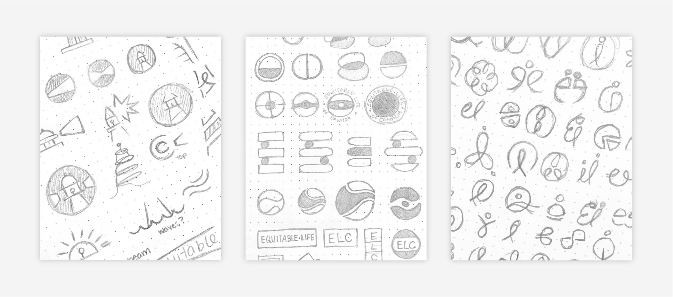
Keeping these factors in mind, we created three concepts to ground our visual exploration of what the brand could be. Our designers developed mood boards to explore how each of these concepts could come to life through different elements. We refined our mood-boards until we collectively felt they passed the “vibe-check”. Then, we put pencil to paper to create rough sketches. All our work was done in greyscale to keep us focused on communicating the idea. At this stage, we focused on developing ideas and not getting bogged down by details.
When a concept was refined enough to bring to life, we started building out the other elements of the brand to go with it, like colour palettes.
We presented our concepts to the Equitable team and worked closely together to get feedback that helped us iterate and further refine each concept. We explored interpretations along spectrums of formality, abstractness and proximity to the existing brand.
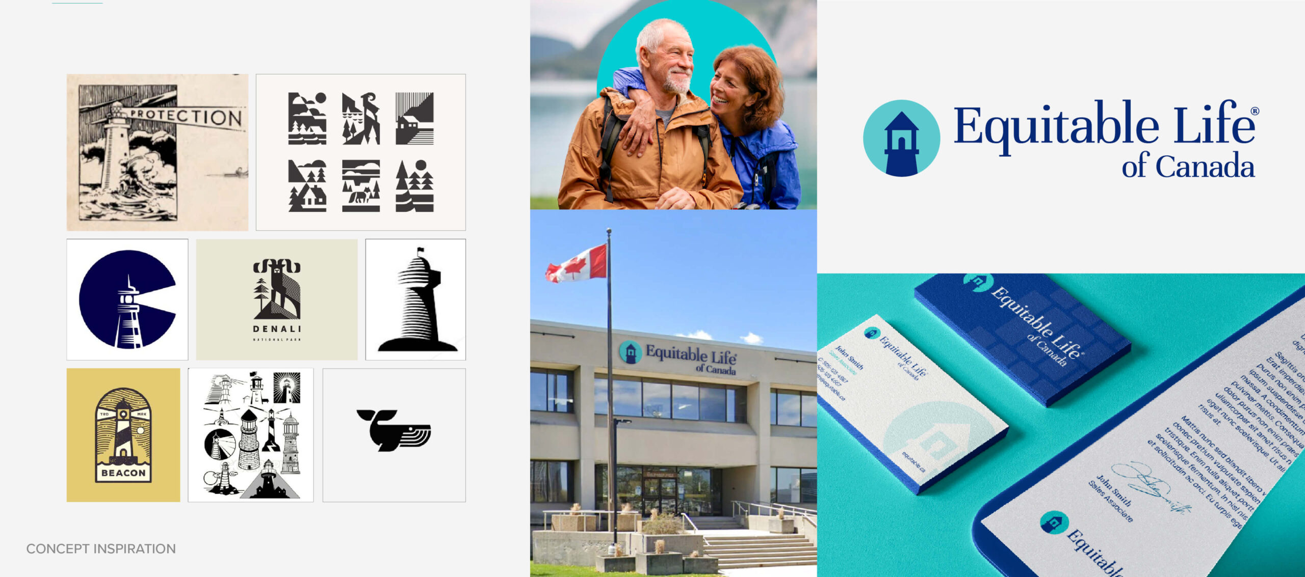
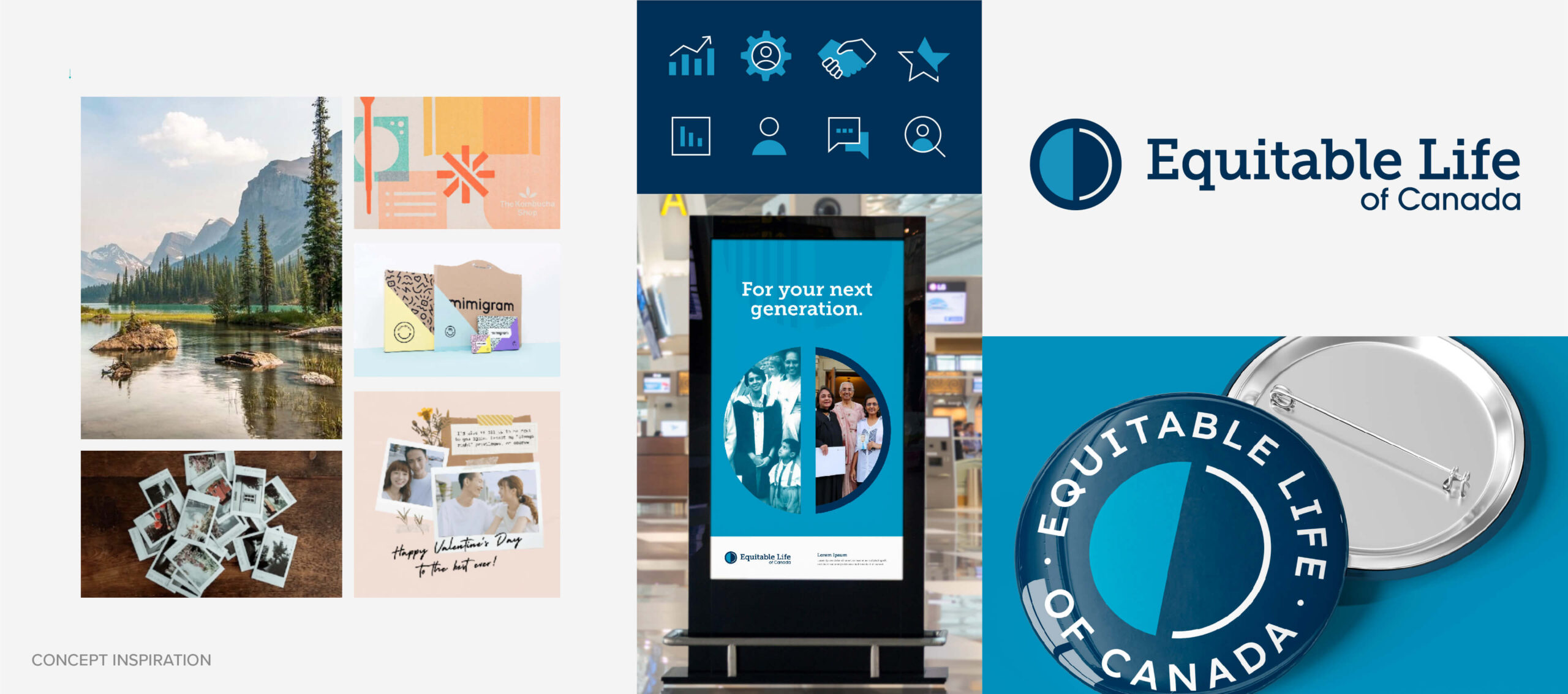
Concept 1: Guidance and Heritage - A reflection of Equitable’s history of guiding clients through their financial journey.
The visual interpretation of this concept was closest in proximity to their existing brand. For decades, Equitable served as a beacon that guided Canadians towards their future goals offering safe passage through life’s journey. For this concept, we explored interpretations of the lighthouse which was an iconic to their brand’s history. We journeyed to create The Equitable Lighthouse which was unique to them.
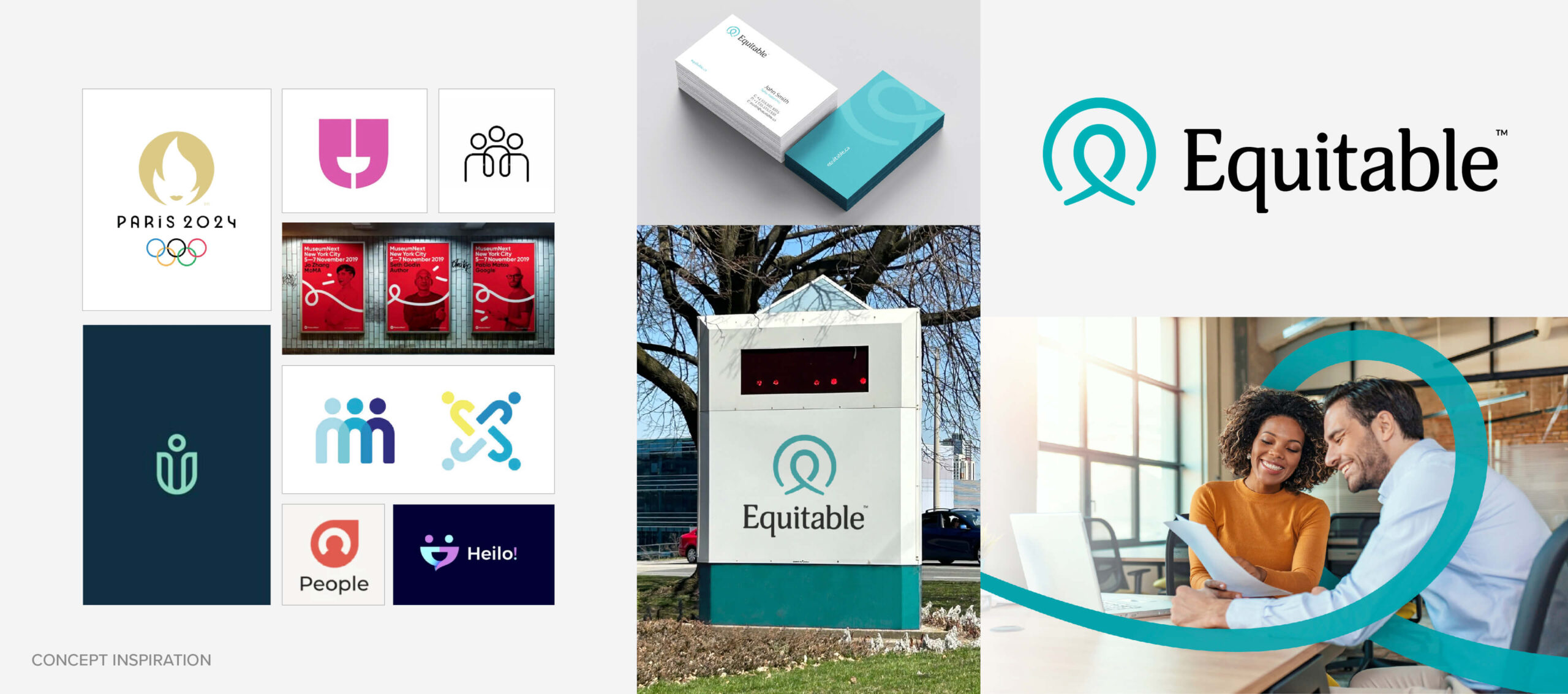
Concept 2: Equity and Togetherness - How Equitable helps your next phase of life whatever it may be.
Whether it’s getting started in your career, growing a family or transitioning to retirement, Equitable is here with you to guide the phases of your life. This concept explored their promise to ensure every phase of their clients’ lives. The logo interpretation resembled a badge as a symbol of belonging and a badge of honour connecting people together. The idea of equity was abstractly demonstrated by two half circles coming together.
Concept 3: Mutual and Client Focus – The uniqueness of being able to focus exclusively on clients as a mutual.
This concept demonstrated Equitable’s ability to provide better client service, better support for independent advisors, and a better employee experience as a result of their mutuality. It was focused on people and their service orientation and a further departure in look and feel from their existing brand.
Meet the new Equitable
25 days, 5 creative Stryvers, 15 boards, 90+ colour palettes, 100+ fonts and 45+ logos later—we arrived at the new Equitable.
Equitable believes in the power of working together with advisors and partners across Canada to offer insurance solutions that help clients protect today and prepare tomorrow. The rebrand underpins the overarching purpose of togetherness through the brand values of simplicity, equity and guidance.
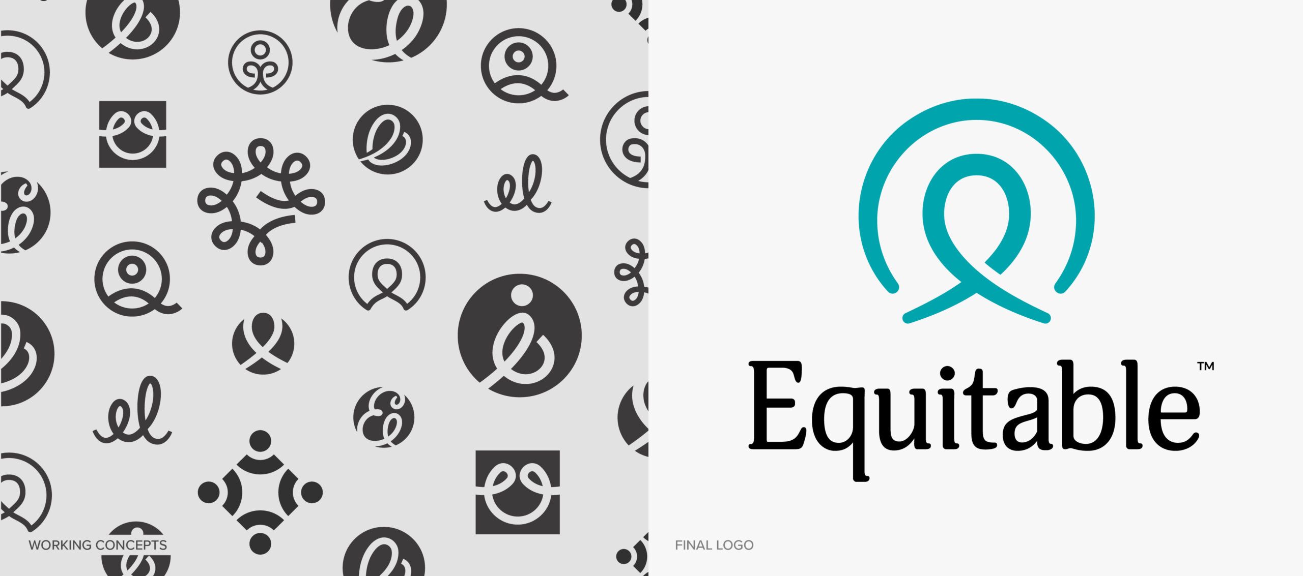
The Logo
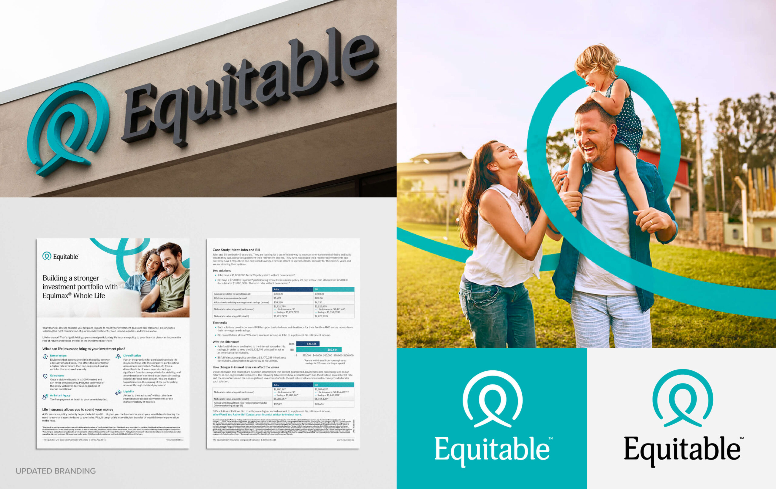
As a mutual, Equitable provides financial security differently by focusing exclusively on their clients. Composed of a cursive ‘e’ that abstractly resembles a human figure nestled within a circle that brings focus to that symbol, the logo stands as an emblem of their commitment to their clients. Adjacent to the icon is the bold wordmark, ‘Equitable’ reinforcing values of simplicity and equity. The decision to drop “Life of Canada” from their name was done to achieve the minimalism they desired while bringing attention to the concept of equity.

The Brand Elements
Inspired by the logo are two supporting brand elements that can be used in playful manners to make the brand come alive across a variety of contexts.
- The Equitable Ribbon: inspired by the cursive ‘e’ in Equitable, the ribbon twirls and twists, a graceful arc unfurled in a timeless swirl to symbolize the financial life journey of clients.
- The Equitable Loop: a gentle curve that wraps around subjects encircling them in a warm embrace symbolizing a focus on clients, guidance and togetherness.
As Equitable’s CEO describes it, “It’s a continuous journey with no distruption and it’s dynamic, it flows and it adjusts. It represents the journey that we’re embarking on with our clients.”
The Colour Palettes
Extensive research was conducted to understand the most common color palettes used within the finance and insurance industries. Competitive analysis and color theory cemented which colors we’d move forward with to make Equitable stand out in the sea of sameness while feeling true to their values and positioning.
Primary Colour Palette
The primary colour palette consists of a dynamic duo that’s a little something old and a little something new. We noticed that teal tends to be a secondary or tertiary colour in the industry so there was an opportunity for Equitable to distinguish itself by owning this colour.
The leading Teal is bright, fresh and attention-grabbing while the Navy honours the colours they’ve historically been known for. Where the Teal adds energy, the Navy adds depth which conveys trust and reliability, an important feeling we wanted to emulate for the theme of financial security.
Secondary Colour Palette and Neutrals
Secondary colours were chosen with the intent of adding vibrancy that complimented the cool tones of the Equitable blues. The yellow creates a feeling of warmth and positivity while the darker purple offers calm stability – both worked as great accent colours to underpin their promise of protection. Neutrals were also provided to help ground communications and maintain balance against the colourful palettes.
The Typography
The old brand used a harsh serif font which felt formal, cold and buttoned up. Equitable wanted the brand to feel approachable, smart and human. When selecting a font, we looked for one with rounded letters and softer edges to reflect their desired brand personality.
To compliment the headline font, we chose a simpler body font which prioritized accessibility and legibility. With a focus on digital transformation, we wanted to ensure that the principal font they lean on for communication has a crisp and clean look which can maintain readability across various sizes and platforms.
With a breadth of technologies nowadays hosting different font libraries, we also selected a substitute font that could be used in moments where their brand font was not available.
The Photography
With a focus on protecting everyday of their clients’ lives, it was important for the photographic approach to encapsulates human moments. The new photographic direction is about real people, in real situations to best represent the depth and diversity of their clients’ lives. We moved away from overly staged photos and built a library consisting of images that reflected warmth, positivity, and authenticity.
We ensured that people from different generations, backgrounds, genders, sexualities and abilities were represented in photography to honour the richness of Canadian communities. With a commitment to cherishing people through the power of togetherness, it was an essential component of their brand to feel inclusive. Embracing diversity in photography was not merely an act of inclusivity but crucial to honoring the kaleidoscope of human experience which Equitable promises to protect.

Ongoing work
Revitalizing Equitable with a rebrand that felt true to who they were and where they wanted to go was only the start of our partnership. Equitable saw the benefit of our consultancy and decided to keep us onboard to actualize the rebrand and support their digital transformation. From preparing for the launch of the new brand, internal brand adoption to creative consulting of headquarter renovations we’ve continued to support them through this milestone moment in their company’s history.