

Crafting a new name and brand for E-Health Centre of Excellence
Project background
Amplify Care (formerly the eHealth Centre of Excellence or eCE) is a not-for-profit that empowers healthcare providers through digital health solutions. They support change management, lead provincial programs, reduce admin burdens with automation, and offer cybersecurity and eLearning services. As the healthcare landscape evolves, eCE recognizes the need for a modern name that reflects their innovative approach and future aspirations, positioning them as a leader in digital health while emphasizing their commitment to enhancing clinician support and improving patient care.
The challenge
A company’s name is more than just a label; it serves as the cornerstone of its identity. When eCE, approached us, they found themselves at a crucial juncture. Their existing name no longer fully captured the essence of their evolving mission or their ambitious vision for the future. They needed a name that would not only reflect their current strengths but also pave the way for their future aspirations. Stryve led a comprehensive rebranding strategy to solve this problem.
The renaming process
Interviews and executive insights
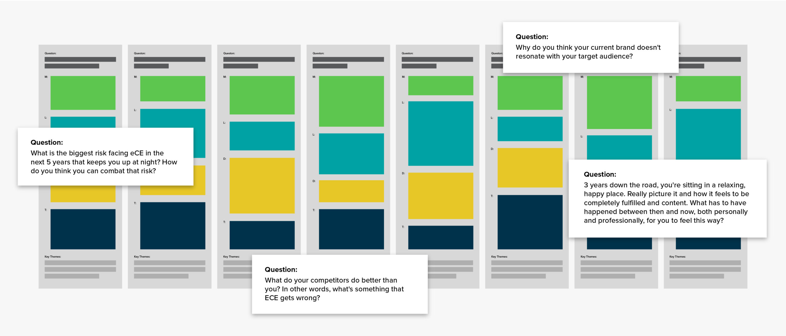
Our journey began with a series of in-depth interviews with eCE’s executive leadership team. These discussions were strategic deep dives into the company’s DNA, exploring its history and how it shaped their current identity, as well as the values that drive day-to-day operations. We sought to uncover the unique personality traits that set eCE apart in the healthcare industry and to understand their vision for the future. These conversations revealed that eCE’s true strength lay in their unwavering support for clinicians and their commitment to putting customers first. This insight became the North Star for our rebranding efforts.
Divergent brainstorming
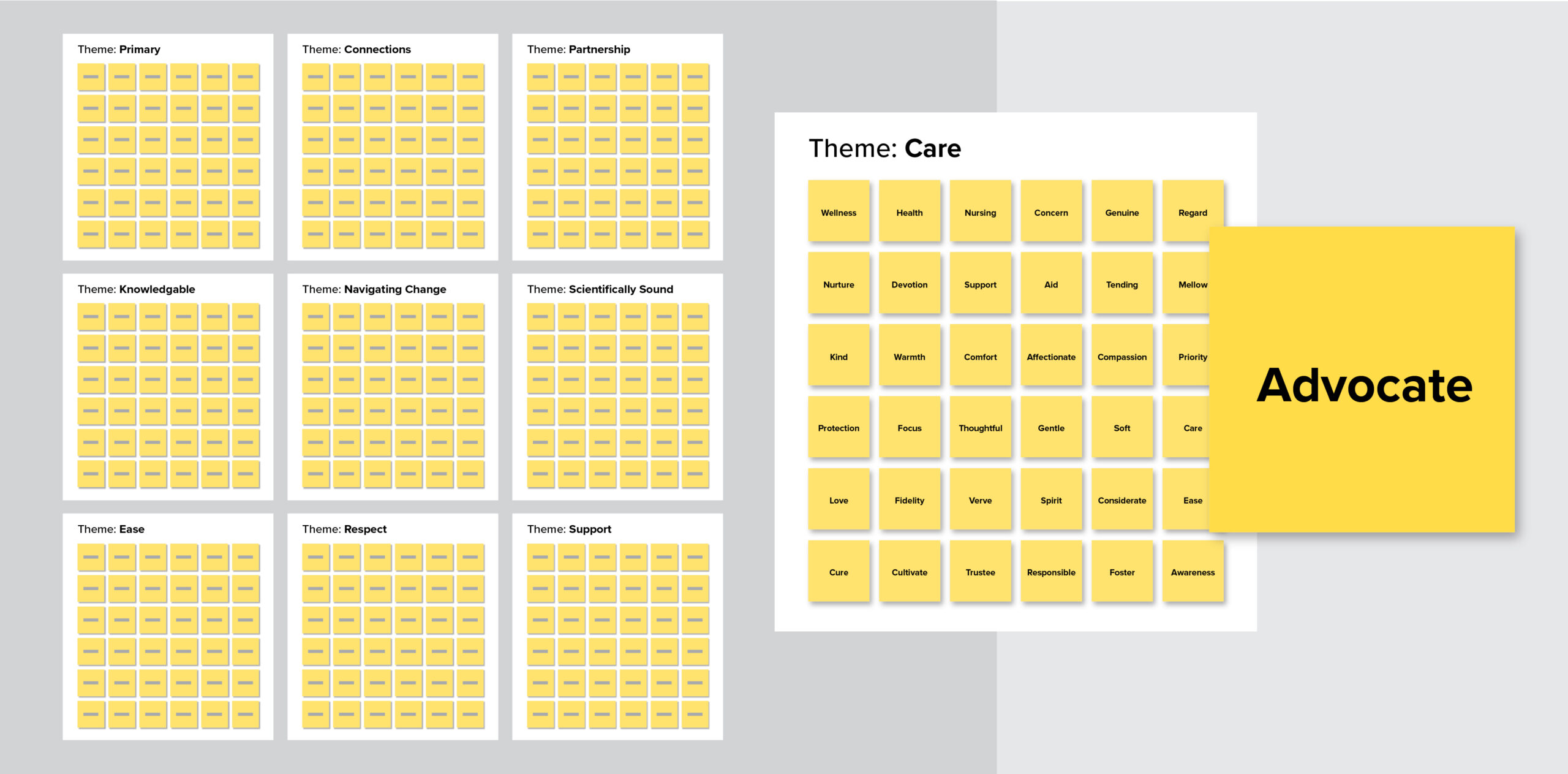
With these insights, we moved into a phase of divergent brainstorming. We created an environment where no idea was too outlandish and no concept too abstract. Our team generated hundreds of words and phrases related to support, healthcare, empowerment, and future-focused concepts. We explored synonyms and antonyms, delved into different languages, and even invented new words. This judgment-free zone allowed us to build a vast pool of potential name components, each carrying a piece of eCE’s story.
Sculpting the perfect name
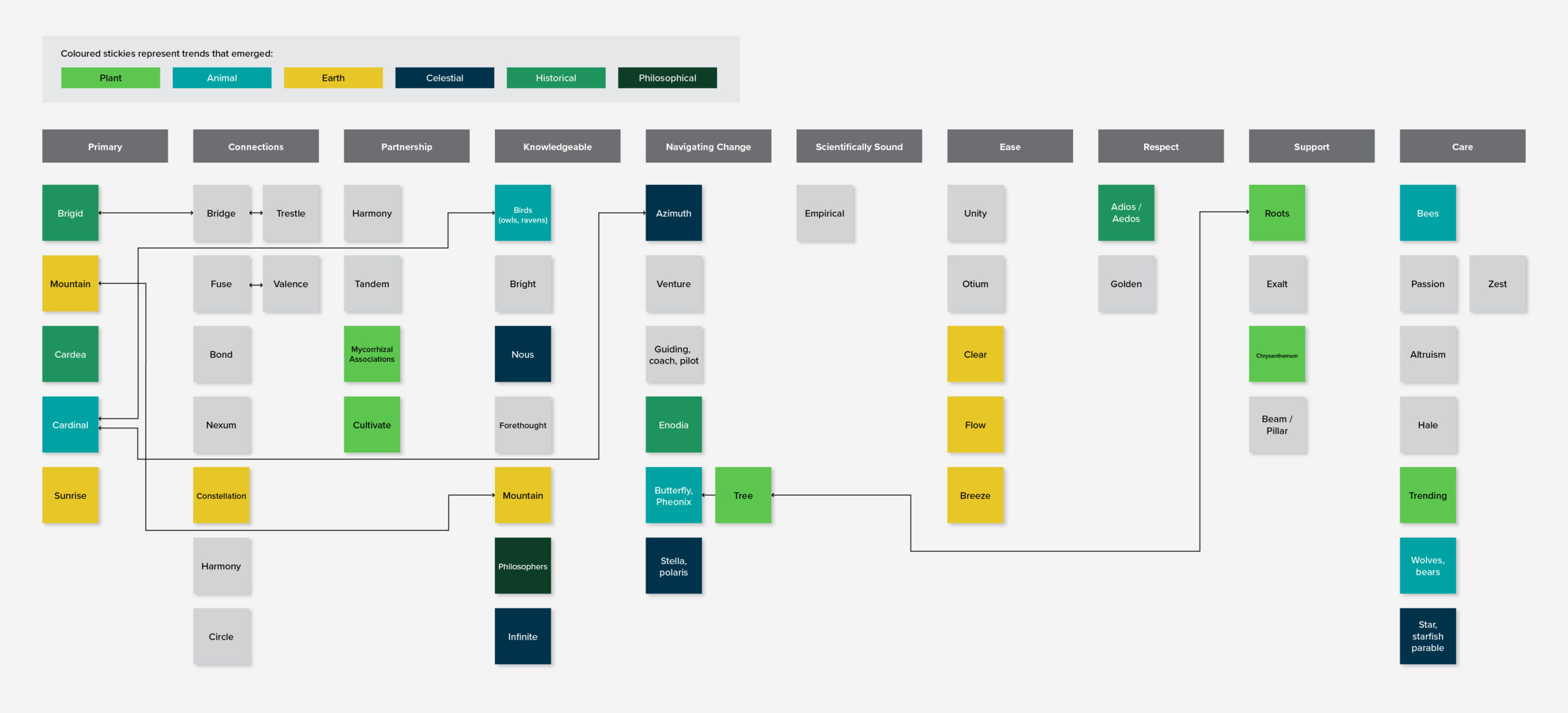
As we began to refine our expansive list, we engaged in an iterative process characterized by multiple rounds of evaluation. Each round was more rigorous than the last, involving deep discussions about the connotations and implications of each word. We constantly referred to our executive insights to ensure that every name considered aligned with eCE’s core values and future direction. This relentless iteration helped us narrow our options down to 50 contenders.
Bringing words to life through visual explorations
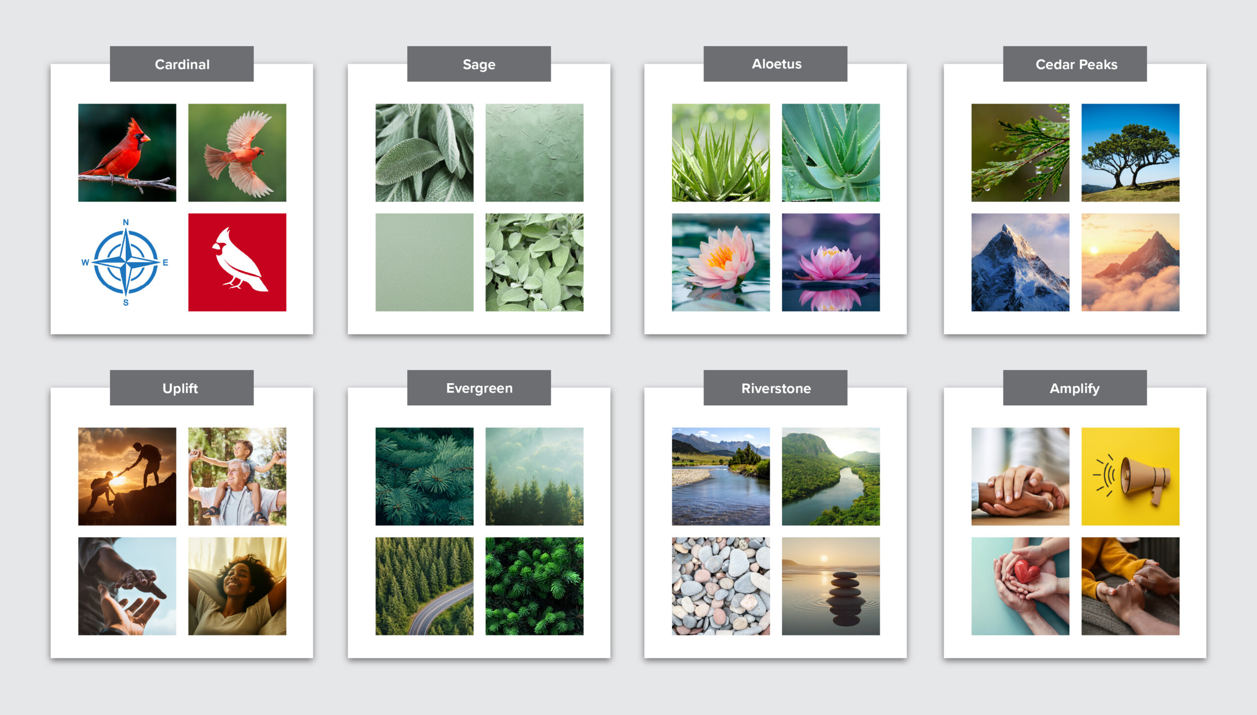
To further enhance our decision-making process, we introduced a visual element for each potential name. We gathered imagery and colours that were associated with the names to more explicitly consider visual associates. This exploration involved considering how each name might translate into logo designs and what broader visual identity it could inspire.
By bringing words to life visually, we were able to eliminate options that didn’t resonate while advancing those that truly captured eCE’s brand personality. For example, while the team liked the direction of the Cardinal, through this exercise we uncovered there was a strong connection to the colour red which felt too aggressive. Red is a colour of urgency, alarm or bodily fluids within healthcare and felt negative given the context of the industry.
The result: Amplify Care
Ultimately, through this exhaustive process, we arrived at “Amplify Care”. This name was not merely selected—it was discovered and refined through careful consideration of eCE’s mission. “Amplify” perfectly encapsulated eCE’s commitment to elevating the voices of their clinicians and enhancing their capabilities while also reflecting the company’s dedication to amplifying positive outcomes for patients.
Creating a new visual identity
Exploring logo concepts for the new name
Once the name was chosen, our next challenge was to bring it to life visually in a way that felt true to the brand’s purpose and values. We started the process with moodboarding exercises.
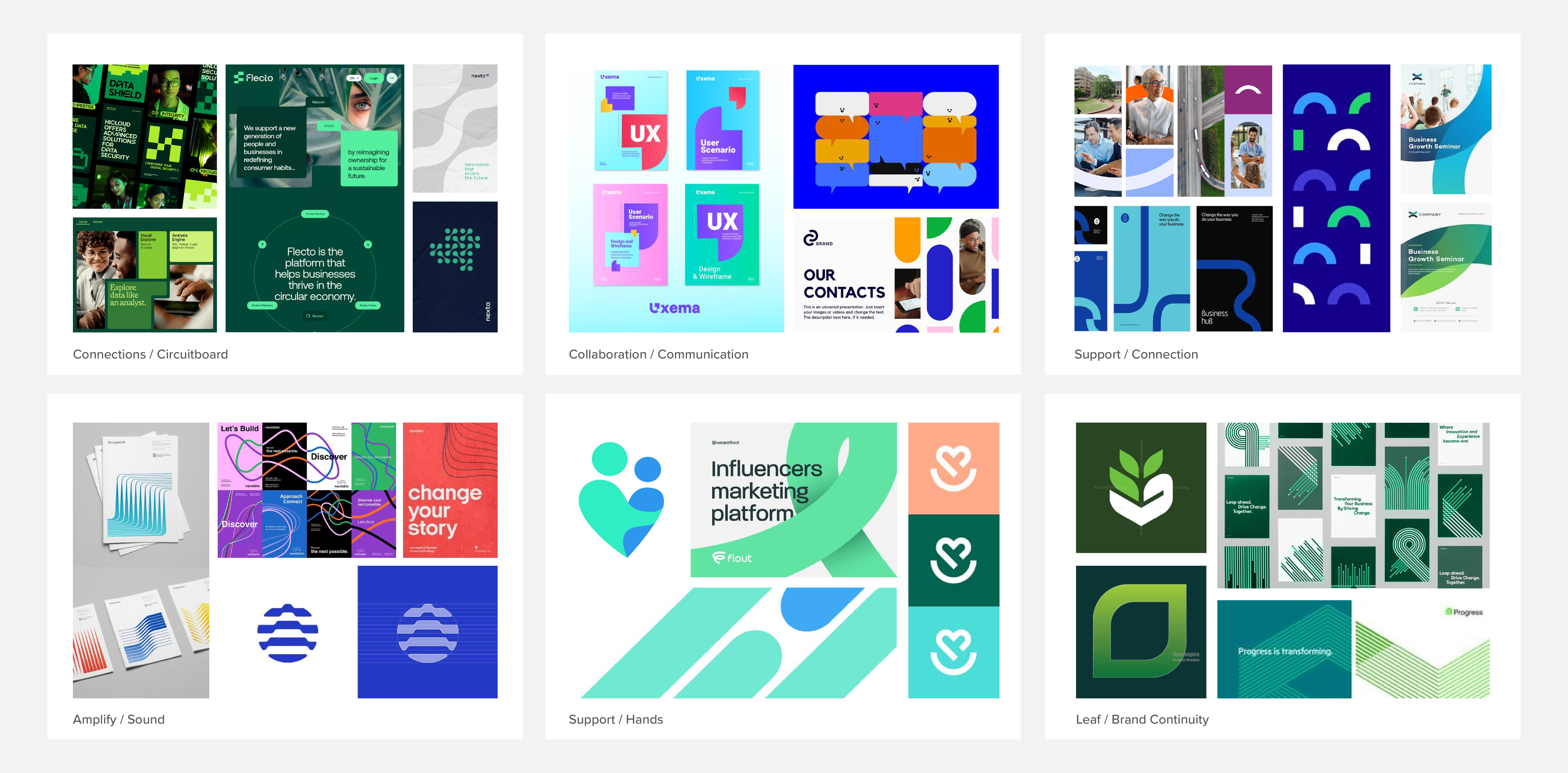
Amplify had a variety of ideas they wanted to communicate, from growth and connection to hints of their legacy branding, so we created multiple boards to show how each concept could translate visually. This process helped the team see options side by side and focus on what felt most aligned with their future direction.
Through these sessions, we narrowed in on elements that should continue to be a part of the new brand adn eliminated those that shouldn’t:
Moving away from sound-based amplification and showing it through communication and growth instead
Forgoing bridge imagery in favour of stronger connection motifs
Refining which colour palettes felt right for the new identity
Removing hand-based support visuals in favour of more modern, abstract expressions
This groundwork gave us a clear creative direction, ensuring the eventual logo and full brand system would feel intentional, cohesive, and unmistakably Amplify.
Designing the logo
Through refinement and experimentation, the Amplify Care logo was born. At its heart is an icon that subtly combines a lowercase “a” with an abstract speech bubble, representing the voice of clinicians and their central role in the healthcare ecosystem. The speech bubble is formed through four interlocking shapes that symbolize teamwork, connection, and flow. Whether your eye starts at the top or bottom of the mark, it is naturally drawn upward, visually reinforcing the idea of amplification.
To further support the brand’s personality, we used soft, approachable curves and paired the icon with lowercase typography. This ensures the logo feels both professional and inviting. The colour choices of green, teal, navy, and yellow provide a distinctive, modern palette and reinforce key brand attributes. These include growth, calmness, trust, and approachability. Together, these design choices ensure that every interaction with the logo communicates Amplify Care’s mission to elevate clinician voices and enhance patient outcomes through digital innovation.
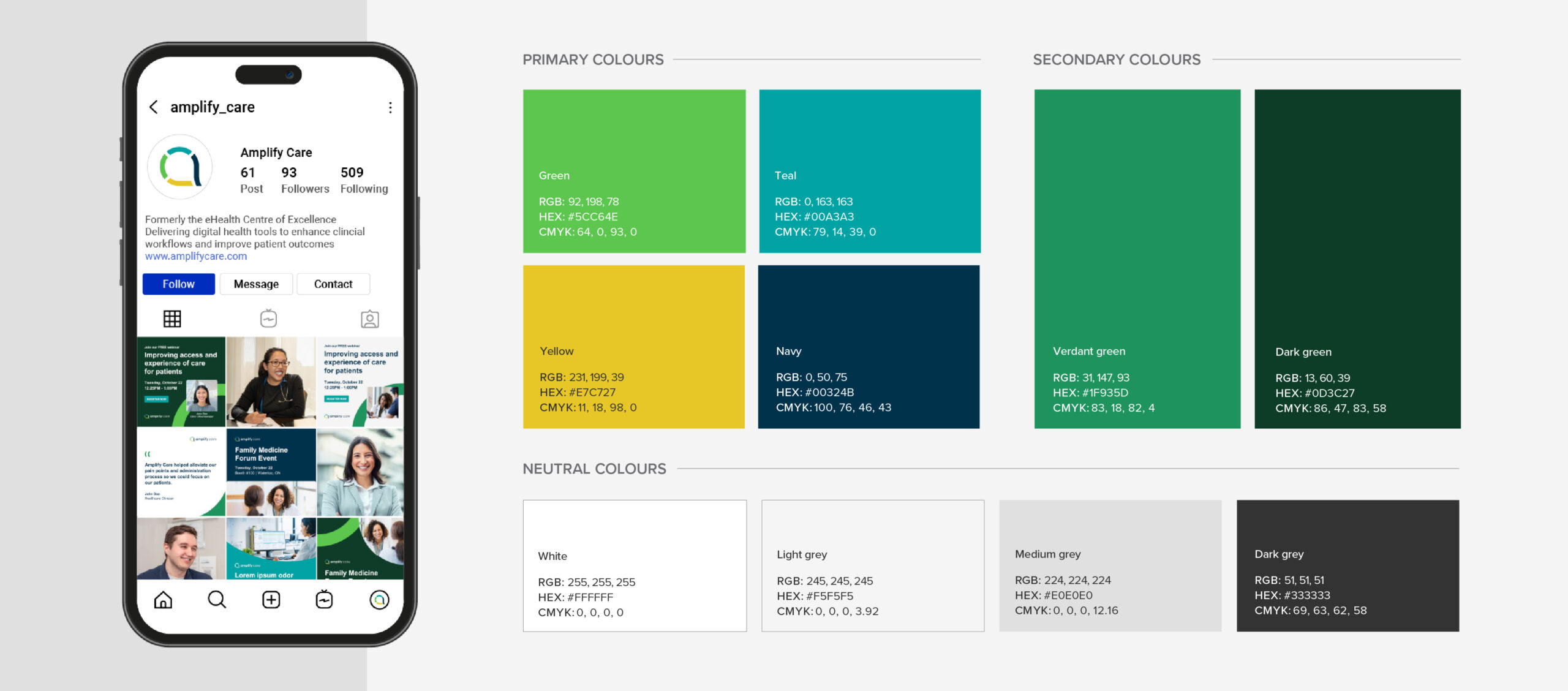
Balancing warmth, trust, and digital focus with a new colour palette
Amplify Care’s colour palette was carefully crafted to strike the right balance between professionalism, innovation, and human connection. The primary colours of green, teal, navy, and yellow work together to convey the brand’s identity and differentiate it within the healthcare space.
Each colour was selected with purpose. Green, a nod to the organization’s legacy, symbolizes growth and transformation. Teal brings calm and balance, reinforcing Amplify Care’s supportive role in clinical workflows. Navy anchors the palette with a sense of trustworthiness and dependability. Yellow introduces a distinct and approachable energy that helps the brand stand out.
Supporting secondary colours and neutrals were also developed to provide flexibility and accessibility across both digital and print applications. This thoughtful approach ensures the palette not only supports a cohesive brand experience but also aligns with Amplify Care’s commitment to clear, inclusive, and patient-centered communication.
Brand elements and imagery: visualizing connection and support
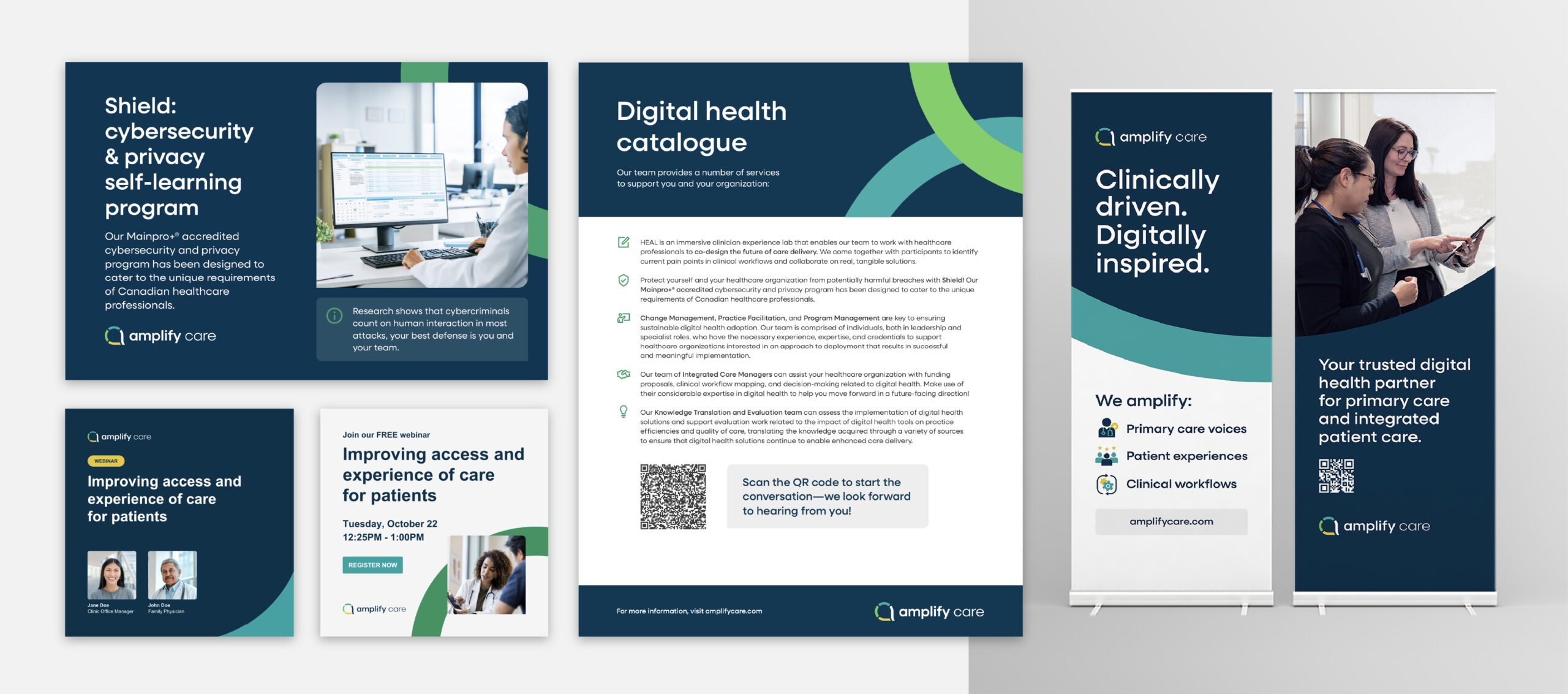
Beyond the logo and colour palette, we developed a rich set of brand elements to further express Amplify Care’s values of connection, partnership, and support. These include “connections and support frames,” which are graphic elements derived from the logo’s forms. They are used to subtly reinforce themes of collaboration and amplification across materials. These elements appear in various applications, from banner designs to presentation covers, framing content in a way that feels dynamic and human-centered.
Photography direction was another critical component of the brand’s visual language. We defined a style rooted in authenticity, with candid and positive imagery that showcases clinicians in their environments and supported by technology. Every image is carefully curated to reflect diversity, approachability, and the patient-centered ethos that underpins Amplify Care’s work. Together, these visual components create a brand experience that is both contemporary and deeply aligned with the organization’s purpose.
Expanding their design system
As part of Amplify Care’s refreshed visual identity, we knew iconography would play a critical role in making dense information more digestible. We built a full icon library that complemented the shapes and lines of the logo while adding clarity and personality to the brand.
The primary icons feature layered line work and overlapping elements, reinforcing Amplify’s core values of connection and support. These were designed for larger, hero applications where visual impact mattered most. We also created a secondary set of simplified icons for smaller uses like lists and navigation, ensuring consistency and versatility across the website and future collateral.
In addition to the icon system, we introduced a unique design element called “information speech bubbles.” Inspired by Amplify’s purpose of elevating clinician voices, these subtle shapes highlight key content such as data callouts, workflow explanations, and user tips. Used sparingly, they add movement and visual interest without overwhelming the clean, approachable feel of the brand.
Together, the iconography and information bubbles became key building blocks of Amplify’s design system, providing visual cues that make the website easier to navigate and more aligned with their mission of digitally empowering primary care.
Building a launch-ready brand kit
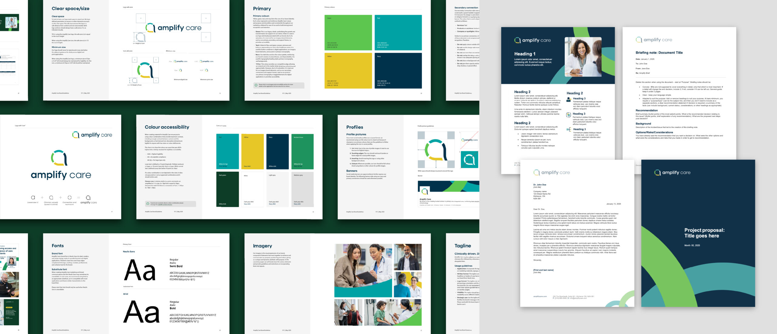
Beyond establishing the visual identity, we helped ensure a smooth and consistent rollout of the new brand. This included the creation of a comprehensive brand guidelines document that outlined clear principles for logo usage, colour application, typography, photography, and brand elements.
In addition, we built a launch-ready brand kit that included a full library of practical and easy-to-use templates and assets. This included letterhead, email signatures, PowerPoint presentations, one-pagers, project proposals, and more. Each asset was designed to help the Amplify Care team confidently apply the new brand from day one. By equipping them with the right tools, we supported a seamless transition.
The feedback we’ve received from partners, funders, and clinicians has been overwhelmingly positive. We’ve heard things like, “Thank goodness,” “About time!,” and “I love the design—it’s so much more modern and reflective of Amplify’s mission.” People have really connected with the story behind the brand.
Danika Voisin, VP, People & Corporate Services at Amplify