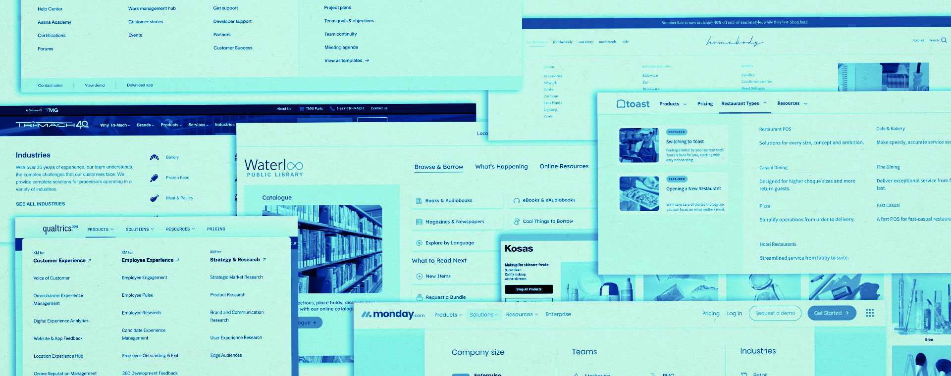
B2B website design trends you need to know in 2024
We’ve covered general graphic design trends and digital marketing trends for 2024. Now, we’re breaking down some of this year’s top B2B website design trends. Here are 7 trends to inspire you—whether you’re completely redesigning your site, starting from scratch, or looking to refresh some parts of your site.
2024 B2B website design trends
1. 3D imagery
Over the past several years the tools for creating 3D models have become more user-friendly and accessible, leading to an influx of 3D design. Some of these tools include Blender, Nomad Sculpt, Spline, Adobe Dimension, and SketchUp. Three-dimensional shapes and objects provide visual interest and create a more immersive experience for users (plus they’re a breath of fresh air from the flat illustration style that has dominated for years).
Almost any industry can incorporate 3D elements into their website. One way of doing this is by showcasing a model of a product, giving users a realistic, three-dimensional view of what they can get.
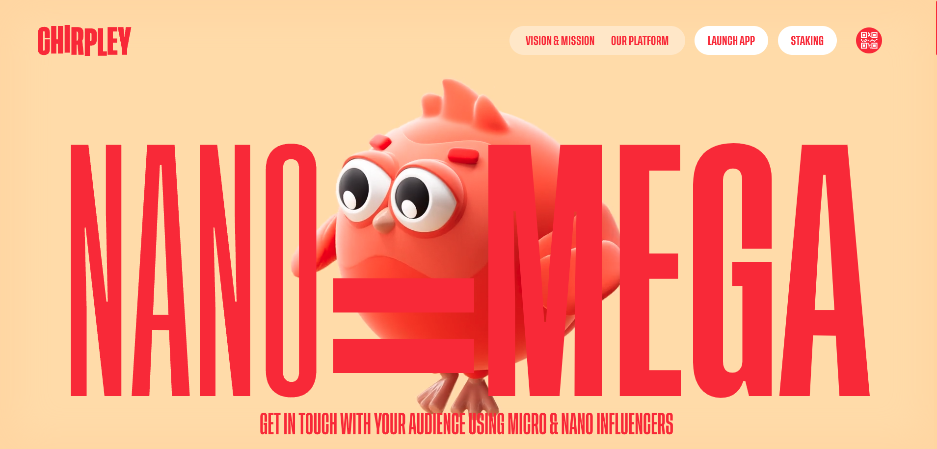
Chirpley uses 3D branding elements along with animation and creative scrolling techniques to entice users and help create a more immersive web experience.
2. Micro-interactions
Micro-interactions are subtle interactions that occur when a user engages with part of a website. They’ve become increasingly popular and help by providing visual feedback to users so they can better understand their actions. They should be subtle and not overcomplicated so that they’re helpful rather than making the experience more difficult.
Micro-interactions can upgrade any B2B website’s navigation. For instance, hovering effects can be added to buttons, and loading animations can take place while a page loads.
UpGuard is an IT software company that uses micro-interactions on its nav bar and drop-down menu to highlight which section is open and what page will be selected. You can see it via the background colour of selections changing to a light blue.
3. Motion/Animation
Animation refers to moving elements on a website. Motion can be incorporated into a website in various ways, from an animated hero section to scroll-triggered animations.
Animation creates visual interest and grabs users’ attention giving them a more enjoyable experience. Certain types of animation, like scroll-based animation, can also captivate users and help tell a story. Animation can also create emotion, help simplify processes, and provide visual cues for improved navigation.
There are so many opportunities for motion to be incorporated into website design. B2B companies can use it to bring products or services to life.
Rainforest is in the financial services industry and uses animation on its homepage to showcase how its software works.
4. Dark mode
You’ve probably noticed the option to switch your apps or operating systems to dark mode. Dark mode for websites gives users the same option. Instead of a white background, the website will shift to a darker colour scheme.
As this trend has grown for apps and other platforms, it’s started to be seen as a possibility for websites as well. It can make content more comfortable to view in low-light settings and save battery life on certain displays. And some people just like it better.
It’s good to look at the target audience when designing dark mode. If the audience is already using this option on their devices then they would most likely appreciate it on a website. Tech and cybersecurity companies could consider dark mode because their tech-savvy audiences may be more likely to use dark mode.
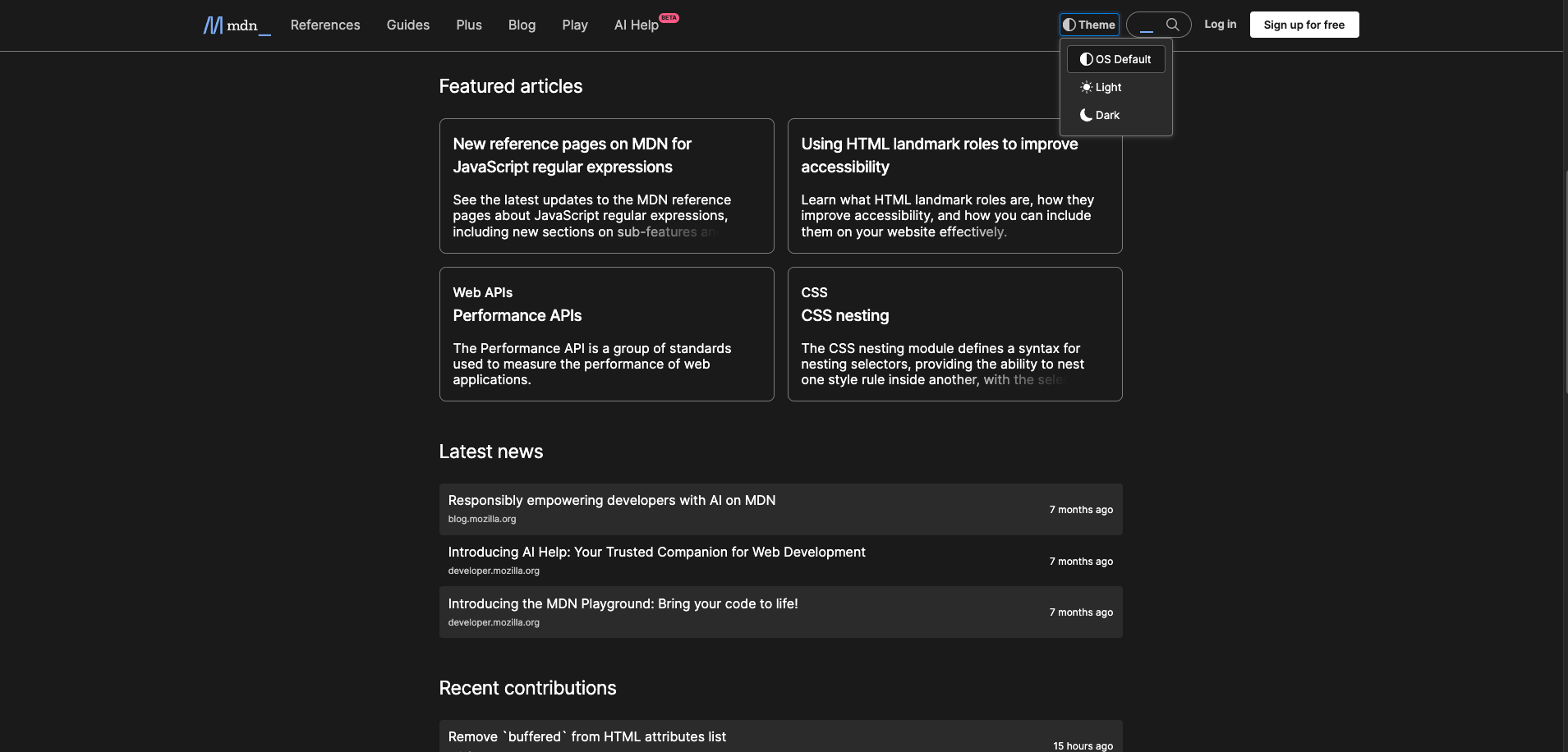
MDN Web Docs is a learning resource for web developers and has the option for users to switch from dark to light mode on their website. It can also match the user’s operating system settings.
5. Scrolling effects
Scrolling effects create changes on a website as you scroll. Techniques like scroll animation, scroll progress bars, or parallax scrolling immerse viewers and create a more delightful journey.
Scrolling effects turn long web pages into an interactive experience and engage viewers so they want to continue scrolling. People enjoy scrolling effects because it breaks things down, allows them to go at their own pace, and creates a sense of exploration. Sticky navigation pairs well with scrolling effects to ensure users won’t get lost.
B2B websites can utilize scrolling effects on long web pages to create a more dynamic experience for users, encouraging them to stay on the website longer and keep exploring. These effects can also be used as tools for “scrolly-telling” to showcase a brand message or story.
The Voluum homepage uses scroll animations to introduce new information as users scroll and sticky positioning brings focus to their product’s features.
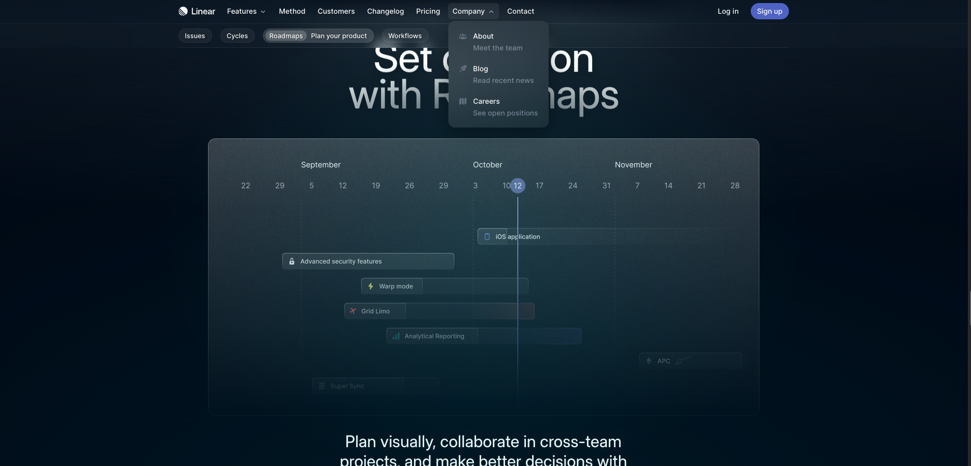
6. Glassmorphism
Glassmorphism is a design trend inspired by glass. It incorporates depth, transparency, and light borders to achieve this look. Elements with glassmorphism can look like they’re floating in space.
One of the most notable uses of glassmorphism is in the design of MacOS’s Big Sur. Glassmorphism has continued to grow in popularity. It can add visual hierarchy and highlight content. People enjoy its sleek, modern, and minimalistic look.
Contrast (and therefore accessibility) is important to keep in mind when designing with glassmorphism since elements are transparent. Shadows, backgrounds, borders, blur, hierarchy, text size—these are all things to keep in mind.
Glassmorphism can be used for things like cards and navigation on websites. A variety of B2B industries could incorporate this trend if they want to achieve a sleek, modern look. I’ve seen it used most for SAAS, technology, finance, and consulting websites.
Linear uses glassmorphism in elements of their website such as the navigation and product visualizations giving it a modern, high-tech look.
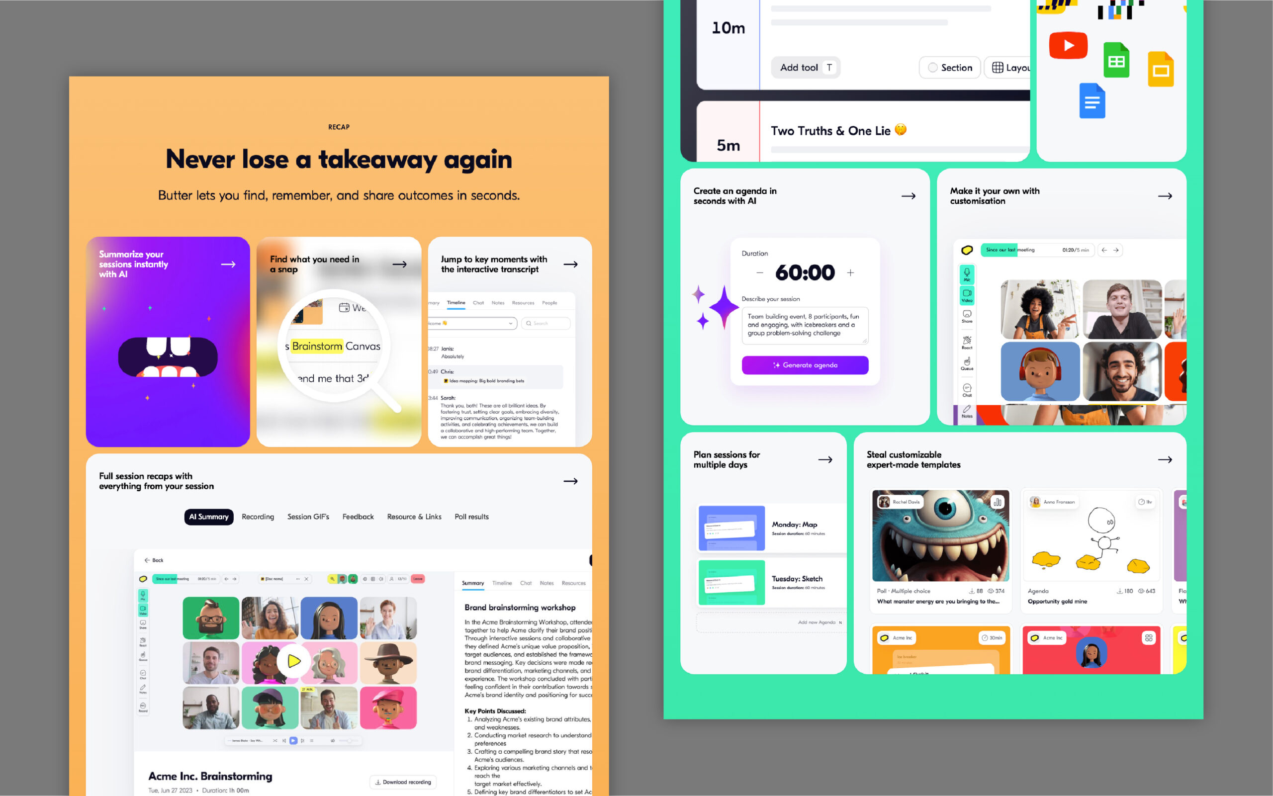
7. Bento layout
The bento layout trend takes inspiration from Japanese bento box containers which often have multiple compartments to store different food items. The bento layout trend uses a similar ideology to organize content on a website in different boxed sections. Although you can’t eat it, it’s a playful way to make content more consumable.
It’s thought that this trend may have been sparked by the specification layouts in Apple’s promotional videos or Microsoft’s Metro design language system. This layout style is trending because it’s simple and modern, providing structure to help organize content.
Bento Grids has a great collection of designs that use, well, bento grids for design inspiration.
Bento layout would be great for any B2B company website that needs to organize a space to flaunt features for their products. For example, SAAS companies can use the bento grid to highlight elements in their software and then lead users to pages where they can learn more.
Butter, for example, used to have the bento layout on their homepage to create organized sections to showcase what their software does. These sections highlight key features and users can click on them to get more information.
Crafting immersive web experiences
There are many great trends to help spark ideas for website design projects. Everything from 3D design to bento layouts can help create an impactful design that will engage your audience. Many of these focus on immersing people into a website and improving their user experience. This is how you can create not only an outstanding website but also an outstanding experience.
Want to test these trends before rolling them out across your entire website? Consider how your brand can interpret these trends on landing pages or micro-sites.
 Download