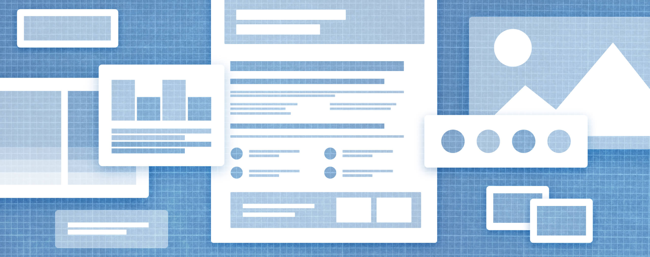
Mega menus: What they are, why they work, and how we design them
How quickly a visitor can understand and use your website’s navigation determines whether they stay or leave within the first ten seconds of landing on your site. Not only can an intuitive navigation system keep someone on your site, but it can also build trust and foster positive associations with your product, service, and brand. That’s not a lot of wiggle room to get it wrong, making it all the more important to get it right.
In the early to mid-2000s, mega menus gained popularity on the web for their ability to simplify complex content and offer a visually engaging, organized way for users to discover what they need. They allow website designers and marketers to balance business objectives with user experience in a way that traditional drop-down menus often can’t, making them a great option to ensure your users aren’t bouncing.
So, let’s dive into what mega menus are, why they work, who they’re for, and practical tips for designing them. Whether you’re looking to optimize your existing website, redesign or launch a new site from scratch, we’ll uncover if and what kind of mega menu is right for you.
What are mega menus?
Mega menus are a hierarchical navigation, which is a structured approach that helps users understand how pages are grouped or nested within themselves, and typically include features like:
- Drop-downs that display all items under a category at once.
- Multi-column layouts with headings and/or lists.
- Interactive or fly-out menus, where additional options within a category are revealed after being hovered over or clicked.
- Pinned content pieces, utility links, and resources for easy access.
- Imagery and icons.
Mega menus also appear in the following three general orientations and structures.
Horizontal mega menus
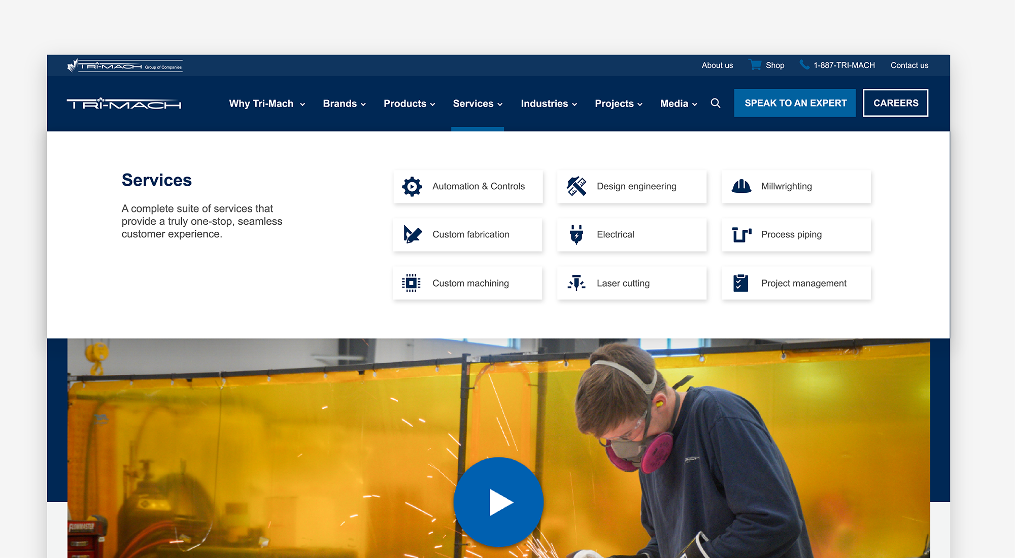
Horizontal mega menus are the most common layout you’ll see. They span across the screen either at the top or bottom of a webpage, making them highly visible and accessible. This orientation works well for websites with numerous categories, like Tri-Mach, for example, as it provides enough space to display content in a way that allows users to easily skim and understand the site’s structure and find the option they’re looking for.
Vertical mega menus
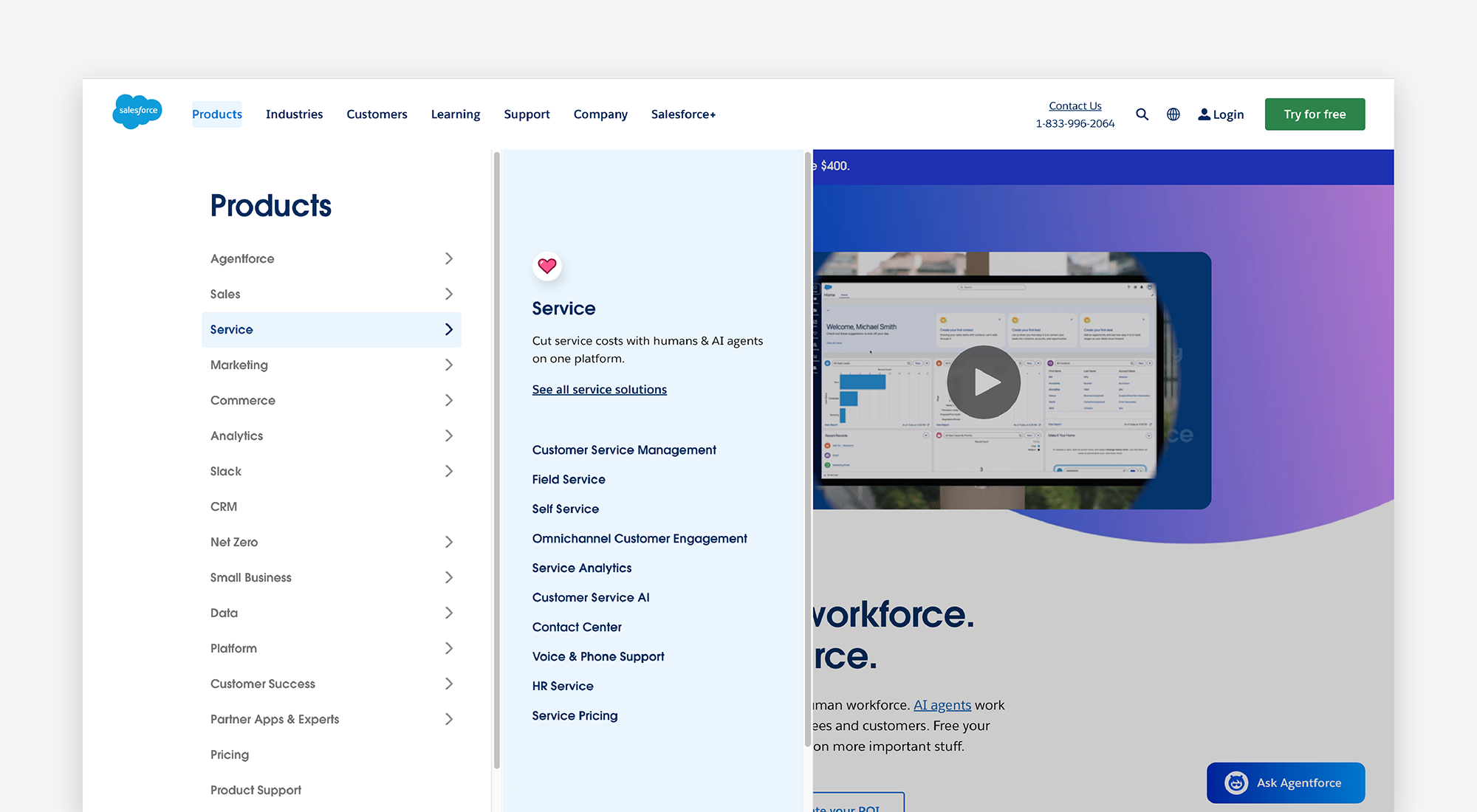
Vertical mega menus are displayed vertically down the side of a webpage, usually on the left side, resembling a sidebar. They can include additional fly-out menus and other interactive features. These menus are best for websites with complex information architectures that require multiple links at the top level, like the Salesforce website, for example. As depicted below, their product list is extensive with various subcategories within each, making a vertical mega menu a more efficient layout than a traditional horizontal mega menu, as it provides more space.
Tabbed mega menus
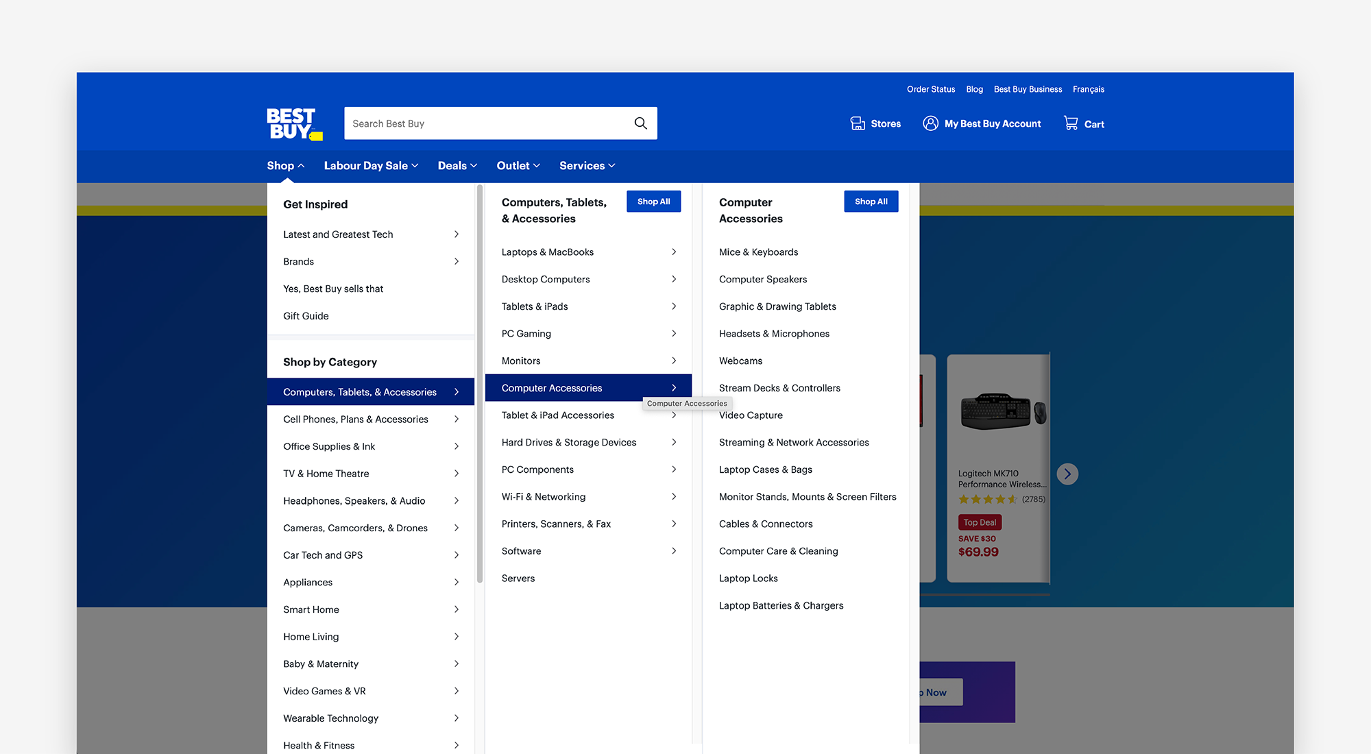
Tabbed mega menus feature tabs or tab-like elements, allowing users to switch between different categories within the menu. The benefit of this approach is that you can organize content in a structured way, allowing users to explore the menu at their own pace. Revealing options as they progress, rather than outlining everything at once, reduces overwhelm and creates an experience that makes the relationship between information and content more understandable. Best Buy’s website utilizes this approach, breaking down its shop menu into bite-sized pieces.
Is a mega menu for you?
If you’ve made it this far, I’m sure you’ve already gathered that mega menus are best for content-rich websites with complex and deep information architectures, including multiple pages, products, services, resources, and content. Therefore, while mega menus can be more impressive, they’re not suited for all websites and businesses, as they require more content to fill them. If your website is simpler and your goal is to direct users to a single page, then a traditional navigation will suit you better.
Mega menus are also better suited for desktop-oriented audiences, as they are larger and can present a lot of information at once, making them a better screen size to take full advantage of the benefits of this menu. Suppose your audience primarily uses your website on mobile. In that case, a mega menu approach may not be the best choice for you, as translating it to smaller screen sizes may dilute its impact. Designing a mobile-first strategy for your navigation could be a better option.
What are the benefits of using a mega menu?
If you’re still unsure whether a mega menu is right for your website, consider the following benefits when comparing it to a traditional navigation drop-down menu:
- They’re more efficient. Since mega menus display all options at once and visually group related items, they make it easier for users to find and compare what they need faster.
- They’re visually appealing. Mega menus provide more space for visual elements, like icons, images, and typography, which can enhance the overall aesthetic of a website. Having a more visually engaging menu can also encourage more exploration and interaction from your users.
- They can increase engagement. When mega menus are executed well, with clear and organized options, they can result in higher click rates compared to traditional drop-down menus, as users are more likely to explore and click on items.
- They provide more opportunity for lead generation. With more space in a mega menu, you can add lead generation items, such as call-to-actions or pinned content pieces, to increase their visibility and conversion rates. However, be mindful not to distract or annoy your users with these. Use them wisely.
How we approach designing a mega menu
Given the complexity of this style of navigation, it is critical that it’s designed in a clear and non-overwhelming manner for your users. Just because you have more space to add to it doesn’t mean you should! However, before we dive into designing and laying out your navigation, ensure you’ve invested the upfront time in your site’s architecture and site map, as having these finalized will make it easier to make decisions that align with your content and website strategy. Taking the time to plan your website project thoroughly is worth the investment.
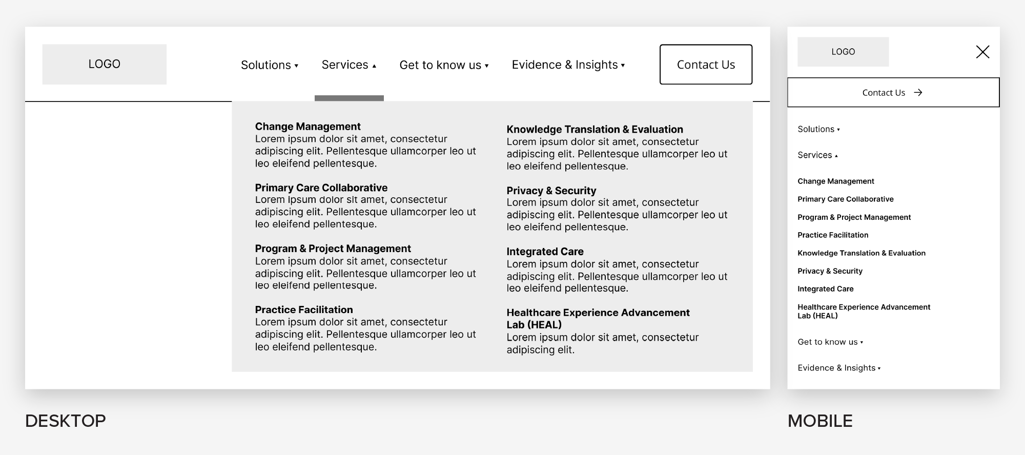
Start with a wireframe
Ignoring colour and any other stylistic approaches to your navigation, wireframe your main navigation and drop-down menus. Wireframes are intentionally simple, allowing us to explore our thoughts and make changes quickly and efficiently. When wireframing or providing feedback on a wireframe, ask yourself the following questions:
- What visual priority do elements need to establish a clear hierarchy? (ie. Headings, labels, buttons, eyebrow menu, etc.)
- What copy or labels are needed to improve the user’s ability to understand and navigate the menu? Keep them concise, descriptive, and universal.
- What pages must be in the main navigation? Consider what your users are most likely to be looking for and ensure it’s accessible.
- What pages are not essential to have in the main navigation? Should they be placed in the footer instead or somewhere else?
- What utility components are needed, and where should they live? (ie. Search bar, logins, user profiles, language switchers, etc. )
- Will visual cues or embellishments, such as icons or symbols, enhance or detract from the user’s ability to understand the menu?
- What interactions or steps could a user take that could make the menu easier to digest for your user? Like fly-out menus, tabs, or hovers?
- Which mega menu orientation will fit your needs? Will it give you the flexibility to add additional pages in the future?
- How will this layout translate to other screen sizes? Don’t forget to plan for these instances as well.
The approach you take will depend significantly on your application, screen size, type of content, and your users’ needs, but it’s best to keep it simple. Fewer options mean less to digest and less to understand for your user. The same goes for redundancy. Show an option only once in a menu. Duplicating options within different menus can cause the user to question whether they are the same or different.
Pro tip:
Avoid placing essential utility links, such as logins and search features, in a mega menu drop-down. These items should remain outside of drop-down menus for easy access and usability in the main navigation bar, eyebrow menu, or footer. Don’t make visitors search for these!
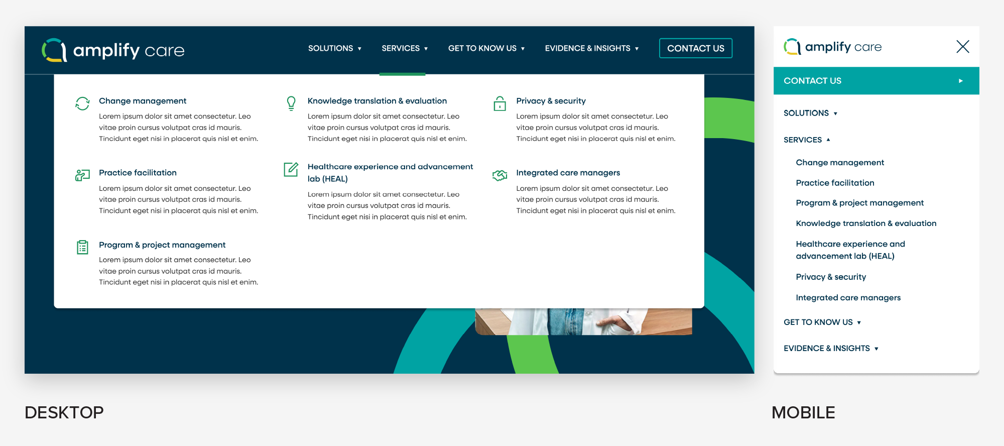
Apply UI design
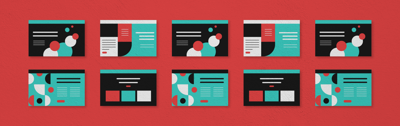
With the structure of your navigation and menus wireframed, layer your UI design onto your foundation. The key to a successfully designed mega menu is establishing hierarchy, which involves visually communicating the importance and order in which a user should read or skim a design. You can achieve this by using a combination of the following:
- Typography: Use headings, labels, and subheadings to guide users. If your brand guidelines allow for it, use different typefaces, case styles, and/or weights to add contrast between headings, links, and paragraph text.
- Sizing: Use size to communicate importance between different elements in your menu. Web designers typically use an 8-point grid system because it scales well across various screen sizes, from high-resolution desktops to smaller mobile devices. Since 8 is an even number, it can be divided and multiplied easily, resulting in clean and consistent scaling. In contrast, odd numbers may cause half-pixel offsets on some displays.
- Colour: Similarly to adding typography and playing with sizing, you can use colour to convey importance. For example, type, buttons, or icons could be a bold colour to draw the eye. You can also use background colours, line dividers, or outlines to help differentiate one section from another, communicating the relationship and flow between content.
- Elevation styles: In addition to or instead of colour, you can use subtle shadows or layering to signal depth. For example, adding a drop shadow to your menu can help it stand out from the webpage behind it.
- Icons and imagery: Visual elements like this can add interest but also further support understanding. For example, if you have three columns in your menu your first column could include icons giving them visual weight. Or all your utility buttons, like a login button, could have icons showing that they are different than your main call-to-action buttons.
- Visual cues: While this may sound similar to icons and imagery, you can add indications, such as an arrow, underline, or a hover effect, to menu items to signal that they open or are selected. This approach removes any guesswork for your user.
While you can use a combination of all these techniques, avoid overdesigning your mega menus; keep them simple, concise, and include only what is necessary, while also accounting for how your decisions will translate to different screen sizes. Changes to your design can be made later, once you gain insight into how users are interacting and engaging with your menu. We love using HotJar to collect user feedback and live sessions of users on our sites.
Accessibility and interactive considerations
A beautifully designed mega menu is only successful if all users can access and interact with it. Accessibility should be built into the design and development process from the start, not added as an afterthought. Here are key considerations to keep in mind:
- Build with assistive technology in mind: Not all users will navigate your website with a mouse. Your mega menu should be functional with a keyboard, including logical tab order, visible focus states, and the ability to open and close menus using standard keys (such as Enter or Space).
- Typography and contrast: Use a minimum font size of 16 px for legibility, taking into account your typeface and weight. Ensure that the colour contrast between text and backgrounds meets WCAG guidelines, for users with low vision or colour blindness. A great tool to utilize for this is Adobe’s Colour Contrast Checker, where you can toggle between AA and AAA standards against your values.
- Click vs. hover behaviour: Menus and drop-downs are more user-friendly when they open on click rather than hover. That’s because opening on hover can cause flickering or menus disappearing unexpectedly as users move their mouse across the screen. A click-based interaction ensures users are deliberate about their choices. However, if you must reveal on hover, delay it by 0.05 seconds before opening, as generally, if a user pauses on an item for this amount of time, they’re interested in seeing the additional options.
Choose the menu that suits your business and users
Mega menus, when planned thoughtfully, can transform your website navigation from frustrating to effortless. They allow you to present complex information and content in an organized, engaging, and visually appealing way while meeting both business and user needs. All while reinforcing trust with your brand and enticing users to explore your website. For websites with a smaller content library, single user journey and or just one offering, a simple navigation often creates a smoother, more intuitive experience than a mega menu ever could.


 Download