Is it time to rethink your brand colour palette? Here’s how to do it strategically.
Whether you’re refreshing your brand or building one from scratch, your colour palette plays a critical role in how people perceive and interact with your brand. It’s not just about aesthetics, it’s about recognition, trust, and consistency! The right colours can make your brand feel approachable, innovative, reliable, or bold. And in an increasingly digital world, your colour choices have to work across screens, print, and everything in between.
Sometimes in the B2B space, colour is treated like an afterthought and is often based on personal biases, when in reality, it should be a strategic decision rooted in accessibility, brand values, and user experience. An intentional colour palette can lead to better design outcomes and brand experiences.
Signs it’s time to rethink your brand colours
Just like your business evolves, your colour system should be flexible enough to adapt, whether that means simplifying an outdated palette, adding new tones to support growing product lines, or adjusting colours to meet accessibility standards across new media.
Knowing when it’s time to revisit your colour palette is key to maintaining a brand that looks sharp, functions well, and reflects who you are now, not just who you were when your logo was created. Here are some reasons it may be time to rethink your palette:
- You’re going through a rebrand – In this case, you already have a business case and you’re likely already doing a deep dive and revisiting many facets of your brand so this is a given.
- Your business has grown or changed directions – Are you offering a new service? Targeting a new industry? Moving from local to global markets? A shift in positioning often calls for a palette that better reflects your future, not your past.
- Your current colours are difficult to use or not accessible – If your palette lacks contrast, isn’t compliant with accessibility standards, or simply doesn’t work well across digital platforms, its time to rethink your palette.
- You have no clear hierarchy or consistency across touch points – If designers and marketing teams are guessing which colours to use where, or if your site, social, and print materials all look slightly different, your palette likely needs simplification or a better structure.
Examples of brands that have changed their brand colour palettes
Revisiting your palette is more common than you think. Recently we’ve seen big brands make some changes to their colour palettes
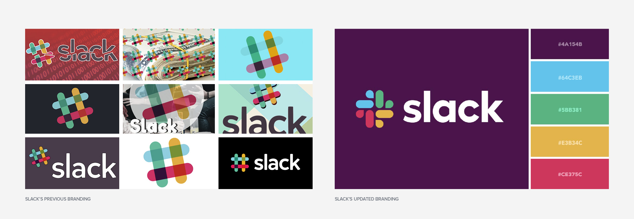
Slack’s original brand palette included 11+ colours, creating a lively but very chaotic system that was difficult to scale and even harder to maintain accessibility across interfaces. In their re-brand, they moved into a more streamlines 4 colour system and ensured that text and interactive elements were updated to meet or exceed WCAG 2.1 AA contrast standards. For dark mode, they didn’t just invert colours, they tested in context, ensuring legibility, vibrancy, and emotional tone remained intact.
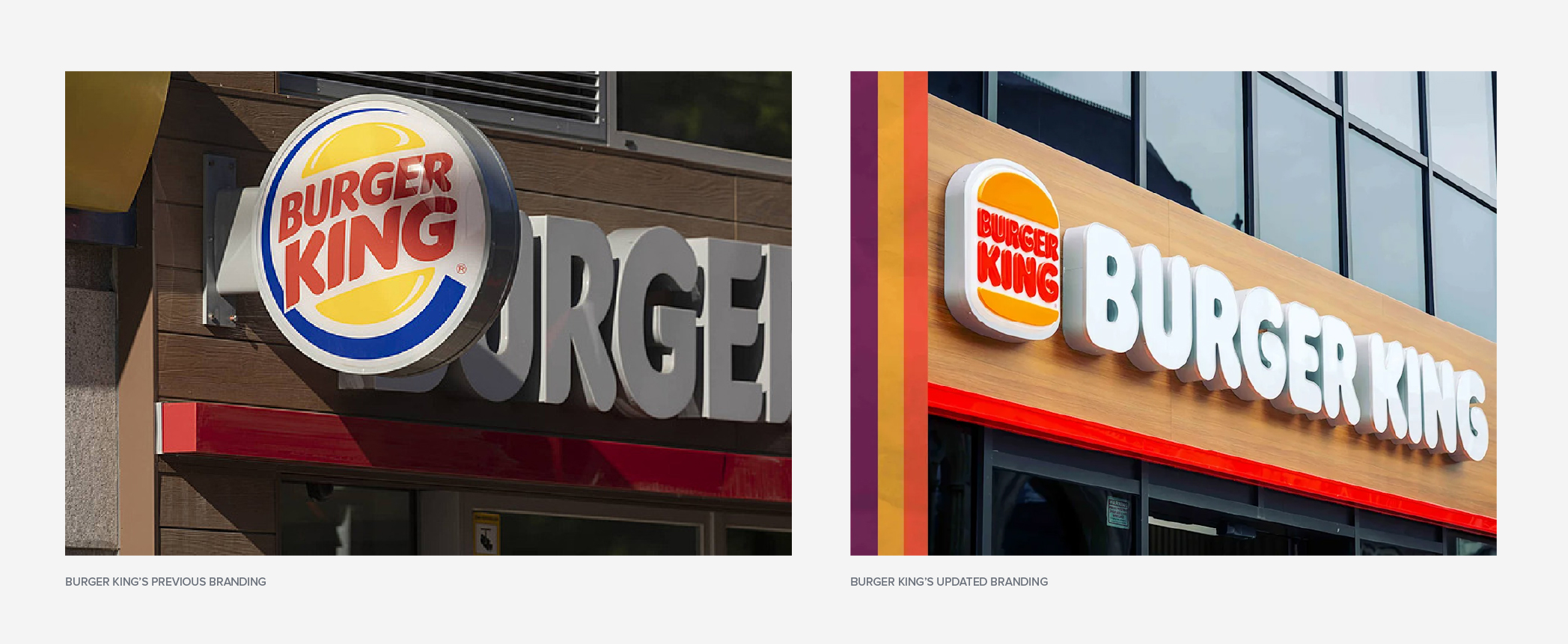
Burger King moved away from the shiny, over-processed look of the 200s, ditching gradients and glossy reds for a flat, retro-inspired palette using mustard yellow, warm brown, and punchy orange. This rebrand reflects a food-first, rich ingredient approach and better aligns with health-conscious and nostalgic consumers. It also brings warmth and simplicity back into their identity, both digitally and in-store. This shift wasn’t just visual, it was about reconnecting with brand values and cutting through the modern visual clutter.
Things to think about when choosing your colour palette
One of the most common missteps businesses make when developing their visual identity is choosing brand colours based on personal preference. Just because you love navy blue or you always wear olive green doesn’t mean those colours belong in your brand’s colour palette. Colour needs to serve a purpose. It’s a key tool for shaping the perception of your brand and creating an emotional connection with your audience. It can also be used functionally within design to do different things like create hierarchy or balance.
Colour structure and why it matters
Without structure, even the best colour palettes fall apart. Here’s why:
Better brand recognition
When your colours are used intentionally and consistently, they become part of your identity. Over time, your audience starts to associate your specific shades with your brand, even without your logo present.
Brand consistency across channels
Structured palettes keep your brand cohesive across all platforms. Without one, designers and marketing teams may guess or pull in new colours, and over time, that leads to chaos. This becomes very important when your brand exists in multiple environments like web, print, social, ads, etc.
Improved accessibility and user experience
A well-structured palette supports contrast, hierarchy, and usability, which are key factors for meeting AODA standards. Instead of asking “what looks good here?” structured palettes ask “what works best here?”
Ask yourself the following when choosing new colours
A strategic colour palette should be built around your brand personality, your industry, and how you want your audience to feel when they interact with you—all while taking the importance of colour structure into account. Think about:
- How should our brand make people feel?
- What qualities do we want our brand to evoke?
- What are our brand values and how can colour help express them?
- What’s our brand’s personality?
- How much do we want to stand out or fit in within our industry?
- What colours have negative connotations within our industry that we should steer away from?
- Do we carry any brand equity in relation to certain colours that we shouldn’t consider straying away from?
- Are we taking accessibility into account within our palette?
- Where are the places that we need to show up? Purely digital or are there physical aspects to our product that we should consider as well?
Ask yourself the following when analyzing your existing colours
If you’re going through a rebrand and scrapping your entire look and feel, then you may not spend as much time here. But if you’re looking to make small tweaks then this is for you. A major component of determining your new palette also includes auditing your existing colour system. We like to start off with an audit which uncovers what’s working and what isn’t:
- Which colours are most recognized and associated with your brand?
- Are certain colours clashing or breaking down in usability?
- How does your palette perform across platforms?
- Are we using proper tools to assess all of our colour interactions for accessibility within our UI or collateral?
- Is there a colour structure in place?
- Are the colour usage guidelines clear?
A colour audit helps you identify where structure is lacking or where colours aren’t working. It’s a lot to consider, but that’s where working with a creative partner or agency makes all the difference. They’ll guide the discovery process showcase a variety of options and help you make the best choice for your brand.
Examples of colour palettes that took these questions into account
Your colours don’t need to be loud to be memorable, they just need to be intentional. They should reinforce your brand values and vice versa.
A great example is Equitable Life. Their recent rebrand introduced a confident teal that set them apart from the traditional or conservative insurance world, while still feeling trustworthy as required within the field of financial services. It communicates friendly energy, innovation and accessibility, which are pillars of their brand strategy. By choosing a more vibrant tone, compared to their old navy blue, they’ve positioned themselves as a competitive and exciting brand within a very conservative industry.

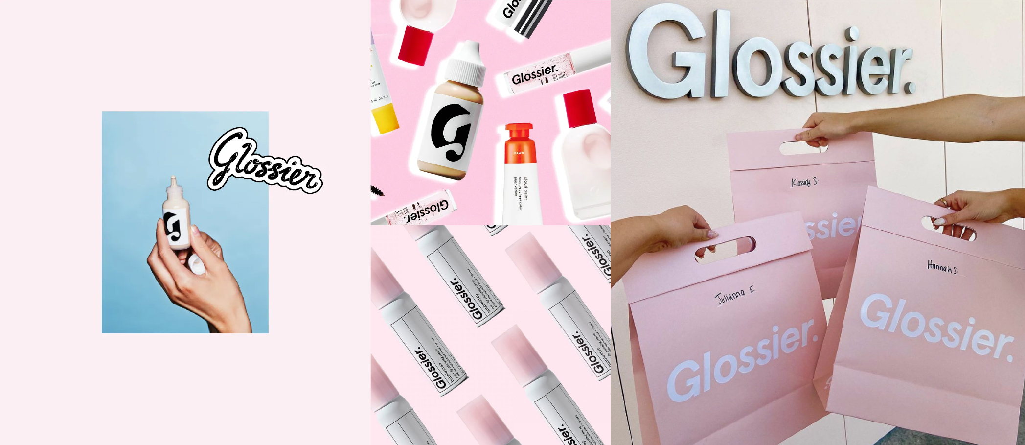
Another example is Glossier. Their iconic use of pink wasn’t just a trendy choice; it was a calculated one. The soft, muted tone speaks to comfort, community, and ease, all traits that align with their minimal product line and “skin first” philosophy. The colour became so recognizable, it essentially became its own brand asset.
Defining usage and guidelines for your colours
So, you’ve decided on your colour palette, that’s step one. Knowing how to use it effectively is where the real brand strength and visual consistency come into play. A well-structured palette is about more than just “pretty colours”, it gives your brand clarity, consistency, and control across every touchpoint, from websites and social media to packaging and pitch decks. To make this work, you need to define clear roles for each colour in your system to ensure your palette is being used with purpose. It’s about setting the creative direction.
Define the roles of each colour
You’ve probably heard of primary and secondary colours, but what do they mean? Every colour in your brand palette should have a defined job. This makes your brand easier to apply and easier to recognize.
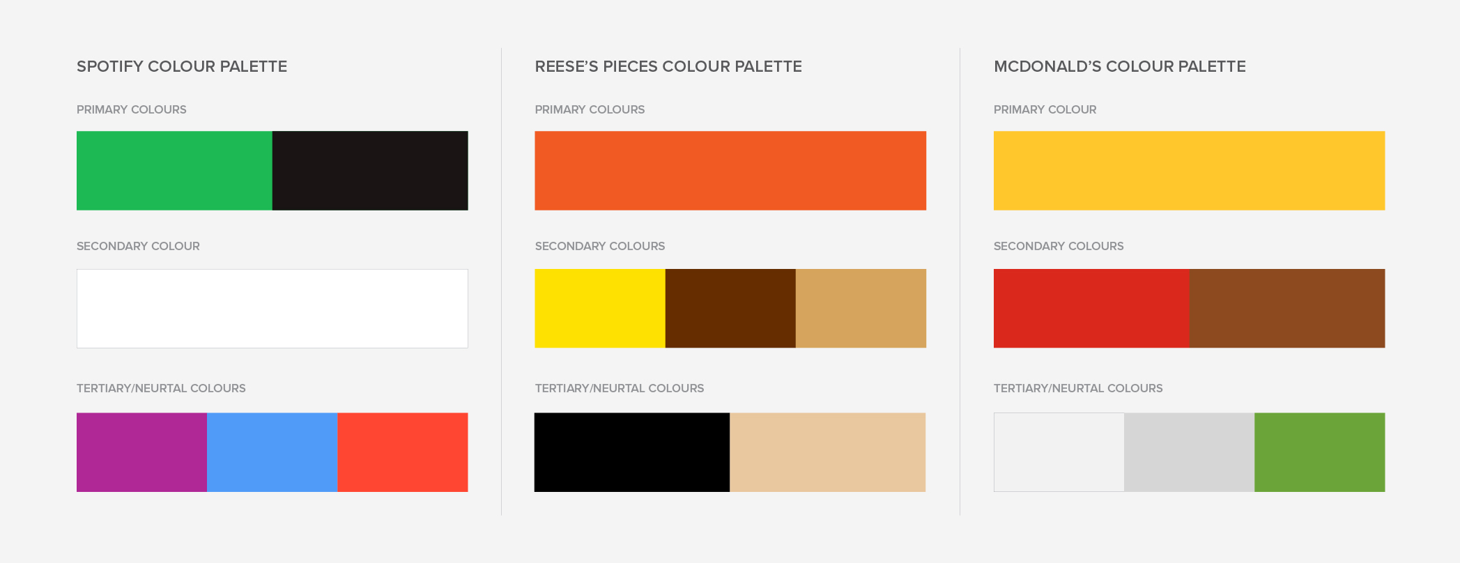
Primary Colours – If someone only remembers one colour from your brand, this is it.
- These are the core of your brand identity. They appear in your logo and are often repeated in areas like key headings, buttons, CTAs, and navigation.
- They set the tone and emotion of your brand.
- Some examples are Spotify’s neon green, Canva’s blue, McDonald’s yellow, Reese’s Pieces orange, Dell’s blue, Yahoo’s purple, Holiday’s Inn green.
Secondary Colours – These are used to create depth, variety, and visual interest without overpowering your primary colours.
- These are ideal for backgrounds, hover effects, and creating contrast.
- They help establish visual hierarchy, giving you more flexibility. Think of them as the supporting cast-mates on stage acting alongside the lead (primary colour).
- Some examples are Canva’s purple, Mcdonald’s red, Reese’s Pieces yellow and brown.
Tertiary Colours – Not the face of the brand but rather they help your brand function.
- These include neutrals, support colours, and functional shades used for UI, icons, alerts, or data visualization.
- Think of these as the backbone of your design system. Greys, off-whites, soft blues, greens for success states, red for errors, etc.
- They are more universally used for function over being “brand personality elements”.
Colour splits and usage rules
Even with a great palette, things can go wrong if colours are used in the wrong proportions. That’s where usage rules and ratios come in. Splits can help teams apply colour consistently when designing.
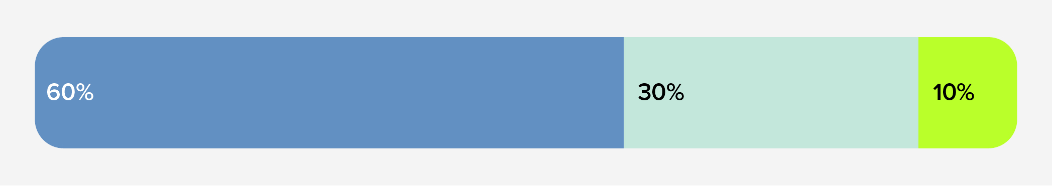
The 60-30-10 Rule (borrowed from interior design)
This simple framework helps maintain visual balance when applying colours.
- 60% Primary colours (backgrounds large sections, body sections)
- 30% Secondary colours (Subheadings, icons,)
- 10% Tertiary colours (CTA’s, buttons, highlights)
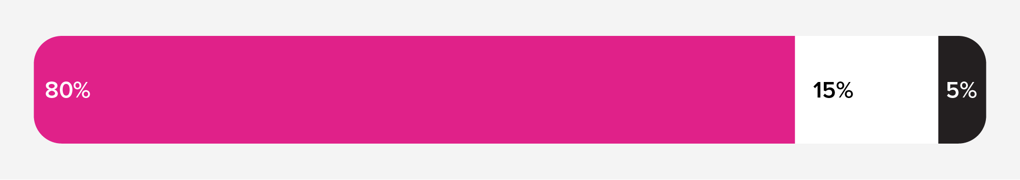
Brand heavy ratios (80-15-5)
Some iconic brands like IKEA and Barbie use a bold, heavy emphasis on their primary colour for maximum recognition.
- 80% Primary
- 15% Neutral
- 5% Accent
This approach is more rigid, but highly effective when you want colour to be central to brand recognition
Functional colour usage (design systems)
In modern UI designs, colours are often assigned a function, not a ratio.
- Primary – Logo, nav, brand headers
- Secondary – Cards, charts, section dividers
- Tertiary – buttons, notifications, success and error messages
- Neutral – backgrounds, typography
Is it time to rethink your colours?
Your colour palette isn’t a static brand element you choose once and forget. It’s a living part of your visual identity that should grow and adapt alongside your brand. When chosen strategically, applied consistently, and evolved with purpose, your palette can strengthen recognition, improve user experience, and make your brand more memorable.


 Download

 Deck
Deck