The blueprint for an impactful B2B sell sheet
Creating a sell sheet sounds easy, until you actually try to make one. You open a blank page, stare at it for a few minutes, and suddenly the panic sets in. Where do you even start? The headline? The layout? Is that too much text? Not enough? How big should my logo be? (Hint: smaller than you think).

On paper, it should be simple. One page…a few bullet points, a logo, maybe a photo. But in the B2B world, a sell sheet is more than that. It’s a silent salesperson working overtime at trade shows, in inboxes, and in boardrooms.
The real challenge is packing clarity, credibility, and visual impact into one page without turning it into a wall of text or a design meltdown. The good news? We’ve broken down everything you need to build a one-pager that actually gets results.
What is a sell sheet?
A sell sheet (sometimes called a sales sheet) is a one-page document that highlights the most important details about your product, service, or company. Think of it as your elevator pitch, but on paper. Its job is simple. Grab attention fast and show potential clients how you can solve their pain points. Done well, it educates, builds interest, and nudges prospects further along their buying journey.
Don’t get lost in the jargon
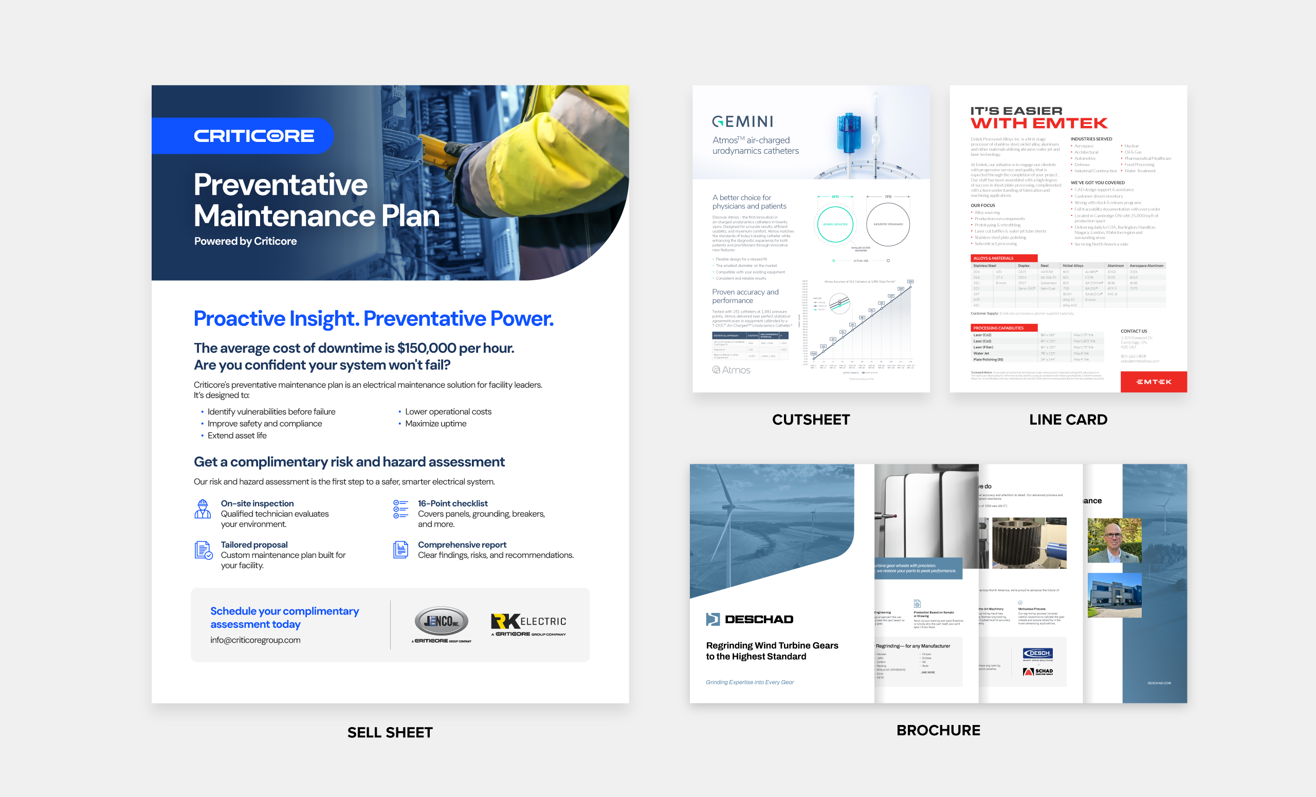
Marketing teams often toss around similar terms like cut sheet, line card, or brochure. While they sometimes get used interchangeably, they serve different purposes.
- Sell sheet: One-page elevator pitch.
- Cut sheet: Focuses on technical details such as specs, dimensions, and performance metrics.
- Line Card: Summarizes your company’s full product or service lineup.
- Brochure: A multi-page piece designed for deeper story telling about your brand or offerings.
Why does a sell sheet matter?
A sell sheet might look simple, but in B2B marketing, it carries serious weight, especially when you don’t always get the chance to connect directly with potential buyers. Decision-makers are busy, and attention spans are short. A clear, well-designed sell sheet delivers your value at a glance: what you offer, how it solves their problem, and why they should care. It’s a more traditional sales tool but still powerful—especially at in-person events or during one-on-one engagements. A strong sell sheet can:
- Build Brand Trust and Consistency: Keeps your team speaking the same language across every touchpoint. A polished, professional design signals reliability and reinforces credibility.
- Save Time for Busy Buyers: Quickly communicates what you do, how it helps, and why it matters, without requiring a meeting or a deep
- Reinforce Sales Conversations: Acts as a leave-behind or digital follow-up that keeps your solution top of mind long after the meeting ends.
- Adapt to Different Audiences: Who are you really selling to? Not every stakeholder values the same thing. Tailored versions let you speak directly to different roles, industries, or buying stages.
- Empower Sales and Marketing Teams: Gives your team a reliable, go-to resource that makes pitching easier and more aligned.
- Drive Action: A strong message, clean layout, and clear call-to-action turn interest into leads.
How to make a strong sell sheet
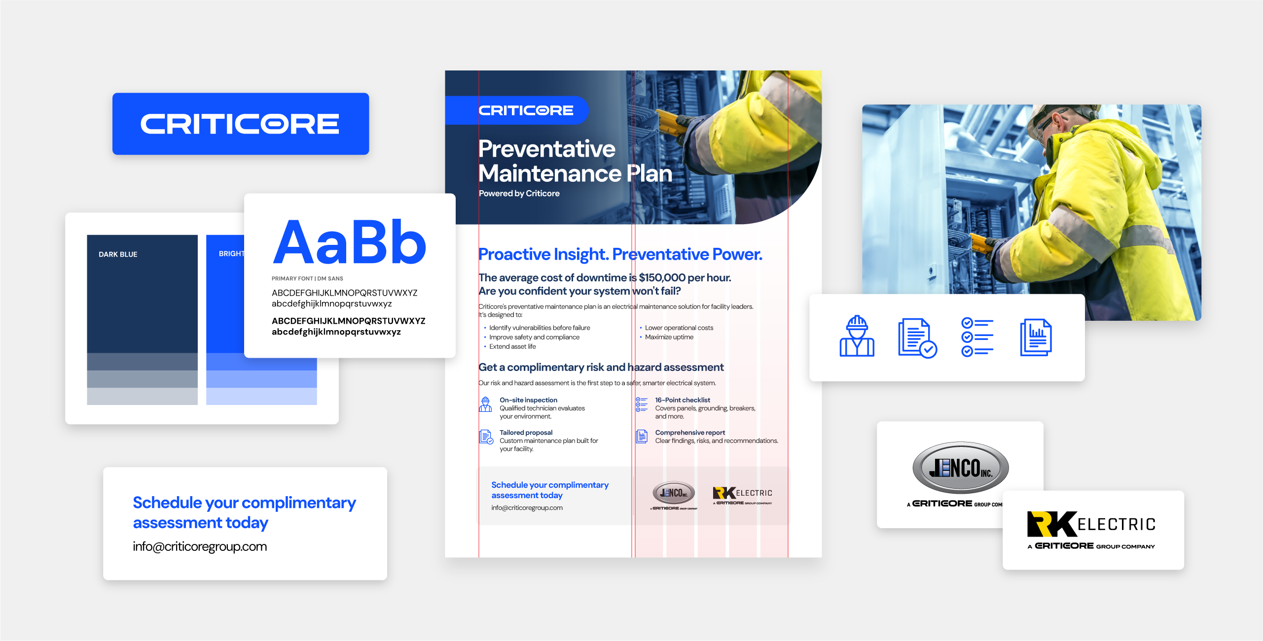
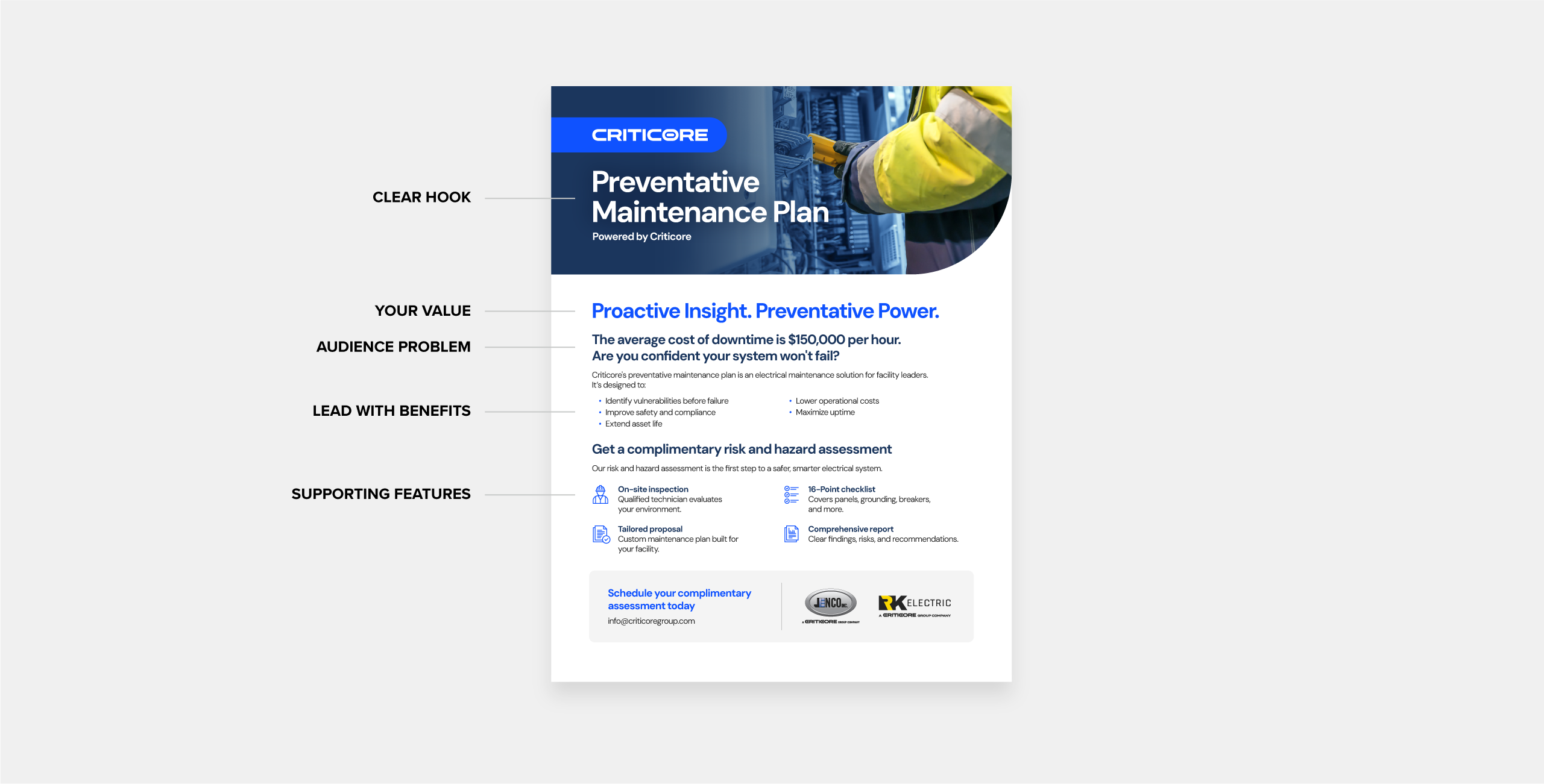
In B2B marketing, first impressions count. That’s why design matters just as much as the content. From branding and layout to visuals and typography, every choice shapes whether your one-pager gets read or recycled. Take this one, for example. A Preventative Maintenance Plan designed to help facilities identify electrical vulnerabilities before failure, improve safety and compliance, and extend equipment life. It’s a great example of how clear structure, strong visuals, and focused messaging can turn a simple sheet into a powerful sales tool.
Let’s break it down and see why it works so well.
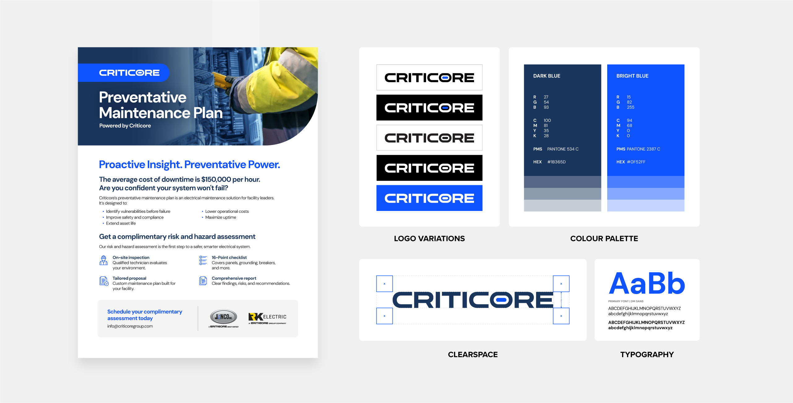
Consistent branding
Your sell sheet should instantly feel like you, not a generic handout that could belong to anyone. Consistency across visuals and tone builds recognition, trust, and professionalism. In B2B, that trust can be the difference between getting noticed and getting ignored.
In our example, the bold headline Preventative Maintenance Plan leads the design, while the subhead Proactive Insight. Preventative Power. reinforces the message. The logo is present but secondary, quietly supporting credibility.
Typography and colour stay on-brand: industrial greys, clean blues, and crisp typefaces that signal reliability and technical precision. Photography shows real technicians on-site, inspecting panels and documenting reports. It feels authentic. Every element feels deliberate, consistent, and trustworthy.
- Logo: Keep it visible but secondary to your headline. The headline should lead the design, while the logo quietly reinforces your identity.
- Brand Guidelines: Your brand guidelines is your compass. They ensure your voice, tone, colours, fonts, and imagery stay on course.
- Typography & Colour: Stick to brand-approved fonts and colours. Avoid experimenting with new shades or typefaces that dilute recognition.
- Visual Elements: Align icon styles, illustrations, and photo treatments for a cohesive look.
- Tone & Messaging: Consistency isn’t just visual. Your wording, phrasing, and personality should feel unmistakably on-brand.
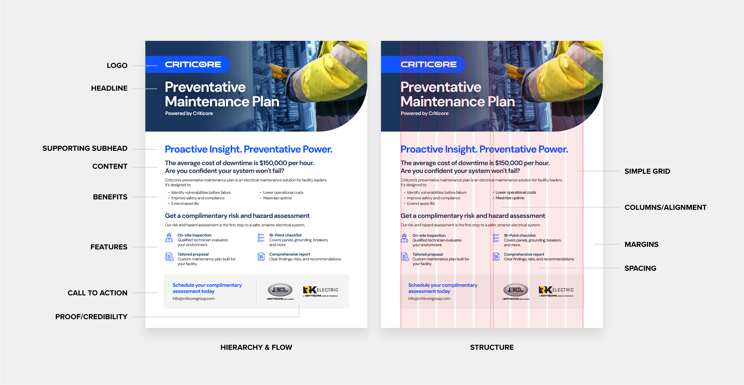
Proper layout structure
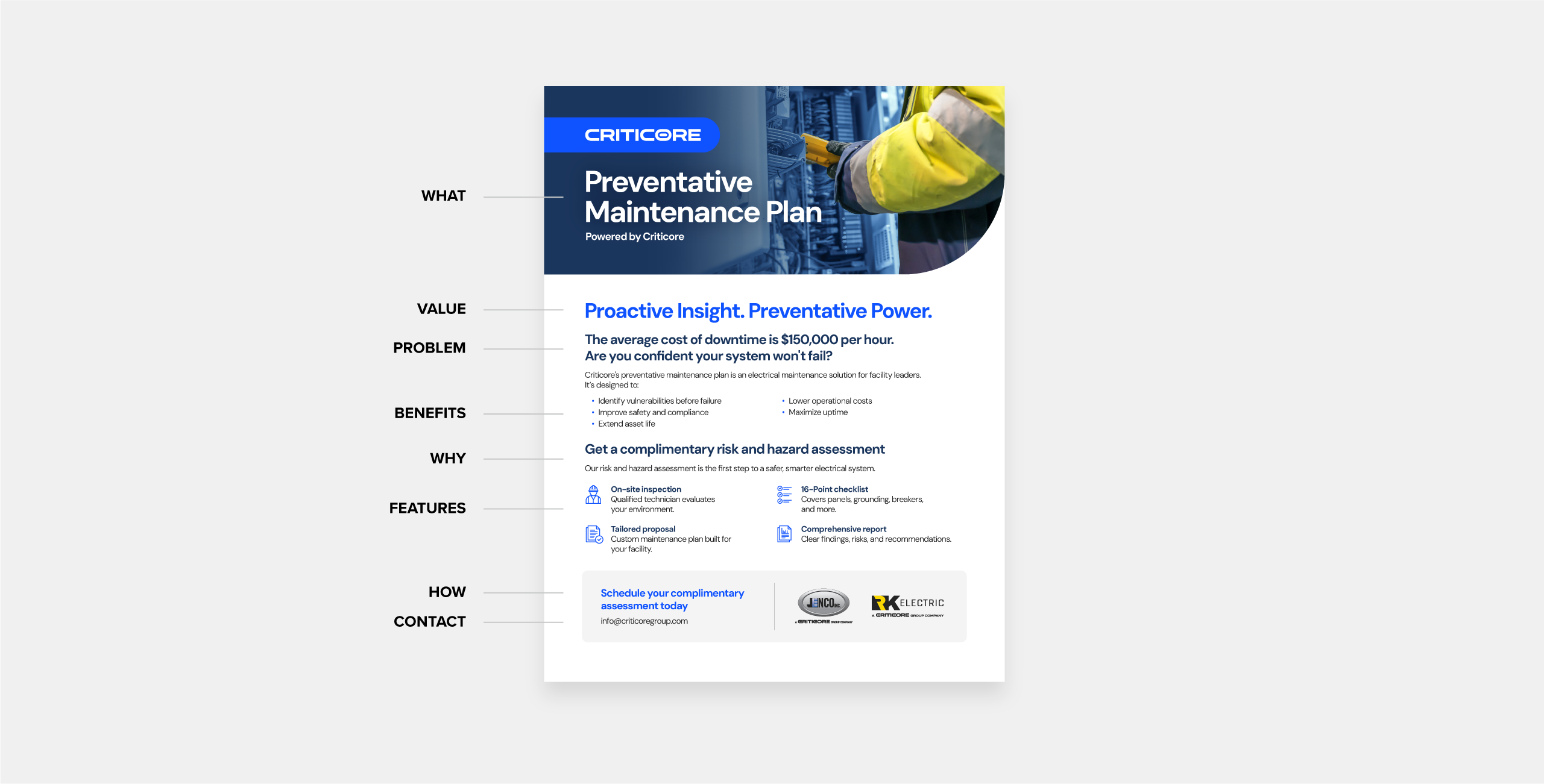
A strong layout gives your message order and flow. It guides the reader’s eye naturally, from headline to proof, without confusion or clutter.
In the example, everything follows a clear rhythm. The headline Preventative Maintenance Plan leads, followed by the subhead Proactive Insight. Preventative Power., and a short, tension-building line pulls the reader in right away.
From there, the design moves naturally through the benefits, features, and call-to-action (Schedule your complimentary assessment today). White space and clean alignment keep the page calm and easy to scan, while visuals like the 16-point checklist and inspection imagery sit neatly beside their related content. Nothing feels random; everything reinforces the story of proactive maintenance and reliability.
- Hierarchy & Flow: Map content logically: logo, headline, intro, benefits/features, proof, and call-to-action. It leads readers from curiosity to conversion.
- Columns & Alignment: Use a simple grid to create balance and organization. Consistent alignment between text and visuals, keeps the design feeling intentional and professional, while uneven spacing can make even great content look sloppy.
- Margins & Spacing: White space is not wasted space, it’s structure. It gives the page breathing room and helps readers process information more easily. Tight spacing can make content feel overwhelming, while generous margins create focus and flow.
- Visual Balance: Keep text and visuals evenly distributed so the eye moves easily across the page.
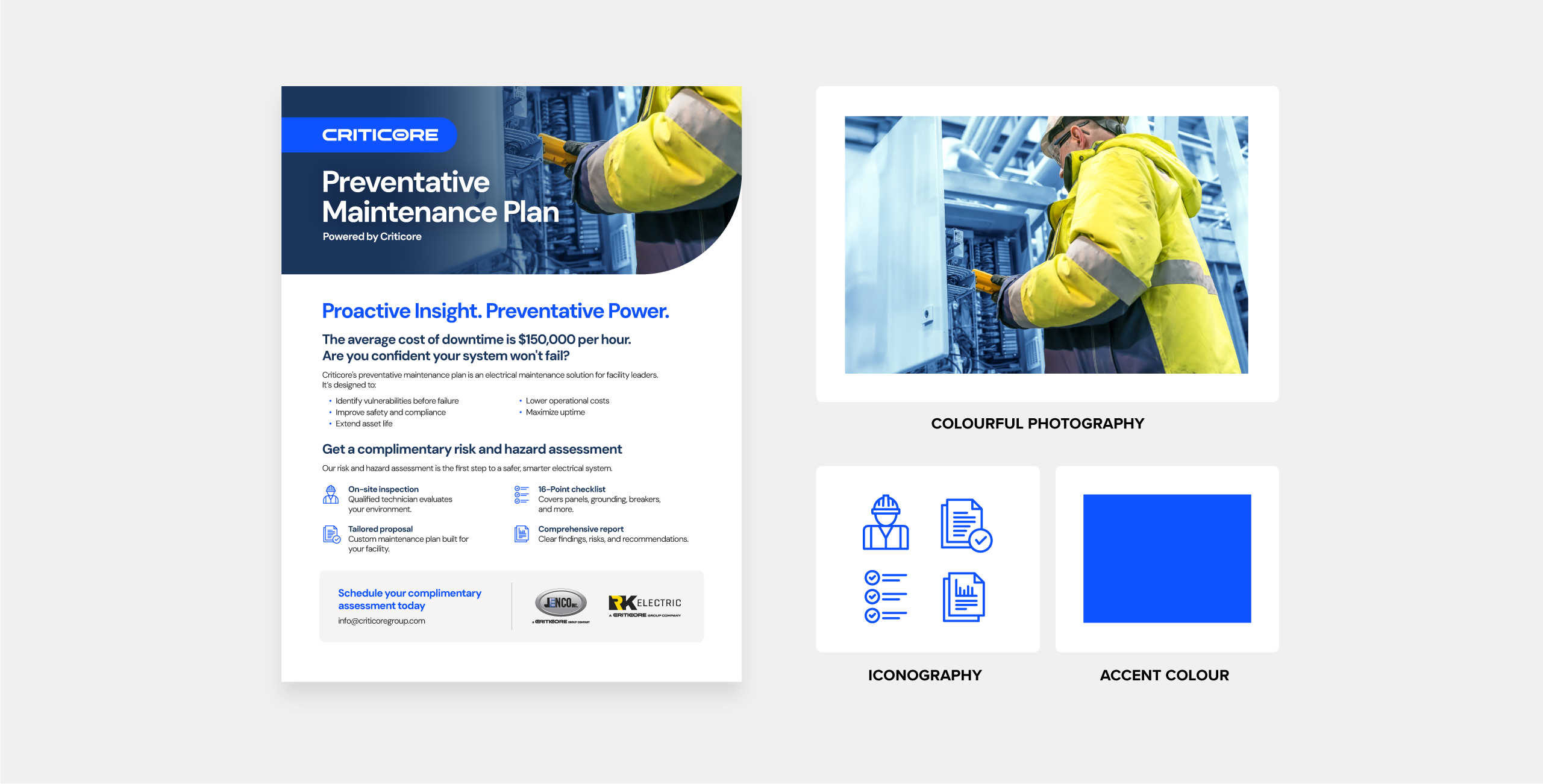
Colourful visuals
Visuals and colour do more than make your sell sheet look good, they make it work. They tell your story, clarify complex ideas, and guide the reader’s attention where it matters most.
The example uses real photography and branded icons to make the content scannable. Instead of abstract graphics or handshake stock photos, it features inspection imagery and branded iconography that communicates professionalism.
Accent colours highlight key ideas like “16-point checklist” or “Comprehensive report,” drawing the eye without overwhelming. The palette reinforces trust, and the white space around visuals creates focus. It’s simple, credible, and designed to work hard in both print and digital formats.
- Photography: Use authentic, high-quality imagery that shows your product or service in context. Real images build credibility, while cliché stock photos (like handshakes or staged office shots) can cheapen your brand.
- Icons & Diagrams: Branded icons and simple diagrams make information easier to digest and help organize content in a visual way.
- Colour Use: Stick to your brand palette for instant recognition. Use accent colours intentionally to highlight key sections or calls to action, and maintain strong contrast for readability.
- Balance: Don’t overdo it. Too many bright tones or using colour everywhere competes for attention. Let white space work with colour to create focus and flow.
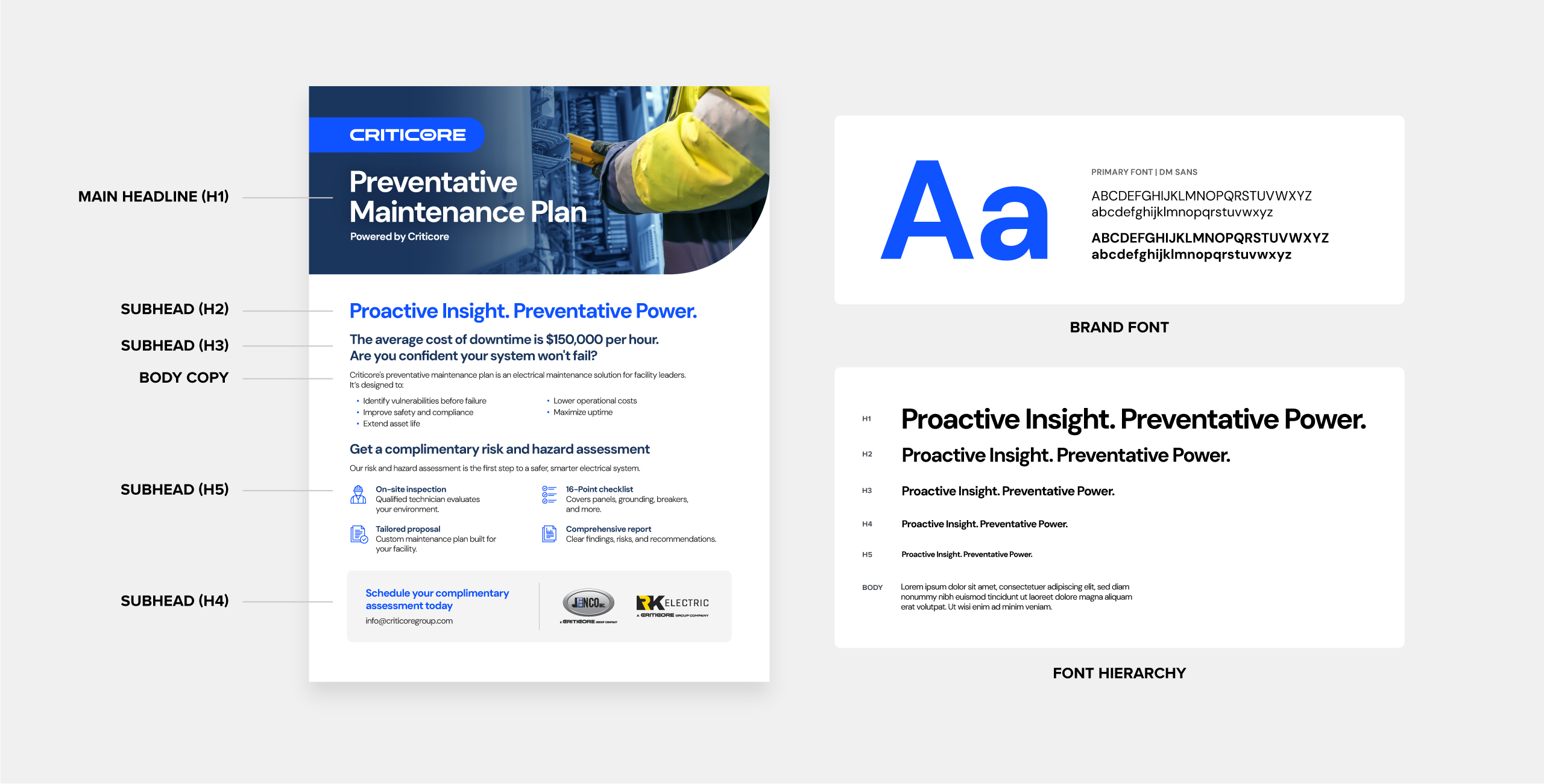
Clear typography
Good typography is like good design, invisible when done right. It shapes how readers experience your content and sets the rhythm for how they move through the page.
This sheet uses a clean sans-serif for headlines and a highly legible body font. The hierarchy is clear: bold for the headline and subheads, regular for body copy. Font sizes and weights help the reader scan quickly from key takeaway to features. Text sits on clean backgrounds for maximum contrast. A dark fade is added in the header to improve legibility over the image. Each section is easy to read whether printed or viewed on a screen.
- Font Hierarchy: Define clear levels for headlines, subheads, and body text so readers can scan quickly and understand what’s most important. A strong headline should draw attention, subheads should group related ideas, and body text should quietly deliver the details.
- Readability: Choose clean, legible typefaces with enough contrast between text and background. Avoid thin weights, overly stylized fonts, or text placed over busy images.
- Number of Fonts: Stick to one or two typefaces (for example, one for headlines and one for body copy). Too many fonts create visual noise and weaken brand consistency. Instead, rely on weight, size, or colour variations within a single font family to add interest.
- Spacing & Alignment: Give your text room to breathe. Proper line height and consistent alignment make dense content easier to read and more polished overall.
- Restraint: Use bold, italic, or caps only when you need emphasis. If everything is shouting, nothing stands out. Strategic restraint makes your content feel confident, not cluttered.
Compelling headlines & informative content
Your headline is your hook. The line that decides if someone keeps reading. It should grab attention, communicate value, and make readers want to know more. Make it concise, concrete, and clear about the value you deliver. In this case, it’s simple and direct: Preventative Maintenance Plan.
The subhead Proactive Insight. Preventative Power. adds punch and alliteration. Together, they tell the reader what this is and why it matters. The short supporting line creates a little urgency without being fear-mongering.
The intro paragraph explains what the plan is, who it’s for, and why it matters: Protect your facility, your people, and your bottom line with a preventative maintenance plan built around compliance, safety, and reliability. It’s concise, informative, and sets the tone for the benefits that follow.
- Keep It Short and Clear: Stick to one or two lines (typically around 5-10 words, but not always) that highlight the value you deliver.
- Lead with the Benefit: Focus on what your audience gains, not just what you do. Make it immediately relevant to their challenges or goals.
- Ditch the Jargon: Avoid buzzwords and filler terms like “cutting-edge,” “revolutionary,” or “industry-leading.” Simple, direct language is what connects.
Once you’ve got their attention, follow with an intro paragraph that acts as your elevator pitch on paper—what you do, who it’s for, and why it matters.
- Stay Focused: Speak to your reader’s problem and how you solve it. Skip the company history or technical deep dive.
- Be Concise: Two or three short sentences are plenty. If it starts feeling like a block of text, break it up into multiple paragraphs to make it more approachable.
- Lead into the Next Section: Your intro should set up the benefits or feature points that follow, creating a seamless flow from curiosity to credibility.
When your headline and intro work together, they deliver the perfect one-two punch.
Communicate the benefits, not just features
Features describe what something is. Benefits explain why it matters. That’s the difference between a product list and a solution that sells.
In the Preventative Maintenance Plan example, the focus stays on outcomes, not technical jargon. It leads with what buyers actually care about: staying compliant, avoiding costly breakdowns, and keeping operations running smoothly. Phrases like “Identify vulnerabilities before failure” and “Improve safety and compliance” instantly connect to real pain points.
The features, like on-site inspections, tailored proposals, a 16-point checklist, and a comprehensive report, are still there, but they serve as proof. They show how those results are achieved, not just what’s included. It’s a subtle shift, but it turns a list of services into a story about value, reliability, and peace of mind.
- Lead with Value: Focus on outcomes first (“Reduce downtime by 40%”), then support with features (“thanks to automated monitoring”).
- Structure for Flow: Follow a simple structure to keep your message clear and persuasive. Start by defining the problem, present your solution, back it up with proof, and end with a clear call to action.
- Keep It Visual: Use icons, blurbs, or colour blocks to make benefits easy to scan at a glance.
- Focus on What Matters: Highlight the top three to five benefits that tie directly to your buyer’s goals
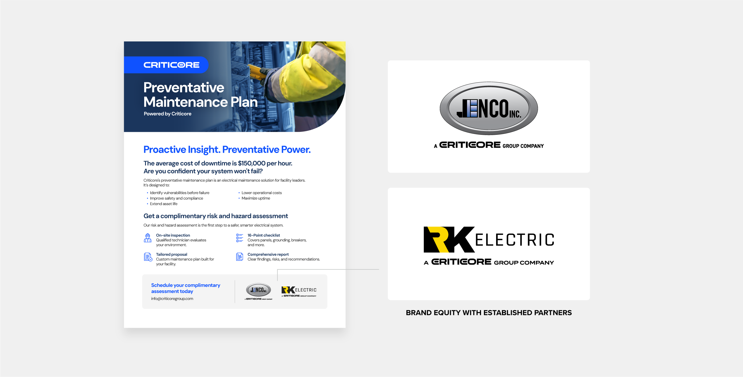
Back it up with data, social proof, or endorsement
In B2B, buyers are cautious, and fair enough, they’re making big decisions with big budgets. That’s why proof isn’t optional. Numbers, testimonials, and recognizable logos give your claims credibility and help readers trust that you can deliver.
In the example, Criticore’s credibility is backed up by the equity and partnership of Jenco Inc. and RK Electric.
- Stats That Matter: Back your message with measurable results. Highlight metrics that matter to your audience such as efficiency improvements, cost savings, uptime, reliability, or ROI. Quantifying outcomes turns vague claims into tangible evidence.
- Logos & Certifications: Showcase who trusts you and the standards you meet. Client logos, industry memberships, or ISO certifications all act as quick visual trust signals that help legitimize your brand in seconds.
- Testimonials with Impact: Keep them short, specific, and attributed to real people. Focus on outcomes and transformations rather than generic praise. “Reduced downtime by 40%” beats “Great company to work with.”
- Make it Visual: Turn data into simple infographics, icons, or callouts that are easy to scan. Visualizing results helps information stick and makes your achievements feel more impactful.
- Context Matters: Place proof points near related content. For example, pair a testimonial with the benefit it supports. This reinforces your credibility right where it counts.
A decisive call-to-action
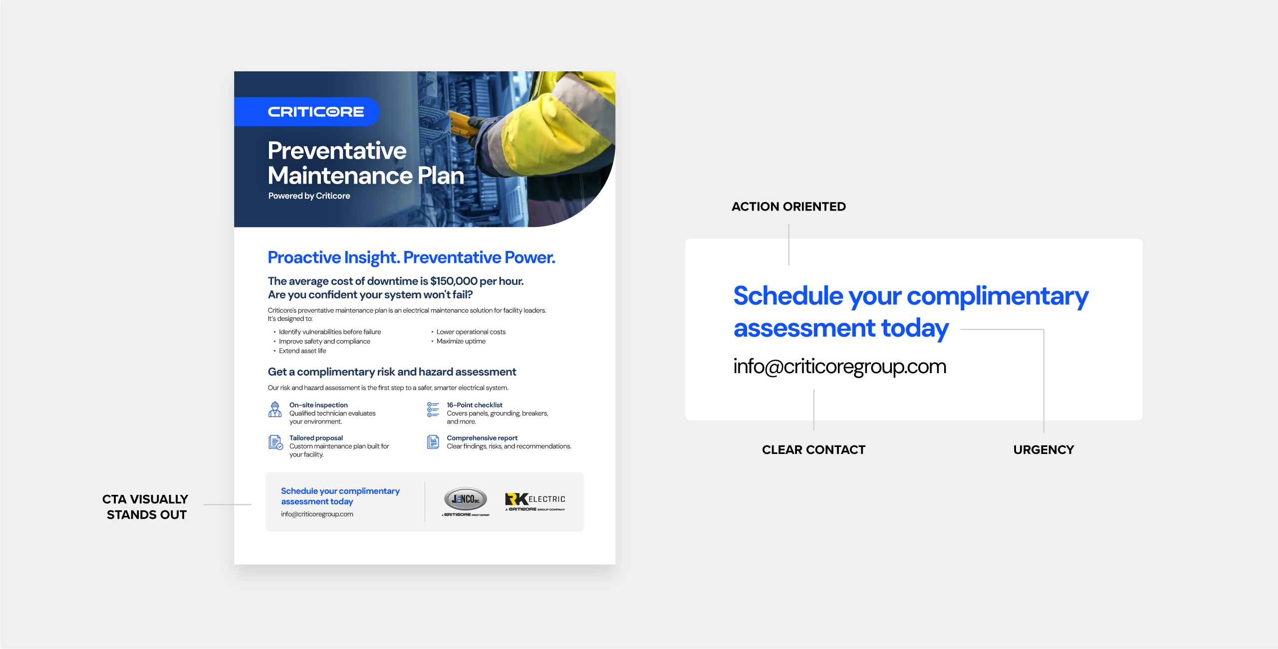
Every sell sheet should end with a direction. Once you’ve caught their attention and earned their trust, tell them exactly what to do next. A clear, well-placed call to action turns interest into action. It’s the difference between “that’s nice” and “let’s talk.”
This sheet doesn’t waste time with “Schedule your complimentary assessment today”. It’s specific, action-oriented, and low-commitment. An easy “yes” for a time-strapped operations manager. The highlighted call to action is clearly visible at the bototm of the page using colour and whitespace. The supporting contact information informs the reader on how to get in touch.
- Be Action-Oriented: Use strong verbs that encourage movement such as “Request a Quote Today,” or “Book a Demo Now”. Generic CTAs like “Learn More” or “Click Here” don’t motivate action or convey value.
- Create Urgency: Adding words like today or now can make your CTA feel more immediate and actionable. Even subtle urgency helps prompt faster follow-ups.
- Make It Visible: Your CTA should stand out visually. Use colour contrast, whitespace, or placement to draw attention. Position it prominently near the bottom of the page.
- Offer Options: Don’t assume everyone wants to reach out the same way. Include your phone, email, website, and even a QR code that links to a landing page or booking form for quick digital access.
Best practices & common mistakes
If someone can tell who you are, what you offer, and what to do next in five seconds, you’ve nailed it. Here’s what to avoid (and what to do instead):
 Don’ts
- Overloading with Information: Trying to cram every product detail, service, and spec onto one page only creates clutter. Crowded layouts overwhelm readers.
- No Structure or Visual Hierarchy: When everything is bold, nothing stands out. Without a clear hierarchy or alignment, the reader’s eye doesn’t know where to go. Random spacing and inconsistent formatting make the design look chaotic and unprofessional.
- Inconsistent Branding: Mismatched colours, multiple fonts, and inconsistent logo use make your brand look disorganized. In B2B, consistency equals reliability. Use colour deliberately, too much of it can distract from your message.
- Weak or Missing CTA: A polished design means nothing if it doesn’t lead somewhere. Generic CTAs like “Learn more” or “Visit our site” don’t inspire action. Be specific and tell readers exactly what to do next.
- Cliché or Stock Imagery: Handshake photos and overly staged shots scream “template.” Generic visuals reduce trust and make your message feel less authentic and weaken credibility.
 Do’s
Do’s
- Keep It Simple and Focused: Stick to one key message or offer per sheet. You’re not trying to tell your whole story, just enough to get the prospect interested. Lead with the why: the outcome you deliver before the details of how you do it.
- Use Strong Visual Hierarchy: Guide the reader’s eye intentionally, from headline to visuals to CTA. Stick to one or two fonts and consistent sizing for a clean, cohesive look.
- Balance Text and Visuals: Aim for roughly a 50/50 mix of text and imagery. White space is not wasted space; it helps your message breathe and makes the content feel approachable.
- Add Proof: Support your message with quick, credible proof. Short testimonials, recognizable client logos, or key stats build instant trust and legitimacy.
- Design for Both Print and Digital: Your sell sheet should perform both on screen and in print. Keep your digital files light enough to email, and your print files high-resolution to print beautifully.
Delivering for both print and digital
A great sell sheet should look just as sharp on paper as it does on screen. That’s why it’s best to export two versions, one for print, one for digital. Whether it’s being handed out at a trade show or attached to an email, the technical side of your design can make or break the final impression.
When exporting, pay attention to file settings, colour profiles, and compression. And to keep things organized, label your files clearly so they don’t get mixed up. It’s very important that you don’t accidentally print and digital file as the imagery will look pixelated and your colours may not look accurate. I like to add “Print” or “Web” at the end (for example, Criticore-SalesSheet-Print.pdf).

Print deliverables
- Resolution: Always use high-resolution images (300 DPI minimum). Low-res graphics that look fine on screen can appear blurry or pixelated in print.
- Colour Mode: Convert all colours to proper CMYK values, to ensure they print accurately so you’re blue doesn’t print purple.
- Bleeds and Margins: Include at least 1/8″ (0.125″) bleeds and safe margins so important text and images don’t get cut off during trimming.
- Paper Stock: Choose a weight and finish that reflects your brand. Heavier matte paper feels professional and avoids glare under trade show lighting, while gloss can make colours pop but show fingerprints.
- Proofing: Always request a printed proof before doing a large run. Colours and contrast can look dramatically different off-screen.

Digital deliverables
- File Size: Keep your file under 2–3 MB so it’s easy to email or download.
- Colour Mode: When exporting for digital, make sure you’re using the RGB colour space, otherwise your colours may appear dull or muted.
- Clickable Elements: Hyperlink your logo, website, email, and CTA buttons to make interacting effortless.
- Mobile Viewing: Test your PDF on phones and tablets. Text-heavy layouts or multi-column designs can become unreadable at smaller sizes.
- Compression: Since your sell sheet is viewed on screen, you don’t need as high a resolution of imagery which can affect your file size. I like to export around 200ppi to maintain crisp images while staying web-friendly.
- Accessibility: Ensure there’s enough colour contrast and use selectable text (not flattened graphics) for better legibility and accessibility for screen readers.
- Additional Formats: If your sell sheet will also appear in a slide deck or presentation, simplify it further. One section per slide keeps it digestible. Remove dense copy, use larger fonts, and treat each section (headline, benefits, proof, CTA) as its own slide or panel. You’re not printing it, you’re telling a story.
You’ve got the blueprint, now it’s time to bring it to life.
A great sell sheet takes strategy, design finesse, and a clear understanding of what makes B2B buyers tick. That’s where we come in. Whether you need help refining your message or designing a killer layout, we can help turn that one-pager into a sales tool that actually sells.