When minimalism hurts accessibility in digital design

Minimalism has been digital design’s favourite word for over a decade. Clean layouts, generous white space, and a “less is more” philosophy have taken over everything from apps to websites. And there’s a good reason for that. Jakob Nielsen’s 10 usability heuristics have long pointed to minimalism as a path to better usability: strip away the clutter, and users can find what they actually need.
And of course, this makes sense. If you keep content and visual design focused on the essentials, you reduce the competition between elements on a page. When fewer things compete for attention, the important ones stand out, which is a win for accessibility. Unnecessary elements distract users from the information they’re actually looking for, which is its own kind of accessibility failure.
But minimalism is a tool, not the end goal. Somewhere along the way, “less clutter” turned into “less of everything,” and that’s where it starts to fall apart.
Has minimalism negatively impacted digital accessibility?
Think about how far the trend has gone in the physical design world. Car dashboards traded knobs and switches for a single glossy touchscreen. It looks clean, sure, but changing the temperature or turning up the tunes now means taking your eyes off the road and tapping through menus by sight alone. The dashboard got simpler to look at and harder to use, especially for drivers with low vision, limited dexterity, or slower reaction times.
Some products took the idea even further. The now-discontinued Humane AI Pin pushed the phone to its minimalist extreme, with no screen, hardly any buttons, and voice as the main way to interact. It was an interesting idea, but it raised an obvious question: what happens to people who can’t (or don’t want to) use a product mostly through voice?
Digital interfaces face the same tradeoff. Every control you strip away for a sleeker look is one more thing a user has to hunt for, guess at, or do without. As designers, we keep refining, removing, and simplifying, and usually that’s a good thing. But at some point, the things we cut stop being clutter and start being the things that helped people use the product. When minimalism becomes the only goal, everything else, accessibility included, gets left behind.
So let’s look at five common ways minimalism works against accessibility, and how to fix each one.
5 ways minimalism can undermine accessibility
Flat buttons that hide their own state
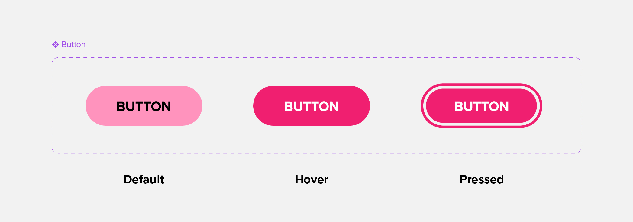
Flat design ditched bevels, gradients, and drop shadows in favour of simple shapes. While I’m not suggesting we bring back the bevel, it’s important to be aware of what value those older design had. Modern, flat buttons often erase the visual cues that told users whether a button was enabled, disabled, active, or being hovered over.
Without those cues, users are left guessing. “Is this button clickable? Did my click even register?” That uncertainty creates friction and, for many users, real confusion.
The fix
Use outlines, contrast, icons, or colour paired with another cue to make each state distinct, including a visible focus state for keyboard users. If a button is disabled, tell users why (“Fill in all required fields to continue”), or leave it enabled and show a clear message when they click.
Unfamiliar icons
Icons are a minimalist’s best friend. A single symbol can replace a whole label and save valuable space, all while (in theory) communicating intent instantly.
The problem starts when designers invent new icons for familiar functions (or even worse, unfamiliar ones). Every new symbol forces users to build a new mental map, even for actions they’ve done a thousand times before.
The fix
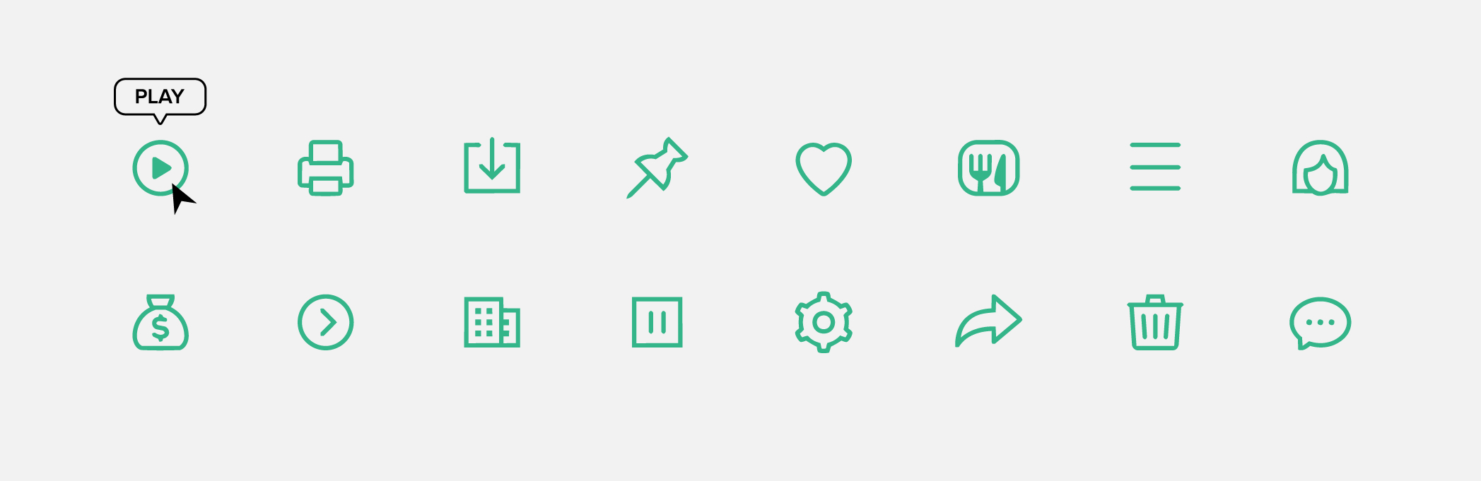
If a standard icon already exists, use it. Play, pause, save, print, undo, redo, and the hamburger menu are some examples of icons users will already recognize. There’s no need to reinvent them. If you do need something original, base it on a real-world object users will recognize.
If there’s no good match between the function and the real world, opt to build up recognition by using the icon with a label early in the user journey, then leaving just the icon later once the user is comfortable with it. When in doubt, add a label. Tooltips help too, but if they rely on a hover interation they won’t be helpful on touch screens, so keep that in mind.
Hidden menus and shortcuts
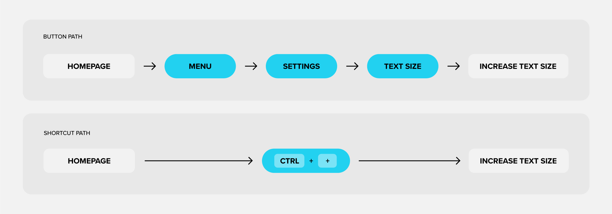
Hidden menus and shortcuts are genuinely great for experienced users who want speed and customization. The trouble comes when they become the only way to access a feature, with no easy and visible alternative for those newer in the journey. For people using screen readers or with cognitive disabilities, a feature they can’t find may as well not exist. Flexibility and user control should never come at the expense of clear design. Providing options is the goal here, not losing the basic functionality.
The fix
Keep your primary layout easy to understand at a glance, even if that means the “default” path is a little slower. Offer personalization for advanced users, an easy way to reset to defaults, and documentation so people can learn the shortcuts on their own terms rather than stumbling into a wall.
Disappearing defaults
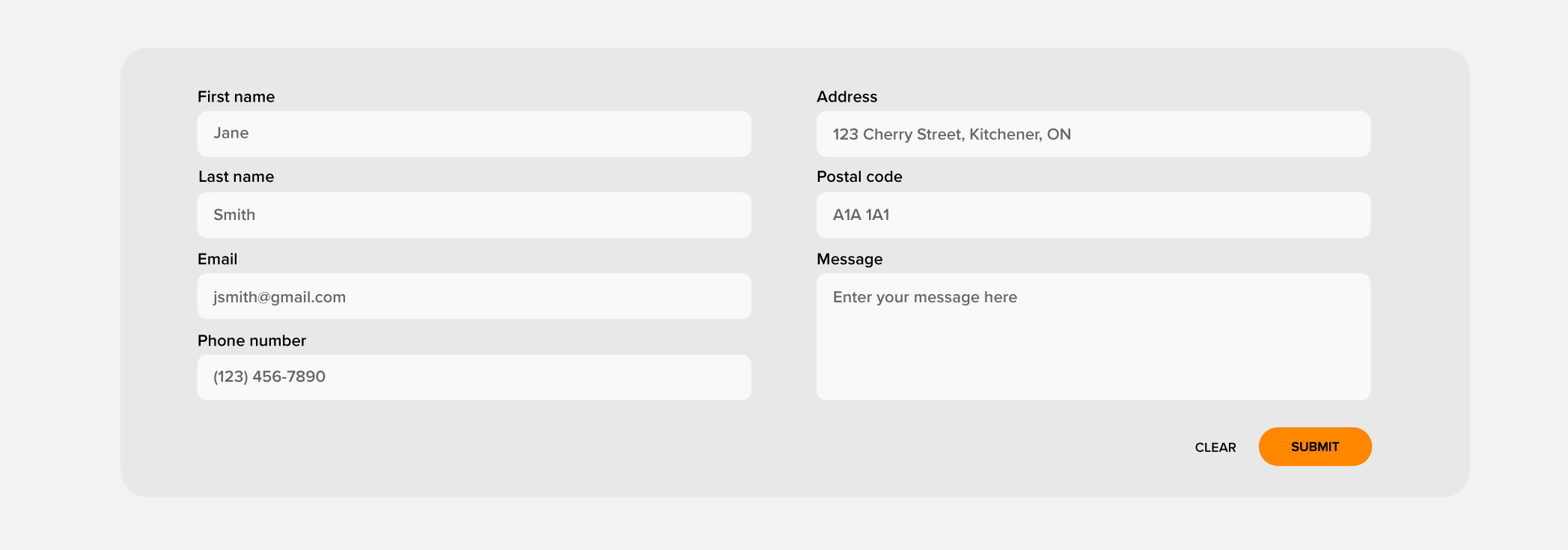
In the quest for a sleeker look, labels and placeholder values have been vanishing from forms and input fields. It might seem like a small change, but I think everyone has experienced trying to submit a form, only to get an angry red message about an unspecified issue.
Without a default or an example to reference, users are left to guess at what format or information you’re actually expecting. It’s far easier for everyone to show an example than to expect someone to happen upon the right format on their own.
The fix
Label your fields and give users a visible example of the expected input. Pair that with clear, specific error messages that tell people exactly what to fix rather than a vague “invalid input.” If there’s common alternative formats, have your design account for and automatically reformat the input into the way you want. Another solution is using separate form fields or drop downs to give predetermined options when applicable (but don’t take away allowing the user to type their own response).
Underutilizing colour
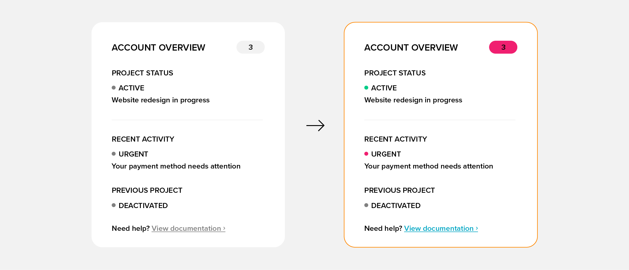
Muted, monochrome palettes are everywhere right now, for that clean, sleek look. But colour carries meaning and stripping it out means losing information along with it.
Users have learned to read colour instantly: green usually means active, red usually means cancelled or urgent, grey usually means deactivated, blue text usually means a link, and a red dot usually means a notification. When you mute all of that away, you’re removing a layer of communication that costs users no extra effort to read.
The fix
Use colour with purpose, and never on its own. Pair it with an icon, label, or underline so the meaning still comes through for people with colour blindness or low vision. A user’s mental map is powerful, so build on what they already expect.
Less is more, until less is less
Minimalism can be great for accessibility. When you take away what doesn’t need to be there, it’s easier for people to focus on what does. But there’s a point where simplifying starts to work against you. Remove the cues, defaults, and context that help people understand what they’re looking at, and the interface might look simpler, but it won’t be any easier to use.
I love Nielsen’s 10 usability heuristics because they help designers create experiences that are more human and accessible. But the minimalism heuristic often gets stretched further than it was meant to go. Nielsen Norman Group points out that minimalist visual design “is often guilty of removing necessary elements“, and that a clean look doesn’t automatically satisfy the heuristic. The heuristic was never about how little you can put on a screen. It was about how well people can understand and use what’s there.
So the fix isn’t to abandon minimalist design. It’s to ask yourself a few questions as you design:
- Would someone know what this does without being told?
- Am I asking users to remember information instead of letting them recognize it?
- Is there something familiar I could draw on instead of asking users to learn something new?
Ask those questions as you go, and minimalism stays what it should be: a tool for making design more accessible.