Designing for understanding: How clarity improves communication

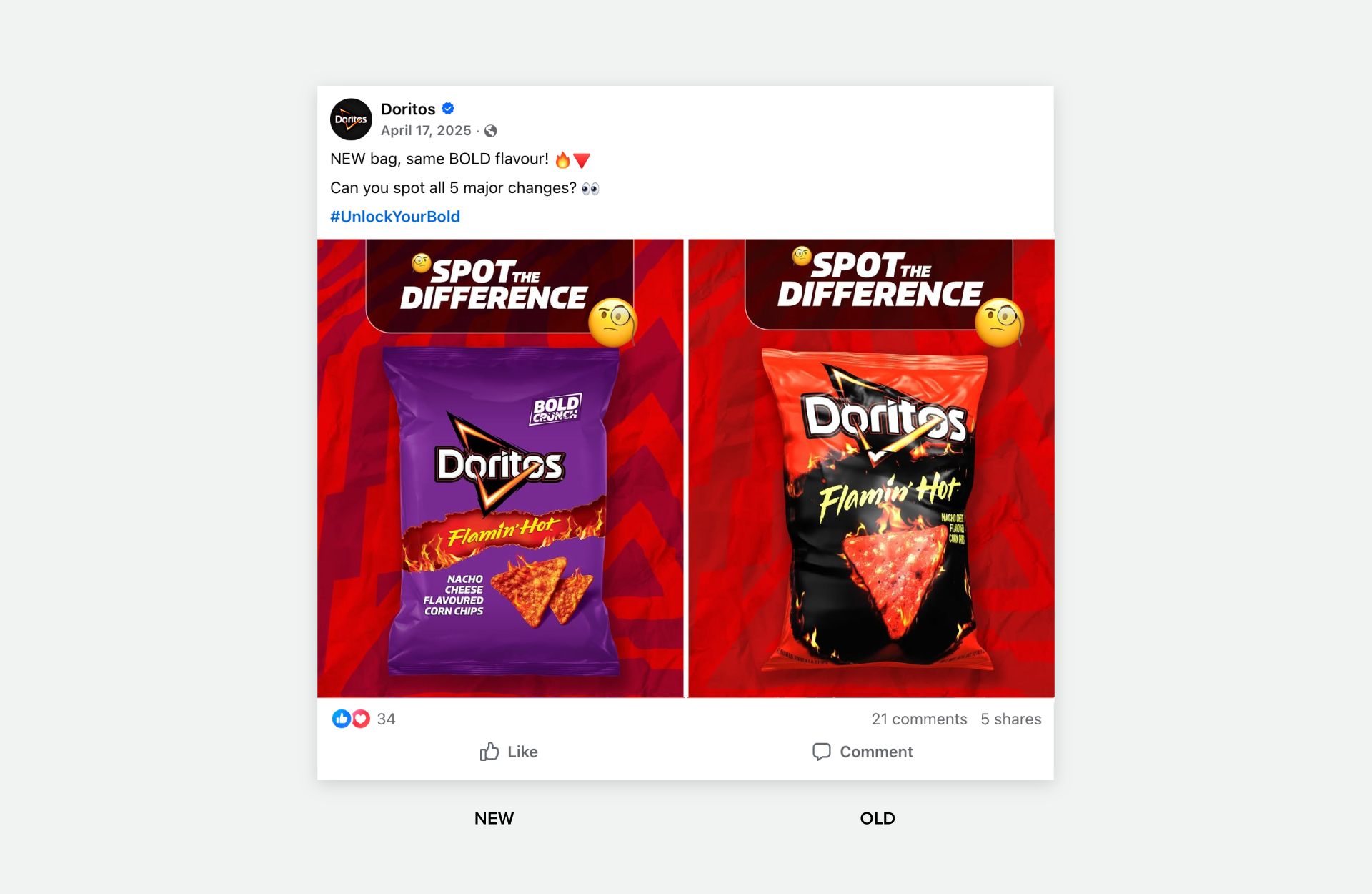
So, I went to the store to pick up my favourite bag of Flamin’ Hot Doritos, and I realized the packaging had changed. Shamelessly, as a designer, I get sad about these things, okay? After analyzing the other bags and doing some research on Reddit, I came to the conclusion that this change must’ve been made to improve clarity across the product lines.
You’ll often see brands undergo a refresh or rebrand. Usually, throughout any transformation, there’s a strategic shift to prioritize clarity, understanding and communication.
What do I mean by clarity?
A design that prioritizes clarity focuses on clear communication and usability. Essentially, visuals are easy to understand, and the design can be navigated effortlessly. If a design is very complex, difficult to use or understand, crowded, or lacks hierarchy, that could indicate that it’s unclear.
In the case of the Flamin’ Hot Doritos, the new bag places clearer emphasis on spicy, fiery, hot and bold. The flames are larger! More of the bag appears to be engulfed by the flames! There’s a black background which is connotative of carbon residue from fire. The chip is burning redder and the words “flamin’ hot” are enlarged while getting rid of “bold crunch” (it’s a chip so of course it’s going to be crunchy). There’s a move away from the coolness of the purple (which is used on their Bold BBQ flavour bag, at least here in Canada) into a warmer red. The move away from purple also sets them apart from Taki’s.
Without even reading, you can understand at a glance that this is what you go for if you want a spicy chip with some heat. It almost looks spicier in it’s new packaging, so much so that you understand the flavour even when it’s in a different language.

Why redesigns often move toward clarity
Now you may be thinking that snack packaging is a far cry from B2B marketing, but in both cases, we’re solving the same type of problem: brands need clear differentiation to stand out. For example, out of dozens of bags of chips Architecture Engineering Firms, what makes yours distinct? Design can help.
Sometimes, when a brand has been around for a while or lacks a solid set of brand guidelines or design system, it can start to look a little messy. Over time, this can make the brand and its assets become unclear. This is why many redesigns and brand refreshes move toward clarity. They focus on things like strong hierarchy, bringing back whitespace, and using elements intentionally so the brand is easier to understand again.
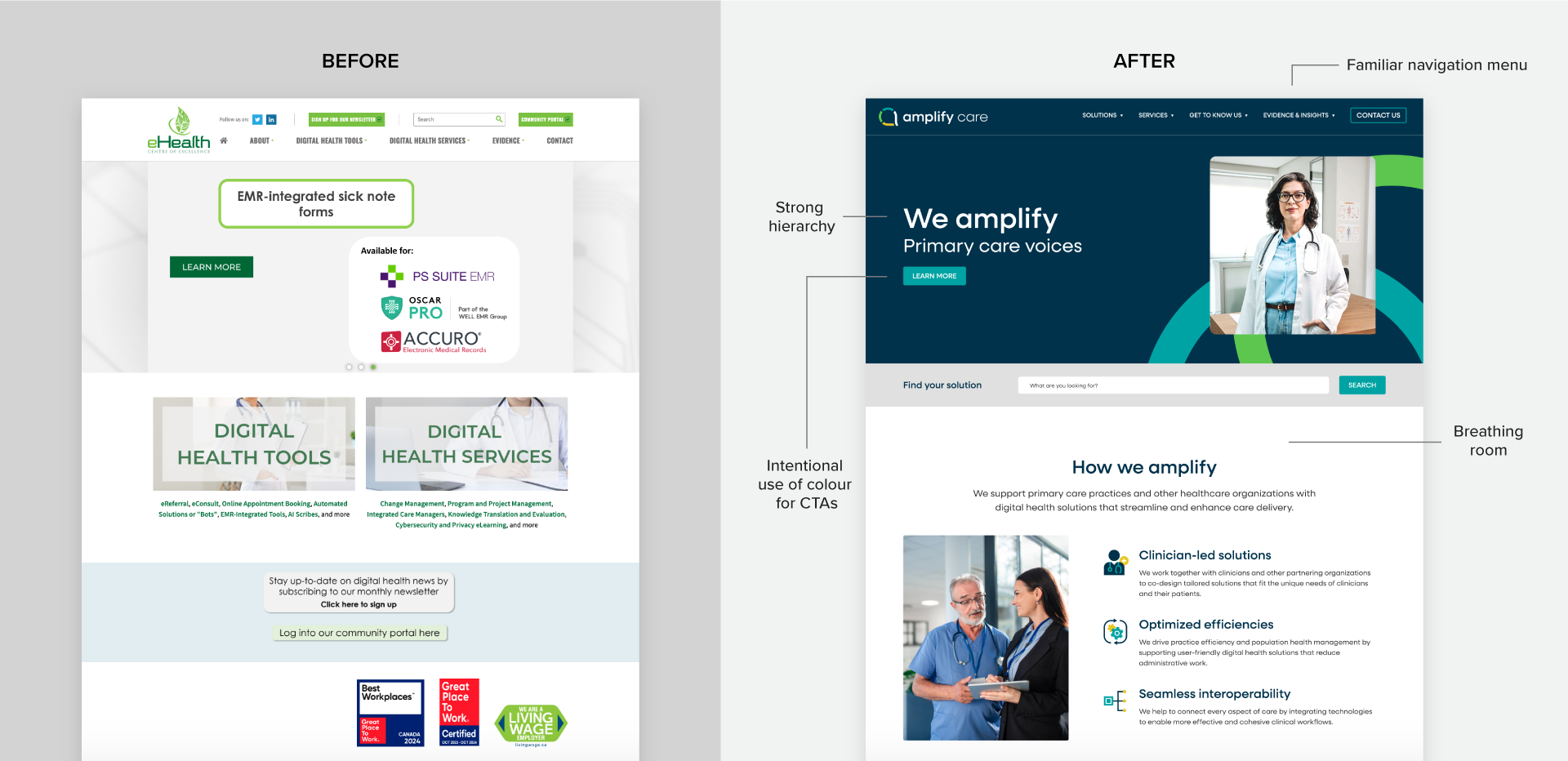
Example: Amplify’s rebrand and website relaunch aimed to differentiate them from competitors while making it easier for different audiences to find the information they needed on the site. The previous website was text-heavy and difficult to navigate. It also lacked consistent branding elements. The redesign introduced clearer hierarchy, improved spacing, more structured content, and intentional use of colour to guide attention. These changes created a more predictable, user-friendly experience. The transformation was improving the brand’s communication but also prioritizing clarity from other competitors.
What clear design looks like in practice
Using smart design decisions and systems makes designs easier to understand. Some of these ideas come from design principles and minimalism.
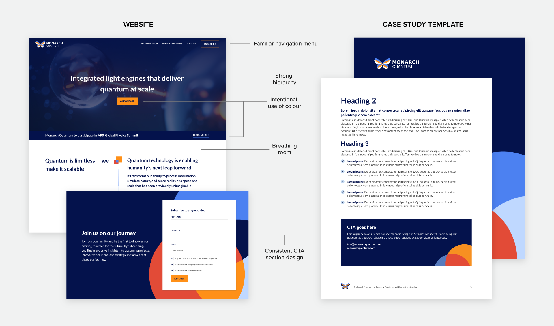
Monarch Quantum is a new company in the quantum space. Their website and collateral are a great example of clear design in practice. They also have brand guidelines to help keep future assets aligned. We’ll refer back to them as our B2B example as we break down what clear design looks like in practice.
Building focus
- Stronger hierarchy: Hierarchy refers to the levels of visual importance of elements in a design. This helps guide the eye to where it should go first, second, and third. For example, large headings are typically read first, while smaller body text is read second. In the chip bag example, when shopping for chips, first I’m scanning for Brand so I can find “Doritos”. Then when I get to Doritos I’m scanning for the flavour. What we’re building focus around means considering your users and what’s most important for them to know quickly. For websites or brochures, that may translate into how you’ve designed headings or your navigation.
- Intentional use of space: Using space intentionally creates breathing room. Whitespace helps prevent designs from looking crowded, making information easier to take in. Padding on websites for clear sectioning is one example of good use of space.
Creating consistency
- Use of familiar patterns: Familiar patterns are common design choices that people are already used to seeing. For example, a website’s navigation bar at the top of a page is a common UX pattern. Familiar patterns should be used so people can navigate or interact with a design how they would normally expect to. In North America, we typically read from left to right. That’s another familiar pattern to keep in mind.
- Consistency across layouts and components: Consistency in design has a similar effect to familiar patterns. When elements are used consistently for specific purposes, it helps users understand what to expect. For example, Monarch uses dark blue backgrounds and an overlapping shape pattern on CTA sections. People can then tell on all collateral that those are areas of importance.
- Design systems and guidelines: These are foundational resources for a brand that outline its elements, rules, and how they should be used. They support clear design by providing a source of truth that helps keep the brand aligned.
Designing intentionally
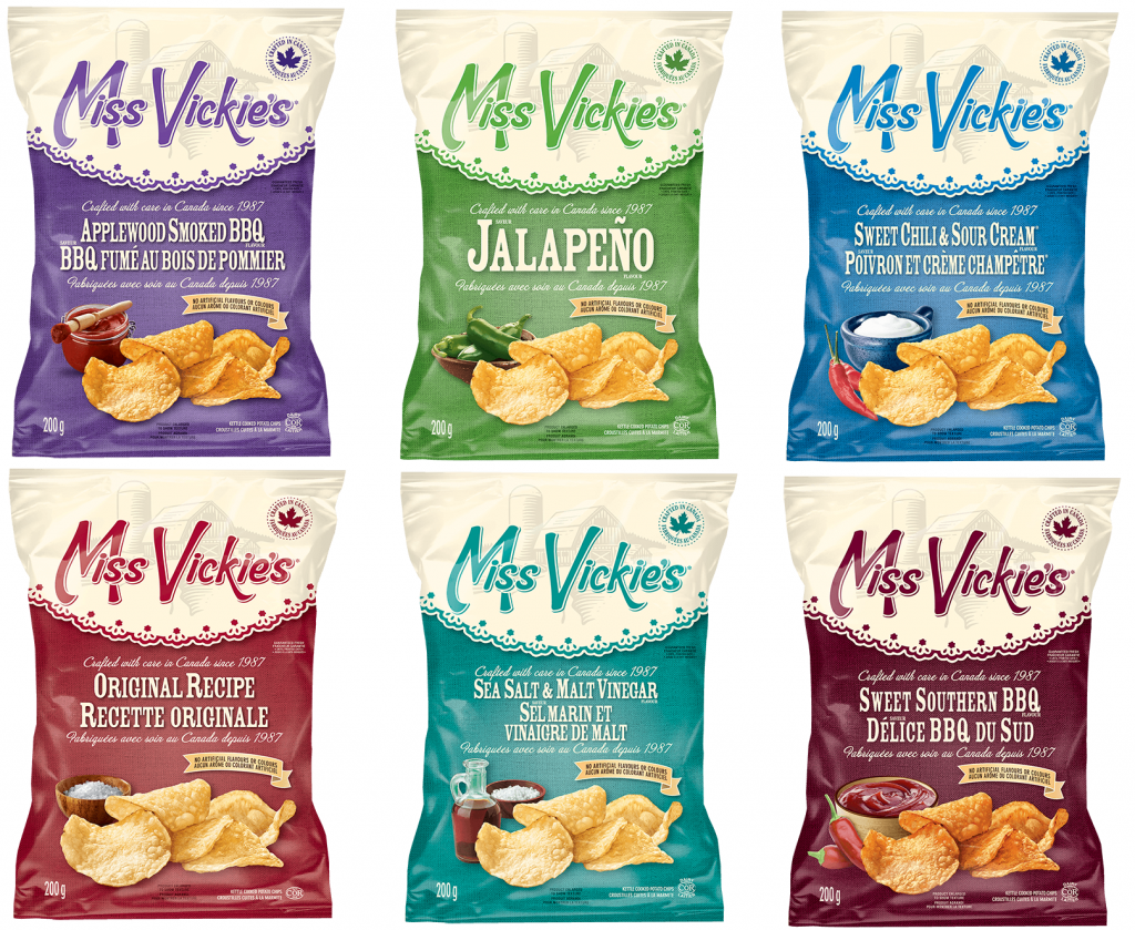
- Intentional design elements: This is similar to minimalism. You want to be intentional and strategic about the elements (shape, colour, texture, etc.) being used so the focus remains on what’s most important. This helps reduce decision fatigue for your team. In the case of Miss Vickie’s, they would have a design formula ready to go if we asked them to create packaging for “everything bagel with lox” flavoured chip or even a “strawberry matcha chip”. For Monarch, there was intentional use of the orange colour for primary CTAs and their website was built with repeatable blocks that could be used to spin up pages quickly.
What clearer design improves and why it matters for B2B
Clear design helps both the audience and internal teams. It can improve how people understand content, use a website, perceive a brand, and create assets. These benefits can have real business impacts:
- Faster understanding: Strong hierarchy, intentional use of space and design elements help users quickly take in what’s most important. This allows them to understand the key message faster, stay engaged, and find what they need. Overall, cognitive load is reduced, allowing users to process information more effectively.
- Better usability: Clearer design makes websites easier to use. Familiar patterns, strong hierarchy, and the use of whitespace create a better user experience. People can navigate websites and digital experiences more easily and find what they need faster.
- Increased trustworthiness: Clarity helps build trust. Clear, organized, and consistent design demonstrates attention to detail and makes a brand appear more trustworthy and reliable. This is especially important in B2B, where business decisions are often complex and significant.
- Stronger brand consistency: Clear design relies on consistency. Using familiar patterns, reusing design elements, and following brand guidelines helps a brand appear cohesive. Assets look like they belong together, creating stronger brand recognition and professionalism.
- More efficient scalability: Clear design is also more scalable. Establishing brand guidelines and maintaining consistent elements helps create a design system that can be implemented more quickly and easily because there is a strategy to follow. This is important for B2B teams that need to produce consistent, high-quality marketing assets efficiently.
Designing for clarity means designing for people
A design can be super clever or complex, but it’s most effective when it’s easy to understand. In B2B, where audiences are often processing complex information, clear design helps highlight what’s most important so key messages can be seen, understood, and acted on. Clarity can borrow from minimalism but it’s not always about doing less; it’s about making intentional design decisions to highlight what matters most for your audience.

 Deck
Deck