Design better B2B case studies for your website
Case studies are a crucial resource within B2B buying cycles. They’re one of the most effective types of B2B content, according to the Content Marketing Institute, ranking #1 in their 2024 content marketing survey and #2 in their 2025 survey. They can be presented as PDFs and other formats, but in this blog, I’m going to focus on case studies designed for your website. We’ll go over what B2B teams are doing to make their website’s case studies visually engaging as well as some things to avoid.
Why does the design of a case study matter?
- Positive first impression. A major benefit of case studies is that they can be used as a sales tool. This is an opportunity for potential clients to get a first impression of your business. If your design is professional and engaging, this can help start you off on the right foot.
- Improved readability. When a case study is designed well it improves the readability. This makes is easier for viewers to digest all the content and find what they’re looking for.
- Memorable design. Distinct visuals and great design can make you stand out from the competition and be more memorable. Additionally, people tend to remember visuals better than words.
- Enhanced storytelling. One of the main focuses of a case study is to tell a story. Adding visuals like imagery, video, or iconography adds emotion and makes storytelling more impactful.
B2B case study design best practices
Make case studies instantly scannable
When it comes to user experience design, scannability refers to how easily the content on a web page can be scanned through. Essentially, when people are “reading” online, they’re really just skimming down the page. Research shows 79% of people scan through web pages, which is why it’s crucial to make them scannable. A Nielsen Norman Group study found that making the copy on a test website scannable gave it a 47% better usability score. A key aspect of creating a scannable case study is determining what your audience cares about the most and how you can make that info quicker to consume. Make the user feel like they have to expend little effort to get what they need.
Designing a scannable layout
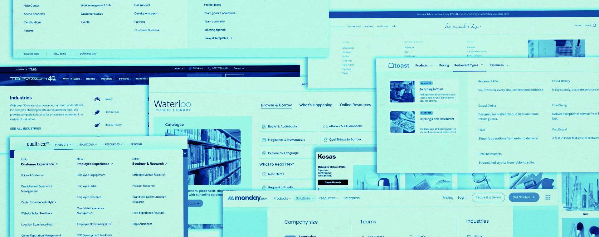
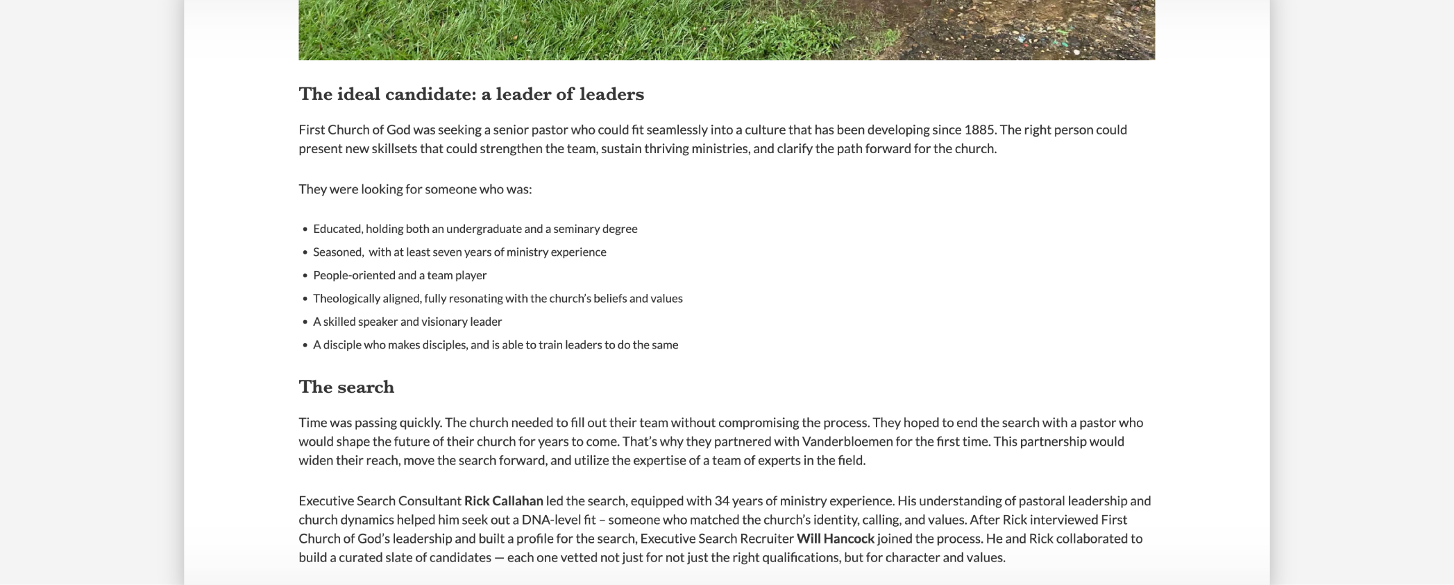
- Text formatting techniques: These include things like summaries, bullet points, and numbered lists. When readers scan a web page, they look for these elements to help them find the information they’re looking for. This will help them navigate through the text and also make the page more scannable by breaking up long chunks of text. In the example below, bullet points separate paragraphs of text, making Vanderbloemen’s case study easy to read.
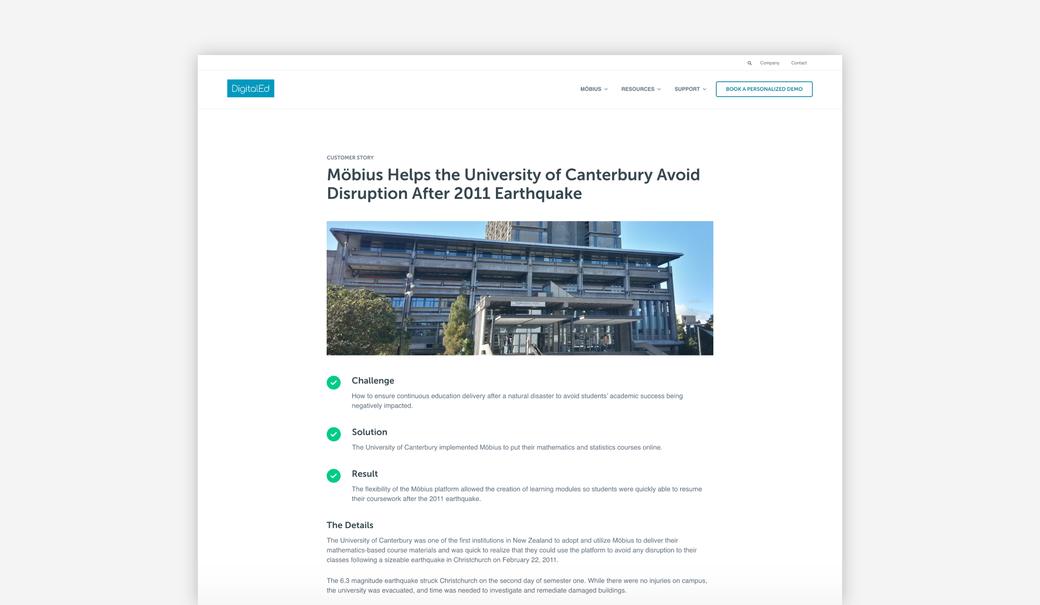
- Consistent hierarchy: Hierarchy involves arranging elements so the order of importance is clear. For a website case study, this could involve having clear headings and subheadings, so readers can skim through and easily find what section they want. For DigitalEd’s case studies, there’s a clear hierarchy. You can see the main title is the largest, then the subheadings, then the body text, and the “customer story” tag at the top is smallest. There’s also many SEO reasons to consider around hierarchy for headings as well but we’ll keep this blog focused on overall design.
- Ample whitespace: Whitespace is the blank area within the design of the case study. Sometimes people want to fill every space, but having some “breathing room” is actually very beneficial. It’ll help make the case study more scannable by separating elements, so everything isn’t too smushed together. In our cases studies, there’s plenty of whitespace to help break up each section.
Emphasize what matters most
The majority of people are scanning through web pages, so it’s vital to make your most important information stand out. For website case studies, that means highlighting proof points so decision-makers scanning through will notice them. Clear emphasis not only improves scannability but also ensures the most valuable content is seen by your audience.
Ensuring key results stand out
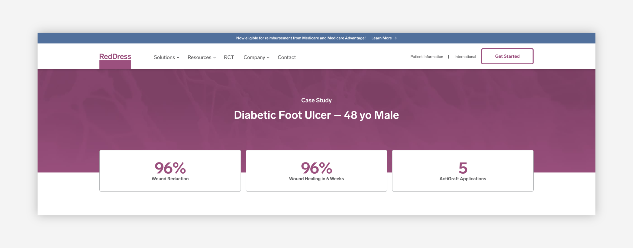
- Highlight key metrics: Use large and/or bold typography to make the stats in your case study stand out from the rest of the text. This will help people see what numbers are important. RedDress has large, bold metrics at the top of each of their case studies highlighting the success achieved.
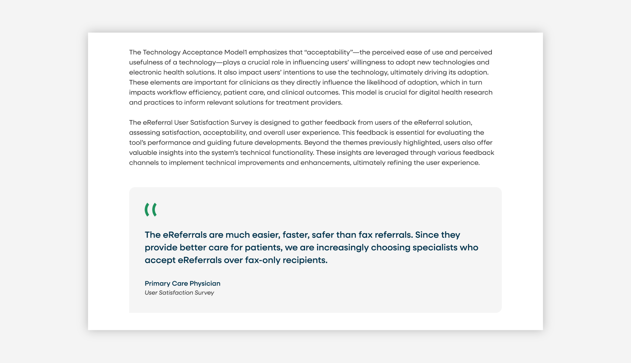
- Use impactful callouts: Implement stylized callouts to draw attention to valuable content on the page. These could include metrics, quotes, or examples. An easy way to do this is to use a shaded box behind the text you want to highlight. Amplify Care does this, highlighting important quotes in light grey boxes, so they stand out from the rest of the text. These can be testimonials from your clients which act as social proof or, they can even be quotes from key members of your team reinforcing the success of the client or explaining the process. Either way, it’s a great option for adding a human-touch to the story.
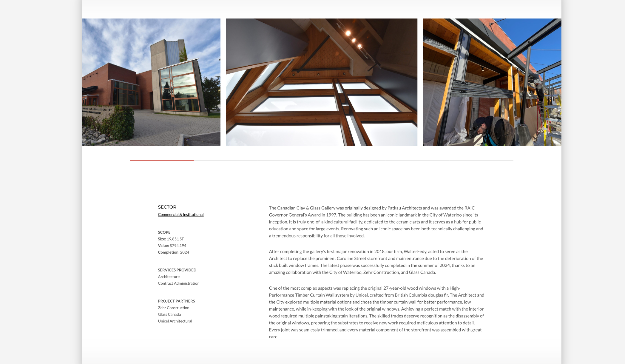
- Prioritize essential context: Consider the placement of where you’re putting the context your audience needs for the case study. This could include industry, year, or project cost. A common practice is to place these details close to the top of the page, so potential clients can immediately gauge if the case study is relevant to them. Walterfedy’s projects have details like sector, scope, services, and partners listed on the left side for viewers to see as they start reading about the project.
Using visual storytelling to engage prospects
Including great visuals in your case study will help with glanceability, make you stand out with imagery nobody else has, and will enhance the overall story you’re trying to tell. There’s also a well-documented phenomenon called the picture-superiority effect, which is where people tend to remember pictures better than words.
Visuals that strengthen a case study
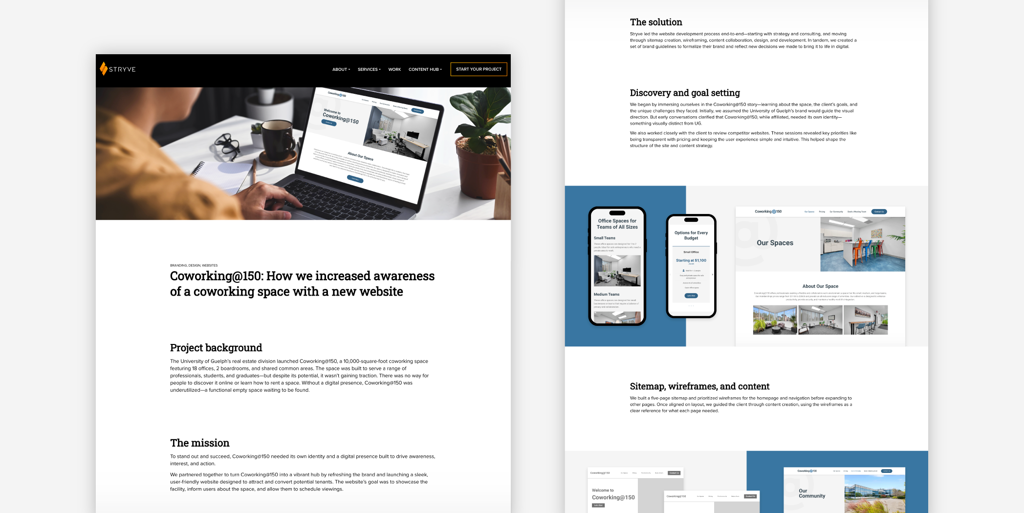
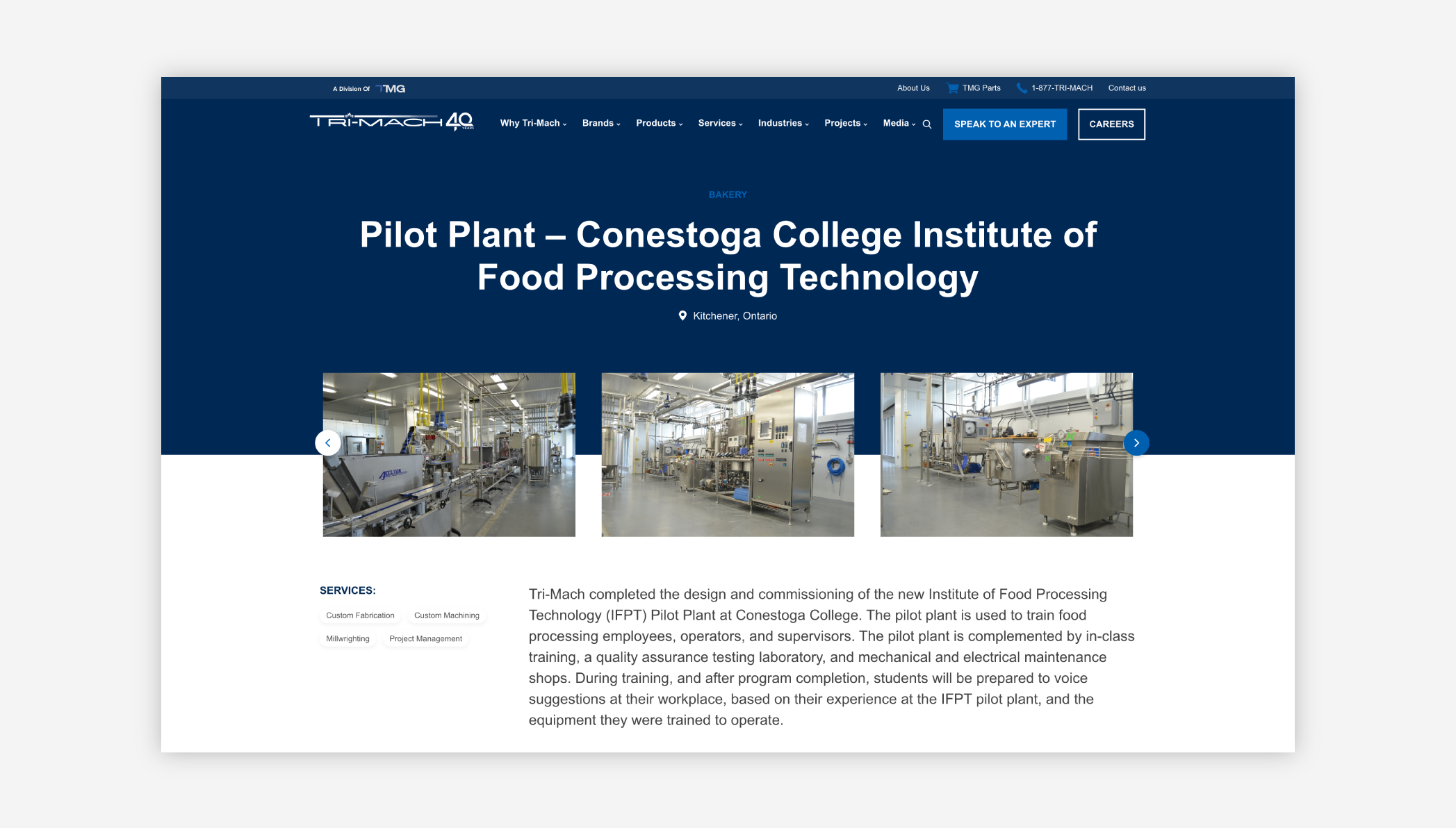
- Relevant images and videos: Showing applicable images or videos of the product or service helps validate your work. This could be a before-and-after shot or the product/service in action. If you don’t have photos, there are lots of other ways to showcase your work: illustrations, 3D renders, mockups, wireframes, etc. Tri-Mach includes relevant photos of the work they’ve done in a carousel at the top of their project pages. At Stryve, we showcase our design work and branded creations. You may have limitations depending on the nature of your product or service but including imagery is always possible with some creativity.
- Guiding icons: Icons can be used to guide people through a case study. For example, you could have icons that correspond to certain sections. It’s a way to inject brand personality. Green Leaf Consulting has branded icons that guide you through the challenge, solution, impact sections of their success stories. Icons are also a great option if you do struggle with sourcing imagery.
![]()
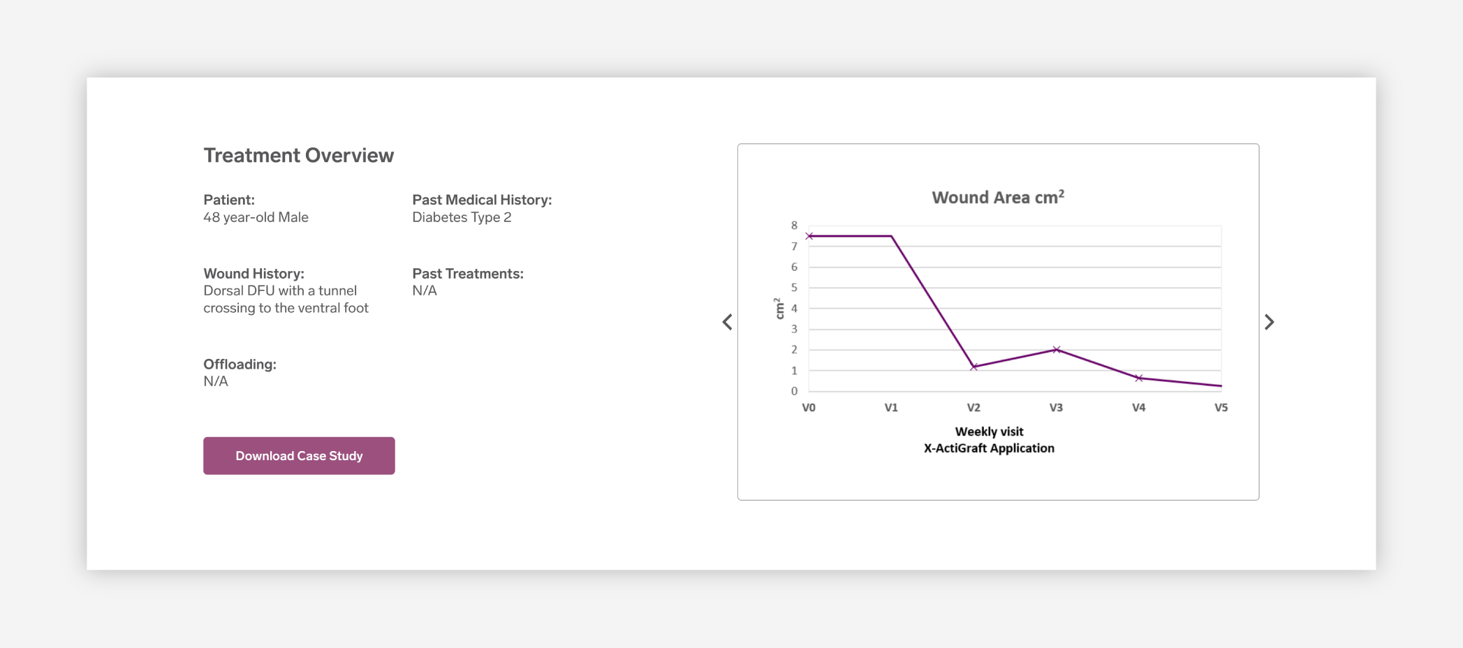
- Data visualization: For case studies that are more focused on the numbers, charts or graphs can be used to make the data easier for prospects to understand. RedDress includes a line graph in their cases studies which visually shows the impact treatment has had over a period of time. When it comes to data visualization, there’s tons of options from tables, pie charts to less traditional visualization like infographics style approaches.
Common pitfalls that weaken case studies
Meaningless imagery
Decorative images like filler stock photography should be avoided in a case study. Ideally, the imagery included should be informational (like product photos) or primary source imagery that no other brand has. After all, a case study story is unique to you and your client so the imagery should be, too. Unique imagery helps prospects make decisions and understand the information in the case study better.
Text overload
The problem with overloading case studies with text is that it makes the page less scannable, negatively impacting the user experience. To combat this, it’s important to design strategically to break your text up into more digestible sections by using some of the strategies previously mentioned like using bullets, adding whitespace, including imagery, etc. This can also be explored by ensuring the back-end of your website experience has an easy to use block-editor or case study template.
No visuals
Having no visuals can easily push a case study into the “text overload” zone. Sometimes there’s a misconception that if the work done wasn’t very visual, then there’s no way to make the case study have imagery. However, even if you don’t have photos of your product or service, there are lots of other options to make the case study more engaging. Businesses will use other types of graphics to showcase the product or visualize processes like wire-framing, brainstorming, mind maps etc.
Validate your success stories with thoughtful web design and creative
Having a scannable layout, emphasizing key points, and adding visuals helps decision-makers read and remember your case study. A lot of this is made possible by having a well-developed website that has an easy to use back-end where your marketing team is empowered to post case studies without requiring developers or being limited by the functionality of the website. Adding multimedia, having a block-quote feature, pre-formatted headings to choose from and a strategically developed template plays a massive role in this. Think about what would be helpful in telling your stories and if you need support in translating your stories into a better web experience, give us a shout.