RideCo
RideCo is a tech company that wants to make urban transportation better. Their mobile app solution lets passengers book shared, professional transportation door-to-door and hub-to-hub, for approximately the same cost and in the same time as using their own vehicles.
The Challenge
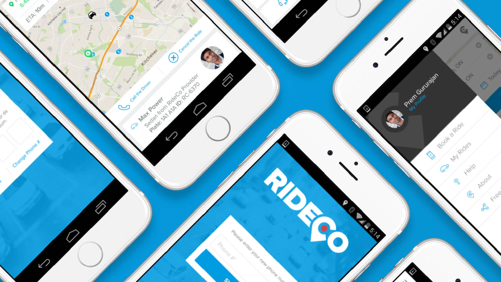
RideCo wanted to refresh the look of their mobile app’s interface. They wanted to reflect that they are modern and professional, but also friendly and accessible.
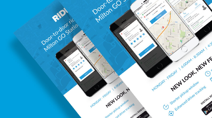
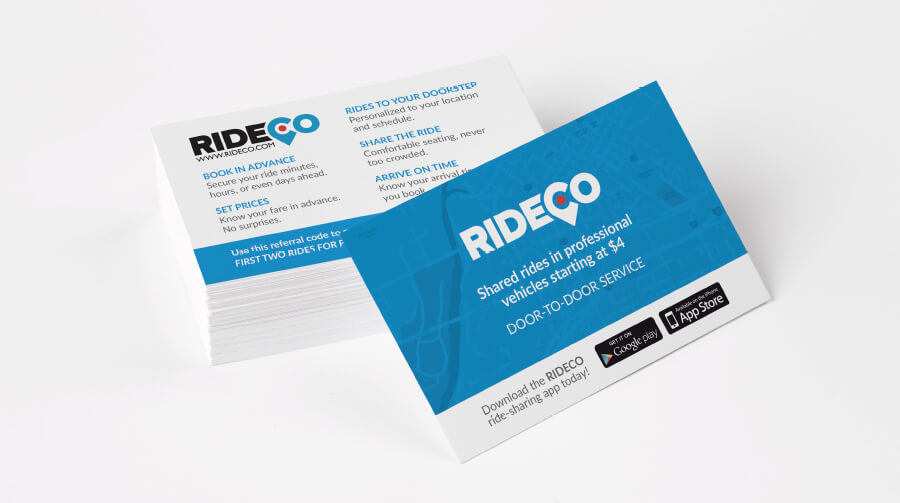
Following the launch of the refreshed interface, they also wished to update the look and feel of their marketing materials to complement it.
The Work
Stryve analyzed the user flow when engaging with the RideCo app, and storyboarded the process to improve its usability. A newly designed skin was created to bring a more vibrant blue brand colour, and items such as icons and user inputs were improved for easier interaction.
This refreshed look and feel was then applied to their email marketing, which was migrated to MailChimp, as well as their printed collateral.
The Results
The new designs for the app were delivered to RideCo to coincide with their development sprints. This resulted in the new version of the app being released to the public within one month.
With the launch of the new emails and marketing collateral, RideCo saw its ridership increase by 50%.